Jump to content


Recommended Posts

Posted

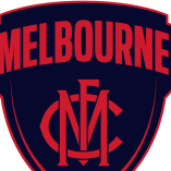
Oh good, let's break even this season, but look at putting more money into the Footy Dept next season or let's get a new emblem again after four years and have to spend money on changing everything again, jumpers, signage, letterheads, merchandising...sigh and sigh...any way agree must we go back to cartoonish emblems..why?....and besides which if it is going to have a name on surely the name should be Dees, don't hear many people calling MFC the Demons these days....

I'd much rather be called MFC, than the Demons. People call us the Demons all the time or Dees and it's usually in a patronising way. It's rare to hear people refer to us as the MFC. Hopefully more strips like the indigenous strip this year will rectify this. I think we might find that the new MFC emblem is very minimalist with the simple MFC logo, ala the Indigenous jumper. I'd support that change, otherwise I kind of like the current emblem.

Every comment I have heard on our current emblem is that it's too busy, but I don't mind it as a business logo, probably looks alright on a letter head and so on, maybe doesn't reflect the " demons" side of the club well enough

There's a trident for a reason. That's your symbolism. They don't have to say "Demons".

  • Like 2

Posted

I reckon the emblem could work in unison with a team logo. The current emblem can remain for all corporate or business matters, while a new more Demon-centric logo can be used for the team itself on merchandise and guernseys.

I keep seeing this idea floated, and I'm not entirely against it, but are there other examples of this in the league to point towards?

The current emblem is a stale corporate nightmare to my eyes, but I can see it being viewed as suitable for letterheads. I just question the merit in having two logos.

Posted (edited)

I keep seeing this idea floated, and I'm not entirely against it, but are there other examples of this in the league to point towards?

The current emblem is a stale corporate nightmare to my eyes, but I can see it being viewed as suitable for letterheads. I just question the merit in having two logos.

The MFC is a business. IMO, you shouldn't muddy your brand. It should be clear and concise. One emblem, for mine.

Edited by AdamFarr
Posted

Oh good, let's break even this season, but look at putting more money into the Footy Dept next season or let's get a new emblem again after four years and have to spend money on changing everything again, jumpers, signage, letterheads, merchandising...sigh and sigh...any way agree must we go back to cartoonish emblems..why?....and besides which if it is going to have a name on surely the name should be Dees, don't hear many people calling MFC the Demons these days....

Do you know for a fact that any money being put into a new emblem will be at the expense of the football dept or are you just ranting?

Posted

The MFC is a business. IMO, you shouldn't muddy your brand. It should be clear and concise. One emblem, for mine.

I would tend to agree. I'm open to the idea, but my preference would be for the one logo.

  • Like 1

Posted (edited)

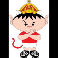
I love the current emblem and all that it stands for, but I also think there's a strong case for a logo that will be attractive to the kids who will form our future membership base. An angry, fire eating Demon would surely have more appeal to the youngsters. Like others have said, there is a place for both an official emblem as well as what I would call a logo, to be used on badges and in newspapers etc..

Dof, fire eaters at our home night games, I like it, brilliant idea. Pre game around the boundary, either side of the Run-Through, & at the long-breaks.

FireEaters-282x228.jpg159522d7cd8cc55e39c601365af2ec53.jpg

Quick someone ring the Club !!!

Edited by dee-luded
Posted

Yeah I quite like the current one, it's just a little too busy.

I'd only have one of the trident, football and southern cross (whichever element is the most important - probably the trident as it's part of our identity, although it should be a smaller trident), and I don't think the flame above the M works well given the usual size of the logo.

I think this is pretty close to the mark.

So much going on in that logo competing for attention, that every facet gets washed out.

I'd be happy for a few tiny details representative of certain aspects of the club's history, but not immediately obvious and all tied together with a strong central theme - currently they're all practically on even footing and no one aspect is the clear central focus.


Posted

I'd much rather be called MFC, than the Demons. People call us the Demons all the time or Dees and it's usually in a patronising way. It's rare to hear people refer to us as the MFC. Hopefully more strips like the indigenous strip this year will rectify this. I think we might find that the new MFC emblem is very minimalist with the simple MFC logo, ala the Indigenous jumper. I'd support that change, otherwise I kind of like the current emblem.

There's a trident for a reason. That's your symbolism. They don't have to say "Demons".

I do think the terms "Demons" and "Dees" have only been used in a patronisingly soft way because they are so inherently linked to the style of play we have served up for decades.

We could have been called anything and it would have been used in a patronising manner.

Turn the form around, and the perception will also change.

I recall under Ross Lyon they played their trademark "saints footy."

Now I think there are few things more weak and pathetic as a mascot than a "saint", but it was hardly looked upon as soft uncommitted footy.

That had nothing to do with the word "saints" and everything to do with what the players brought on the field.

Similarly the "swans" are a fairly lame mascot, but they did revert to a much more tough sounding "bloods" terminology.

  • Like 2

Posted

Said it before and will say it again. The emblem as it is is just that an emblem - it is rich in what it stands for and should continue as such. However what is needed is a logo - a simple little design that works for when a little logo is required ie the little logos on the TV score board and on the header of the afl website. For me the little blue square with the red yoke works just fine for those situations as would the MFC monogram. We need an emblem for official things like big signs and letterheads etc as well as a little logo for the times when the detail isn't so necessary. I think that is where the problems are the emblem was needed - our song refers to an emblem that is otherwise non existent but a simple little logo is needed as well

  • Like 1
Posted (edited)

I think this is pretty close to the mark.

So much going on in that logo competing for attention, that every facet gets washed out.

I'd be happy for a few tiny details representative of certain aspects of the club's history, but not immediately obvious and all tied together with a strong central theme - currently they're all practically on even footing and no one aspect is the clear central focus.

Without want to rant here, I feel like this has Schwab's fingerprints all over it. I'm only speculating, but surely the designer would have said, 'you need to focus on a strong central theme'. I remember when they wheeled it out on the club website and they had a little video to explain every aspect. Every element seemed to be as important as the other. That doesn't speak designer to me. That speaks of an executive that doesn't understand design. Anyway, I still think that logo looks classy.

I do think the terms "Demons" and "Dees" have only been used in a patronisingly soft way because they are so inherently linked to the style of play we have served up for decades.

We could have been called anything and it would have been used in a patronising manner.

Turn the form around, and the perception will also change.

I recall under Ross Lyon they played their trademark "saints footy."

Now I think there are few things more weak and pathetic as a mascot than a "saint", but it was hardly looked upon as soft uncommitted footy.

That had nothing to do with the word "saints" and everything to do with what the players brought on the field.

Similarly the "swans" are a fairly lame mascot, but they did revert to a much more tough sounding "bloods" terminology.

I agree. It's linked with our past failures, but I'd like to get away from that really. That said, I loved how Roos was conscious of the 'bloods' nickname and what it stood for. Even if he can something remotely similar with the Demon, I'll be a very happy man. But as you say, M, the connotation of the 'Demon' will change with our performances.

Edited by AdamFarr
Posted

Hahah i'm not sure you'd want to brag about being " the Toffees", but I take your point.

Comes from a Toffee Lady who used to walk around the ground before kick off throwing toffees into the crowd. I have been an Evertonian since 1976 and was there when we won our last FA Cup, magical day

  • Like 1
Posted

Said it before and will say it again. The emblem as it is is just that an emblem - it is rich in what it stands for and should continue as such.

However what is needed is a logo - a simple little design that works for when a little logo is required ie the little logos on the TV score board and on the header of the afl website. For me the little blue square with the red yoke works just fine for those situations as would the MFC monogram.

We need an emblem for official things like big signs and letterheads etc as well as a little logo for the times when the detail isn't so necessary. I think that is where the problems are the emblem was needed - our song refers to an emblem that is otherwise non existent but a simple little logo is needed as well

nicely articulated jako13

Posted

The current emblem is unbearably self-important. It doesn't offer a challenge to the world, it sits on its backside and says "We are the Royal and Ancient. Admire us."

The sooner we lose it the better.

  • Like 2

Posted

I like the current emblem and would hate to see it superseded, as would one of my sons who has it tattooed on his bicep.

  • Like 2
Posted

The current emblem is unbearably self-important. It doesn't offer a challenge to the world, it sits on its backside and says "We are the Royal and Ancient. Admire us."

The sooner we lose it the better.

I've come to think this, also.

At first I liked it because I thought the club should be proud of its history (and it should), but holding it up as justification for respect is a bit rich considering the club's lack of success over such a long period.

It's time to redefine the club and we're in the middle of this, I'm not sure the current brand reflects where the club wants to go.

Posted

Hahah i'm not sure you'd want to brag about being " the Toffees", but I take your point.

Presumably they stick together when the going gets hot (unlike Melbourne in the recent past).


Posted (edited)

I've come to think this, also.

At first I liked it because I thought the club should be proud of its history (and it should), but holding it up as justification for respect is a bit rich considering the club's lack of success over such a long period.

It's time to redefine the club and we're in the middle of this, I'm not sure the current brand reflects where the club wants to go.

The team on the park reflects where we want to go, not an emblem, the emblem was introduced to replace that horrid modern red V and blue abomination, want to go back to that?......I do not want a Demon anywhere near the emblem/badge/brand....it is Americanised, cartoonish and childish Edited by Satyriconhome
  • Like 1
Posted

Maybe we can take the large sum of money out of football operations it would cost to think tank and design an emblem to everyone's taste.

Honestly we have far more important things to attend to, and put our limited funds toward, than a new logo.

I want to win games of footy and don't give two stuffs what emblem is on our polo shirts while we do so.

Posted

The current emblem is unbearably self-important. It doesn't offer a challenge to the world, it sits on its backside and says "We are the Royal and Ancient. Admire us."

The sooner we lose it the better.

You've obviously never played a round at St Andrews

It's an emblem, it says to me MFC, that's all it is supposed to say, what do you want something Americanised, it asks you how you are and how your are feeling

Posted (edited)

Maybe we can take the large sum of money out of football operations it would cost to think tank and design an emblem to everyone's taste.

Honestly we have far more important things to attend to, and put our limited funds toward, than a new logo.

I want to win games of footy and don't give two stuffs what emblem is on our polo shirts while we do so.

No to pay a design agency, I was one of a small select group who was shown a prototype of the emblem by the said Mr Schwab, there were actually a couple of changes put in place, if you would like to see the inspiration behind the emblem ....tried to paste it wouldn't work...look up Barcelona Football Club emblem

Edited by Satyriconhome
Posted

The current emblem is a dogs breakfast of symbolism. New one should definitely have a cartoon pic of Roosy with horns on his head. All class.

  • Like 2
Posted (edited)

I've come to think this, also.

At first I liked it because I thought the club should be proud of its history (and it should), but holding it up as justification for respect is a bit rich considering the club's lack of success over such a long period.

It's time to redefine the club and we're in the middle of this, I'm not sure the current brand reflects where the club wants to go.

we don't need to divorce our past, to become a force, & move forward as a modern growing club. we are not a different club, we are the same with many faults that have been left to grow through our fibres.

we need to realise & recognise these rotten parasitic fibres entwined in our being, & then shed them as we grow another skin.

we do need to open up to a broader demographic of people to grow our support base. but Not doing this in our past 50 Yrs is part of the infection.

Edited by dee-luded

Join the conversation

You can post now and register later. If you have an account, sign in now to post with your account.

Guest
Unfortunately, your content contains terms that we do not allow. Please edit your content to remove the highlighted words below.
Reply to this topic...

×   Pasted as rich text.   Paste as plain text instead

  Only 75 emoji are allowed.

×   Your link has been automatically embedded.   Display as a link instead

×   Your previous content has been restored.   Clear editor

×   You cannot paste images directly. Upload or insert images from URL.

  • Recently Browsing   0 members

    • No registered users viewing this page.
  • Demonland Forums  

  • Match Previews, Reports & Articles  

    TRAINING: Monday 18th November 2024

    Demonland Trackwatchers ventured down to Gosch's Paddock for the final week of training for the 1st to 4th Years until they are joined by the rest of the senior squad for Preseason Training Camp in Mansfield next week. WAYNE RUSSELL'S PRESEASON TRAINING OBSERVATIONS No Ollie, Chin, Riv today, but Rick & Spargs turned up and McDonald was there in casual attire. Seston, and Howes did a lot of boundary running, and Tom Campbell continued his work with individual trainer in non-MFC

    Demonland
    Demonland |
    Training Reports

    2024 Player Reviews: #11 Max Gawn

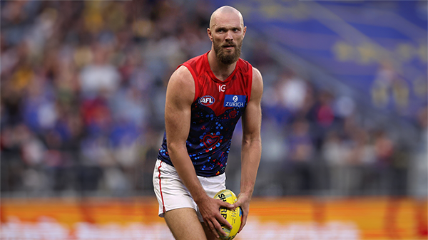
    Champion ruckman and brilliant leader, Max Gawn earned his seventh All-Australian team blazer and constantly held the team up on his shoulders in what was truly a difficult season for the Demons. Date of Birth: 30 December 1991 Height: 209cm Games MFC 2024: 21 Career Total: 224 Goals MFC 2024: 11 Career Total: 109 Brownlow Medal Votes: 13 Melbourne Football Club: 2nd Best & Fairest: 405 votes

    Demonland
    Demonland |
    Melbourne Demons 11

    2024 Player Reviews: #36 Kysaiah Pickett

    The Demons’ aggressive small forward who kicks goals and defends the Demons’ ball in the forward arc. When he’s on song, he’s unstoppable but he did blot his copybook with a three week suspension in the final round. Date of Birth: 2 June 2001 Height: 171cm Games MFC 2024: 21 Career Total: 106 Goals MFC 2024: 36 Career Total: 161 Brownlow Medal Votes: 3 Melbourne Football Club: 4th Best & Fairest: 369 votes

    Demonland
    Demonland |
    Melbourne Demons 5

    TRAINING: Friday 15th November 2024

    Demonland Trackwatchers took advantage of the beautiful sunshine to head down to Gosch's Paddock and witness the return of Clayton Oliver to club for his first session in the lead up to the 2025 season. DEMONLAND'S PRESEASON TRAINING OBSERVATIONS Clarry in the house!! Training: JVR, McVee, Windsor, Tholstrup, Woey, Brown, Petty, Adams, Chandler, Turner, Bowey, Seston, Kentfield, Laurie, Sparrow, Viney, Rivers, Jefferson, Hore, Howes, Verrall, AMW, Clarry Tom Campbell is here

    Demonland
    Demonland |
    Training Reports

    2024 Player Reviews: #7 Jack Viney

    The tough on baller won his second Keith 'Bluey' Truscott Trophy in a narrow battle with skipper Max Gawn and Alex Neal-Bullen and battled on manfully in the face of a number of injury niggles. Date of Birth: 13 April 1994 Height: 178cm Games MFC 2024: 23 Career Total: 219 Goals MFC 2024: 10 Career Total: 66 Brownlow Medal Votes: 8

    Demonland
    Demonland |
    Melbourne Demons 3

    TRAINING: Wednesday 13th November 2024

    A couple of Demonland Trackwatchers braved the rain and headed down to Gosch's paddock to bring you their observations from the second day of Preseason training for the 1st to 4th Year players. DITCHA'S PRESEASON TRAINING OBSERVATIONS I attended some of the training today. Richo spoke to me and said not to believe what is in the media, as we will good this year. Jefferson and Kentfield looked big and strong.  Petty was doing all the training. Adams looked like he was in rehab.  KE

    Demonland
    Demonland |
    Training Reports

    2024 Player Reviews: #15 Ed Langdon

    The Demon running machine came back with a vengeance after a leaner than usual year in 2023.  Date of Birth: 1 February 1996 Height: 182cm Games MFC 2024: 22 Career Total: 179 Goals MFC 2024: 9 Career Total: 76 Brownlow Medal Votes: 5 Melbourne Football Club: 5th Best & Fairest: 352 votes

    Demonland
    Demonland |
    Melbourne Demons 8

    2024 Player Reviews: #24 Trent Rivers

    The premiership defender had his best year yet as he was given the opportunity to move into the midfield and made a good fist of it. Date of Birth: 30 July 2001 Games MFC 2024: 23 Career Total: 100 Goals MFC 2024: 2 Career Total:  9 Brownlow Medal Votes: 7 Melbourne Football Club: 6th Best & Fairest: 350 votes

    Demonland
    Demonland |
    Melbourne Demons 2

    TRAINING: Monday 11th November 2024

    Veteran Demonland Trackwatchers Kev Martin, Slartibartfast & Demon Wheels were on hand at Gosch's Paddock to kick off the official first training session for the 1st to 4th year players with a few elder statesmen in attendance as well. KEV MARTIN'S PRESEASON TRAINING OBSERVATIONS Beautiful morning. Joy all round, they look like they want to be there.  21 in the squad. Looks like the leadership group is TMac, Viney Chandler and Petty. They look like they have sli

    Demonland
    Demonland |
    Training Reports 2
  • Tell a friend
    Love Demonland? Tell a friend!

×
×
  • Create New...