
-
-
 Recently Browsing
0 members
Recently Browsing
0 members
- No registered users viewing this page.
-
Demonland Forums


-
-
Match Previews, Reports & Articles

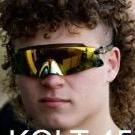
Welcome to Demonland: Luker Kentfield
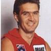
With the Melbourne Football Club's first pick in the 2024 AFL Mid-Season Draft and pick number 11 overall the Demon's selected Western Australian key forward Luker Kentfield from Subiaco.

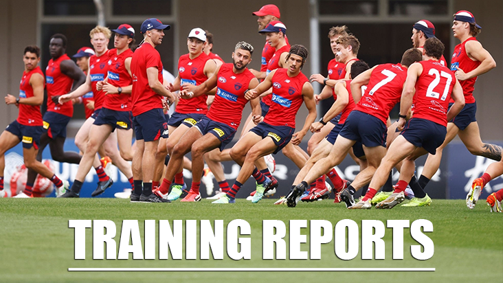
TRAINING: Tuesday 28th May 2024
Veteran Demonland Trackwatcher Kev Martin returned to the training track to bring you the following observations from Gosch's Paddock this morning. Beautiful morning for training. The dew has dried, out from AAMI, quiet chatting. Maysie does his heart symbol. 7 in rehab, Turner, Hore, Sestan, BBB, Petty, Spargo and Schache. All in runners. Melky weighted and change of angles work. Salem has his individual program. White cap (no contact), Howes, Woewodin and Sparrow
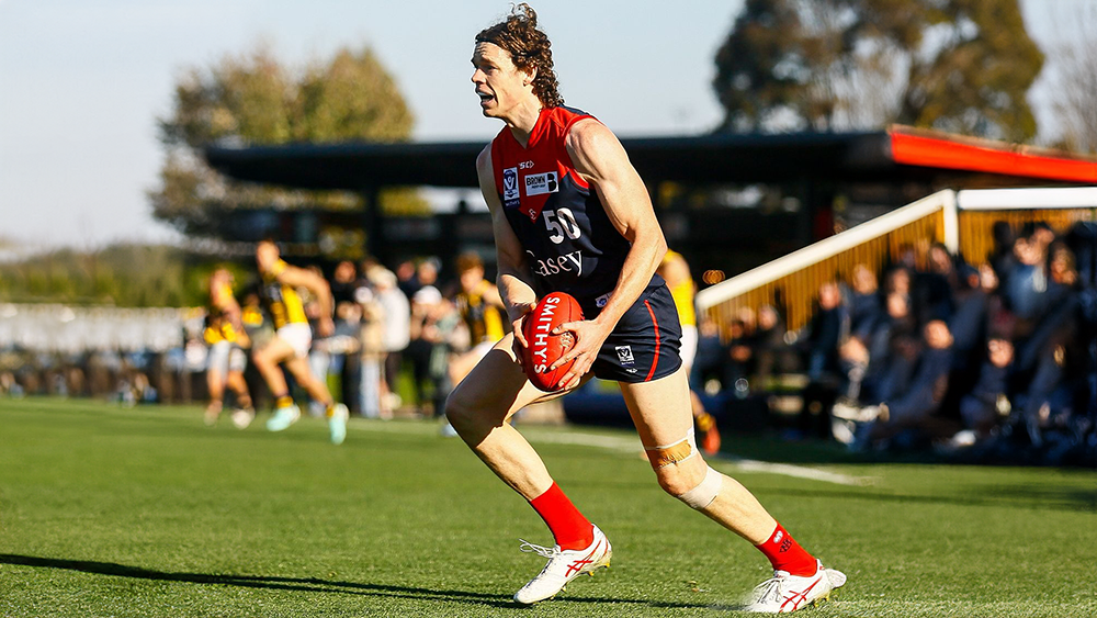
GALLANT by KC from Casey
The world “gallant” is not one that is readily acceptable to losing teams in our game of football so when it was used in the context of the Casey Demons’ loss to Sandringham in yesterday’s match at Casey Fields, it left a bitter taste in the mouth. The Demons went into the game against the St Kilda affiliated Zebras with the advantage of playing on their home turf (not that this has been a major asset in 2024) and with very little else going in their favour. The Saints have close to a full
MEANWHILE by Whispering Jack
… meanwhile, at about the same time that Narrm was putting its feet on the accelerator to obliterate the long-suffering Euro-Yroke combination, I heard someone mention in passing that Kuwarna was leading Waalitj Marawar by a whopping 46 to 1 halfway through the second quarter of their game over in Adelaide. “What is football coming to?” I asked myself. In front of my eyes, the Demons were smashing it through the midfield, forcing turnovers and getting the footy to their forwards who w
PREGAME: Rd 12 vs Fremantle
The Demons head back on the road for the fourth time this season as the travel to Alice Springs to take on the Fremantle Dockers at Treager Park on Sunday afternoon. Who comes in and who goes out?
PODCAST: Rd 11 vs St. Kilda
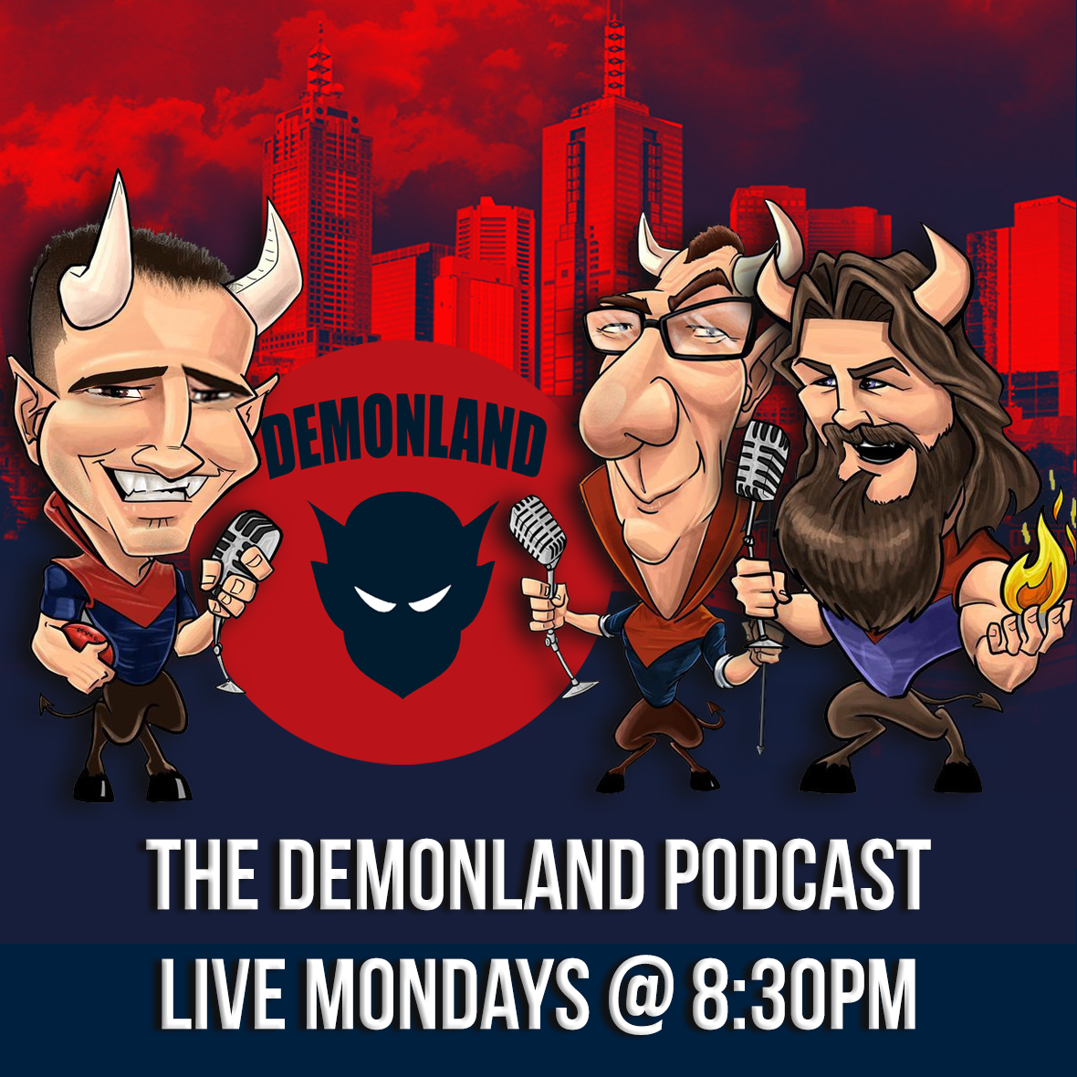
The Demonland Podcast will air LIVE on Monday, 27th May @ 8:30pm. Join George, Binman & I as we analyse the Demons victory at the MCG over the Saints in the Round 11. You questions and comments are a huge part of our podcast so please post anything you want to ask or say below and we'll give you a shout out on the show. If you would like to leave us a voicemail please call 03 9016 3666 and don't worry no body answers so you don't have to talk to a human. Listen & Chat LIVE
VOTES: Rd 11 vs St. Kilda
Captain Max Gawn has a considerable lead over reigning champion Christian Petracca in the Demonland Player of the Year Award. Steven May, Alex Neal-Bullen & Jake Lever make up the Top 5. Your votes for the win against the Saints. 6, 5, 4, 3, 2, 1.
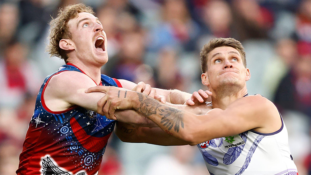
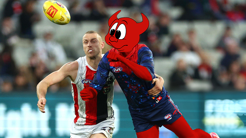
POSTGAME: Rd 11 vs St. Kilda
After a very wasteful first half of footy the Demons ended up cruising to a clinical victory over the Saints by 38 points at the MCG and ultimately reclaimed a coveted spot in the Top 4.
GAMEDAY: Rd 11 vs St. Kilda
It's Game Day and after 2 losses on the trot the Dees must win against the Saints today at the MCG to keep in touch with the Top 4. A loss today will see them drop out of the Top 8 for the first time since 2020.
-
Tell a friend
-
Podcast

-
-
Podcast


-
Podcast Stream
Open Stream in
New Window

-
-
Support Demonland


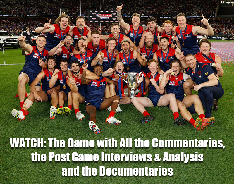
 2021 Premiership
 Social Media


 Non MFC Games
NON-MFC: Round 12
Discussion of all the other games that don't involve the Demons in Round 12 ...
READ MORE
Demonland | Round 12 
2024 Midseason Draft 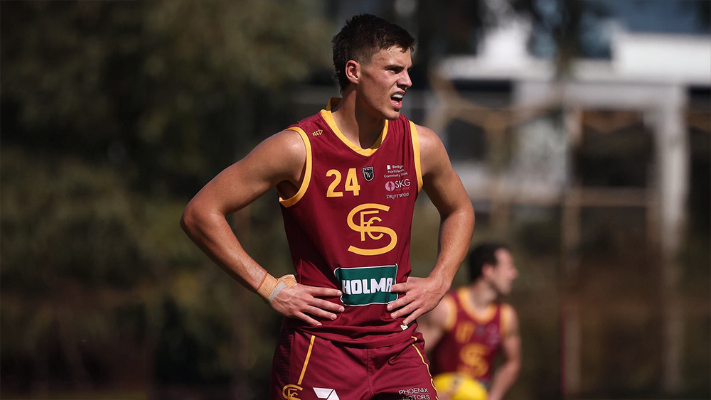
Welcome to Demonland: Luker Kentfield
With the Melbourne Football Club's first pick in the 2024 AFL Midseason Draft and pick number 11 overall the Demon's selected key forward Luker Kentfield from Subiaco ...
READ MOREDemonland | May 29 
PreGame 

PREGAME: Rd 12 vs Fremantle
The Demons head back on the road to Alice Springs to take on the Fremantle Dockers at Treager Park on Sunday. Who comes in and who goes out? ...
READ MOREDemonland | May 28 
Training 

Tuesday, 28th May 2024
Veteran Demonland Trackwatcher Kev Martin returned to the training track to bring you the following observations from Gosch's Paddock this morning ...
READ MOREDemonland | May 28 
Latest Podcast 
PODCAST: Rd 11 vs St. Kilda
The boys dissected the clinical victory over the Saints lauding the Masterclass of Max Gawn & praising our defence ...
LISTENDemonland | May 28 
Casey Report 

GALLANT by KC from Casey
The world “gallant” is not one that is readily acceptable to losing teams in our game of football so when it was used in the context of the Casey Demons’ loss to Sandringham in yesterday’s match at Casey Fields, it left a bitter taste in the mouth ...
READ MOREDemonland | May 28 
Match Report 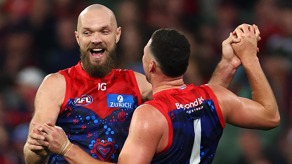
MEANWHILE by Whispering Jack
... meanwhile, at about the same time that Narrm was putting its feet on the accelerator to obliterate the long-suffering Euro-Yroke combination, I heard someone mention in passing that Kuwarna was leading Waalitj Marawar by a whopping 46 to 1 halfway through the second quarter of their game over in Adelaide ...
READ MOREDemonland | May 27 
Post Game 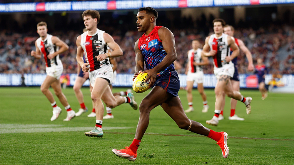
POSTGAME: Rd 11 vs St. Kilda
After a wasteful first half the Demons cruised to a clinical victory over the Saints by 38 points at the MCG and reclaimed a coveted spot in the Top 4 ...
READ MOREDemonland | May 26 
Votes 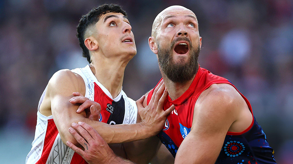
VOTES: Rd 11 vs St. Kilda
Captain Max Gawn has a considerable lead over reigning champion Christian Petracca in the Demonland Player of the Year Award. Steven May, Alex Neal-Bullen & Jake Lever make up the Top 5. Your votes for the win against the Saints. 6, 5, 4, 3, 2, 1 ...
READ MOREDemonland | May 26 
Game Day 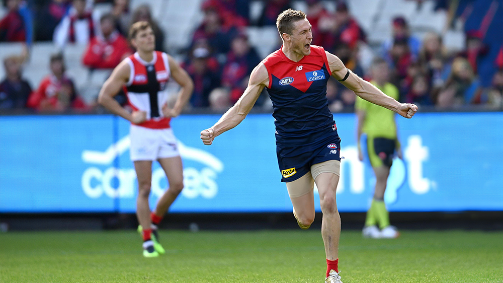
GAMEDAY: Rd 11 vs St. Kilda
It's Game Day and after 2 losses on the trot the Dees must win against the Saints today at the MCG to keep in touch with the Top 4. A loss today will see them drop out of the Top 8 for the first time since 2020 ...
READ MOREDemonland | May 26 
Match Preview 
HEAVEN OR HELL by The Oracle
Clashes between Melbourne and St Kilda are often described as battles between the forces of heaven and hell. However, based on recent performances, it’s hard to get excited about the forthcoming match between these two sides ...
READ MOREDemonland | May 23 
Player Interview 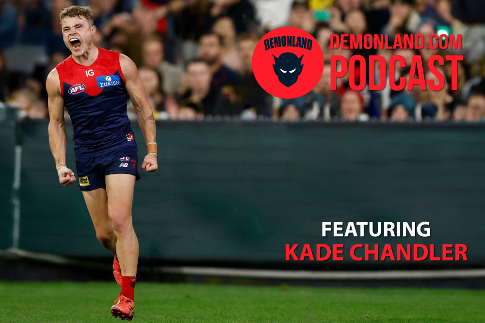
PODCAST: Kade Chandler Interview
I interview Kade Chandler about his road from being overlooked in the draft to his rookie listing to his apprenticeship as a sub to VFL premiership player to his breakout 2023 season to mainstay in the Forward line and much more ...
LISTENDemonland | May 01
Next Match . Round 12
vs
Sunday 2nd June 2024
@ 01:00pm (TP)
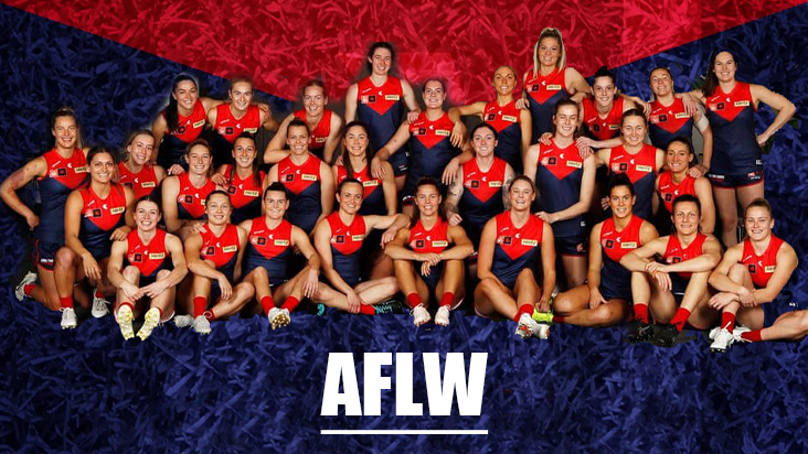
MFC Forum Match Previews & Reports Training Forum AFLW Forum 2024 Player Sponsorship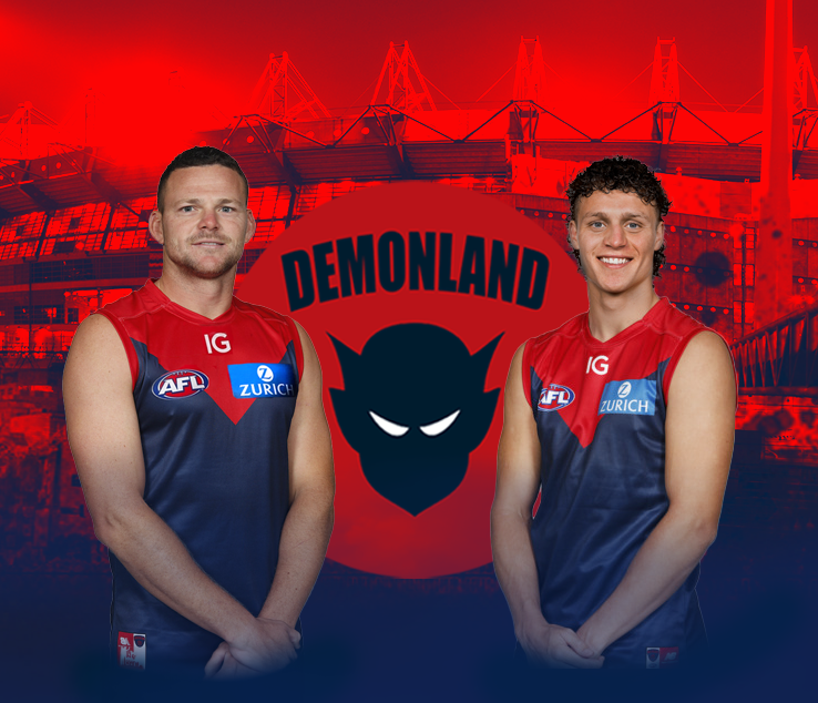 TopicsInjury List
PLAYER INJURY LENGTH 
Tom Fullarton Hamstring Test 
Harrison Petty Ankle Test 
Daniel Turner Calf Test 
Marty Hore Calf 2-3 Weeks 
Josh Schache Foot 2-3 Weeks 
Jake Lever Knee 3-4 Weeks 
Jake Melksham ACL 3-5 Weeks 
Charlie Spargo Achilles TBC 
Joel Smith Suspension TBA Player of the Year
PLAYER VOTES 1 
Max Gawn 129 2 
Christian Petracca 84 3 
Steven May 70 4 
Alex Neal-Bullen 59 5 
Jack Viney 43 6 Jake Lever 40 7 
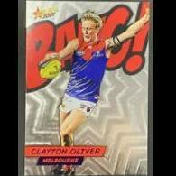
Clayton Oliver 34 8 
Bayley Fritsch 31 9 
Kysaiah Pickett 26 10 
Christian Salem 24
FULL TABLEDemonland Interviews


 Upcoming Events


Recommended Posts
Join the conversation
You can post now and register later. If you have an account, sign in now to post with your account.