
-
-
 Recently Browsing
0 members
Recently Browsing
0 members
- No registered users viewing this page.
-
Demonland Forums


-
-
Match Previews, Reports & Articles

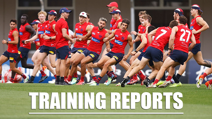
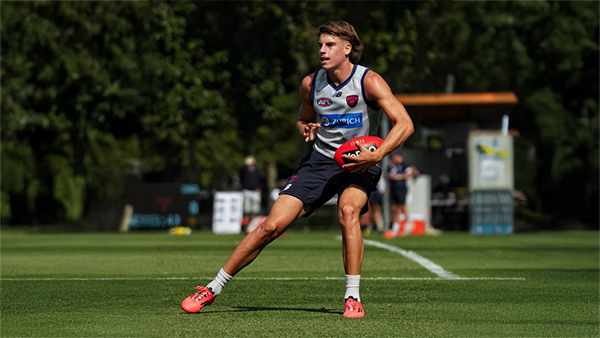
TRAINING: Wednesday 29th January 2025
A number of Demonland Trackwatchers swooped on Gosch's Paddock to bring you their observations from this morning's Preseason Training Session. DEMON JACK'S PRESEASON TRAINING OBSERVATIONS Beautiful morning at Gosch's Paddock. Very healthy crowd so far. REHAB: Fullerton, Spargo, Tholstrup, McVee Viney running laps. EDIT: JV looks to be back with the main group. Trac, Sparrow, Chandler and Verrell also training away from the main group. Currently kicking to each other ins

TRAINING: Wednesday 22nd January 2025
Demonland Trackwatchers were out in force for training at Gosch's Paddock on Wednesday morning for the MFC's School Holidays Open Training Session. DEMONLAND'S PRESEASON TRAINING OBSERVATIONS REHAB: TMac, Chandler, McVee, Tholstrup, Brown, Spargo Brown might have passed his fitness test as he’s back out with the main group. Sparrow not present. Kozzy not present either. Mini Rehab group has broken off from the match sim (contact) group: Max, Trac, Lever, Fullarton
TRAINING: Monday 20th January 2025
Demonland Trackwatcher Gator attended training out at Casey Fields to bring you the following observations from Preseason Training. GATOR'S PRESEASON TRAINING OBSERVATIONS There were 5 in the main rehab group, namely Gawn, Petracca, Fullarton, Woewodin and Lever. Laurie was running laps by himself, as was Jefferson. Chandler, as has been reported, had his arm in a sling. Lindsay did a bit of lap running later on. Some of the ''rehab 5'' participated in non contact drills and b
TRAINING: Wednesday 15th January 2025
There were a number of Demonland Trackwatchers at Gosch's Paddock this morning to bring you their observations from Preseason Training. KEV MARTIN'S PRESEASON TRAINING OBSERVATIONS They were going hard at each other. The sims were in two 15 minute blocks. The second block finished a few minutes early, they gathered and had another 7 minutes at it. I think they were asked to compete, as they would play against an opposition. There was plenty of niggle, between some of them. At the end o
TRAINING: Monday 13th January 2025
Better late than never … and quite frankly, there’s very little to report other than that training took place at Casey Fields this morning, that Tracc was there nursing his rib injury and that some photographs are on the club’s social media including this one of Clarrie in Raging Bull stance that gives rise for confidence. The other news is that the club has a new train on player in 185cm Dandenong Stingrays midfielder Noah Hibbins-Hargreaves (love the hyphenated name which is just so fitti
TRAINING: Thursday 9th January 2025
Welcome back to Demonland for those like me who have been on vacation. I’m posting this with some trepidation because of a certain amount of uncertainty surrounding the return of preseason training in 2025 after a flurry of weddings including those of our coach, one of our superstar players and a former premiership champion player and bloke, not to mention the recent mysterious incident that occurred on the Mornington Peninsula. I believe that the team reassembles this morning at Casey Fie
TRAINING: Wednesday 18th December 2024
It was the final session of 2024 before the Christmas/New Years break and the Demonland Trackwatchers were out in force to bring you the following preseason training observations from Wednesday's session at Gosch's Paddock. DEMONLAND'S PRESEASON TRAINING OBSERVATIONS TRAINING: Petracca, Oliver, Melksham, Woewodin, Langdon, Rivers, Billings, Sestan, Viney, Fullarton, Adams, Langford, Lever, Petty, Spargo, Fritsch, Bowey, Laurie, Kozzy, Mentha, George, May, Gawn, Turner Tholstrup, Kentfi
TRAINING: Monday 16th December 2024
Demonland Trackwatchers braved the sweltering heat to bring you their Preseason Training observations from Gosch's Paddock on Monday morning. SCOOP JUNIOR'S PRESEASON TRAINING OBSERVATIONS I went down today in what were pretty ordinary conditions - hot and windy. When I got there, they were doing repeat simulations of a stoppage on the wing and then moving the ball inside 50. There seemed to be an emphasis on handballing out of the stoppage, usually there were 3 or 4 handballs to
TRAINING: Friday 13th December 2024
With only a few sessions left before the Christmas break a number of Demonlander Trackwatchers headed down to Gosch's Paddock to bring you their observations from this morning's preseason training session. DEMONLAND'S PRESEASON TRAINING OBSERVATIONS PLAYERS IN ATTENDANCE: JVR, Salem, McVee, Petracca, Windsor, Viney, Lever, Spargo, Turner, Gawn, Tholstrup, Oliver, Billings, Langdon, Laurie, Bowey, Melksham, Langford, Lindsay, Jefferson, Howes, McAdam, Rivers, TMac, Adams, Hore, Verrall,
-
Tell a friend
-
Podcast

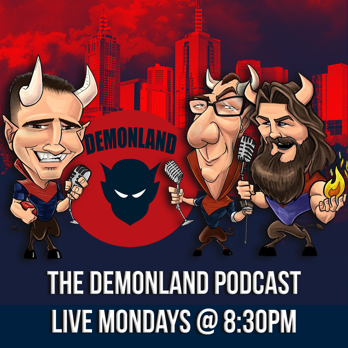
-
-
Podcast


-
Podcast Stream
Open Stream in
New Window

-
-
Support Demonland


 2021 Premiership
 Social Media


 Trade & Draft Forum
  Preseason Training
Wednesday, 29th January 2025
A number of Demonland Trackwatchers swooped on Gosch's Paddock to bring you their observations from this morning's Preseason Training Session ...
READ MORE
Demonland | January 29 
Preseason Training 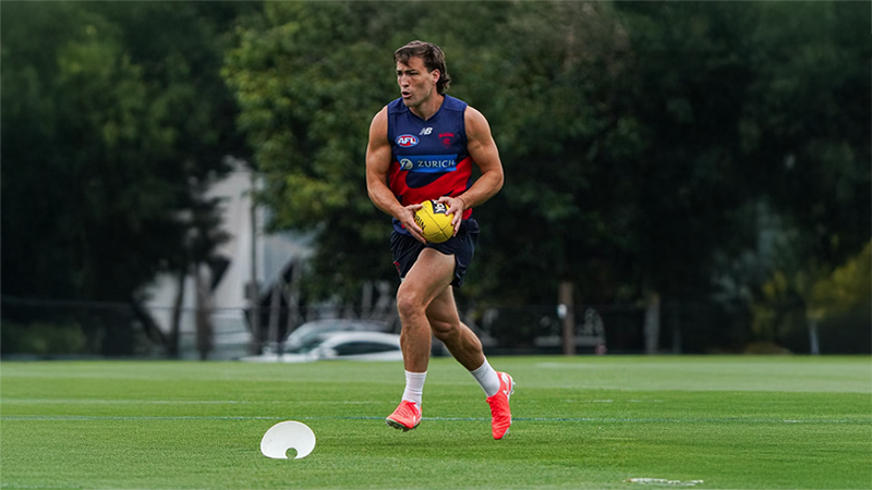
Wednesday, 22nd January 2025
Demonland Trackwatchers were out in force for training at Gosch's Paddock on Wednesday morning for the MFC's School Holidays Open Training Session ...
READ MOREDemonland | January 22
Preseason Training 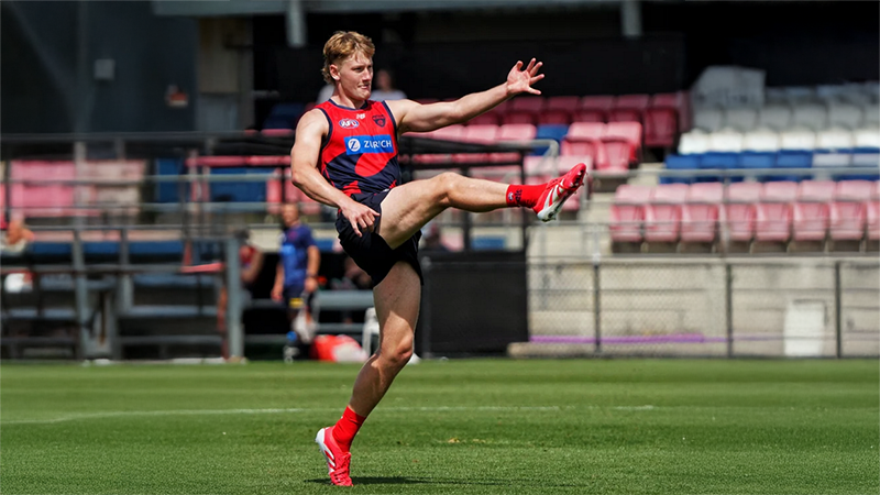
Monday, 20th January 2025
Demonland Trackwatcher Gator attended training out at Casey Fields to bring you the following observations from Preseason Training ...
READ MOREDemonland | January 20
Preseason Training 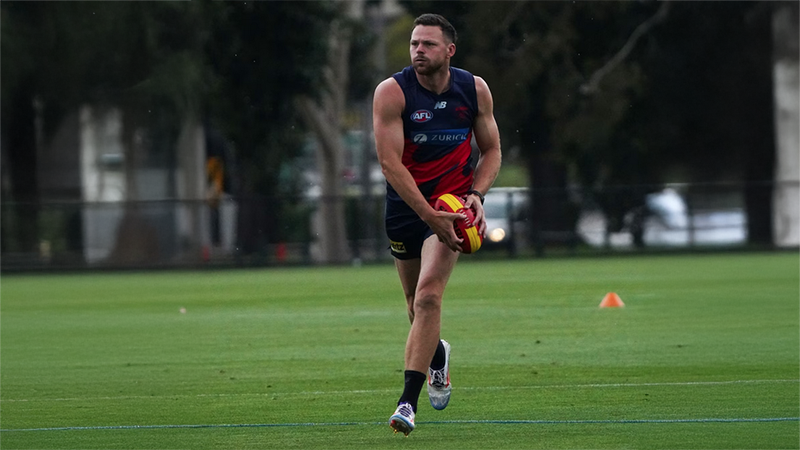
Wednesday, 15th January 2025
There were a number of Demonland Trackwatchers at Gosch's Paddock this morning to bring you their observations from Preseason Training ...
READ MOREDemonland | January 15
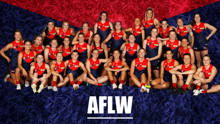
AFLW Season Review 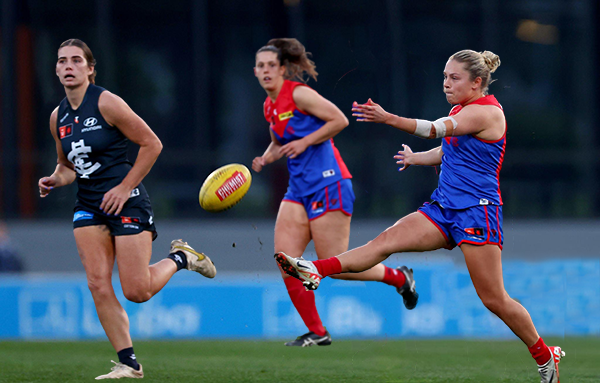
BEST OF THE REST by Meggs
The 2024 AFLW season was a challenging year marked by injuries, tough fixtures, and emerging young talent, with hopes for a brighter 2025 ...
READ MOREDemonland | December 04 
2024 AFL Draft 
UP IN LIGHTS by Whispering Jack
Those who watched the 2024 Marsh AFL National Championships closely this year would not be particularly surprised that Melbourne selected Victoria Country pair Harvey Langford and Xavier Lindsay on the first night of the AFL National Draft ...
READ MOREDemonland | November 21 
2024 AFL Draft 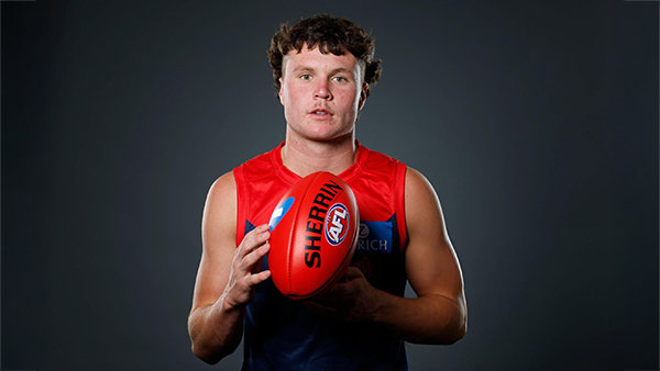
Welcome to Demonland: Harvey Langford
With the Demons first selection in the 2024 AFL Draft they took ready made midfielder Harvey Langdord from the Dandenong Stingrays at Pick 6 ...
READ MOREDemonland | November 21
2024 AFL Draft 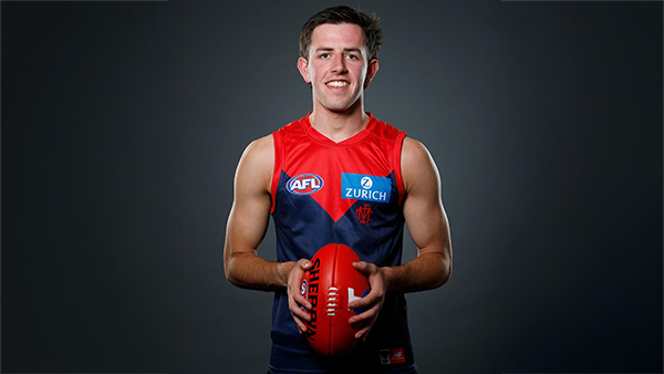
Welcome to Demonland: Xavier Lindsay
With their second selection in the 2024 AFL Draft the Demons selected Gippsland Power midfielder Xavier Lindsay at Pick 11 ...
READ MOREDemonland | November 21
MFC Forum Match Previews & Reports Training Forum AFLW Forum 2024 Player Sponsorship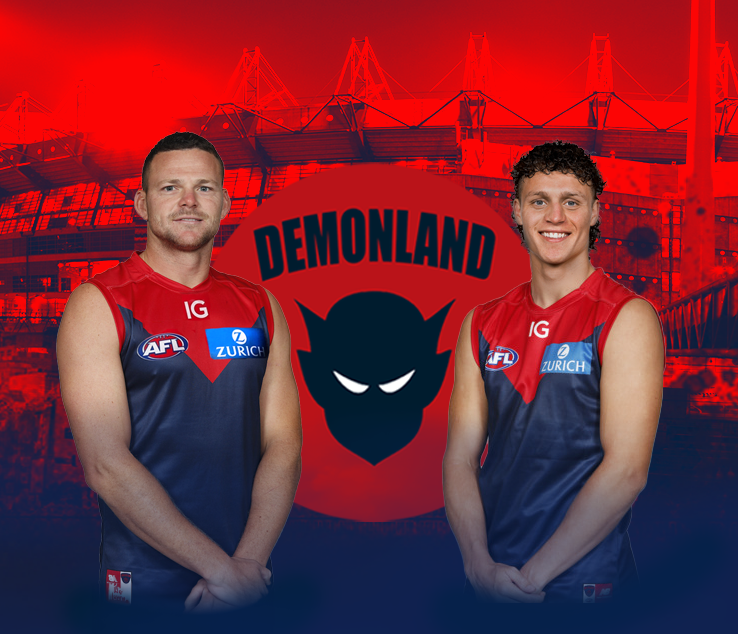 TopicsPlayer of the Year
PLAYER VOTES 1 
Max Gawn 220 2 
Jack Viney 123 3 
Trent Rivers 112 4 
Steven May 104 5 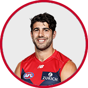
Christian Petracca 97 6 
Alex Neal-Bullen 93 7 
Kysaiah Pickett 81 8 
Ed Langdon 79 9 
Clayton Oliver 65 10 
Christian Salem 60
FULL TABLEDemonland Interviews


 Upcoming Events


Recommended Posts
Join the conversation
You can post now and register later. If you have an account, sign in now to post with your account.