


Poll: The Zurich Logo

The Zurich Logo 99 members have voted
Featured Replies
Featured Content
-
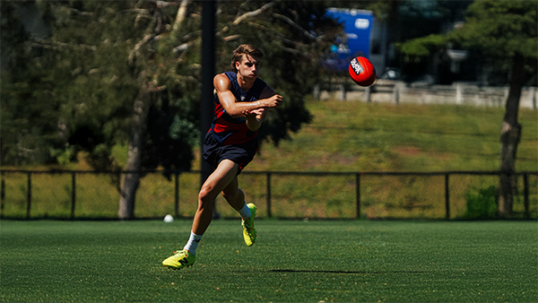
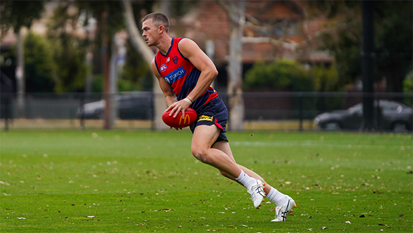
TRAINING: Wednesday 28th January 2026
A plethora of Demonland Trackwatchers were once again out in force to bring you their preseason training observations from Wednesday morning's open session at Gosch's Paddock.-
-
- 2 replies
-
-
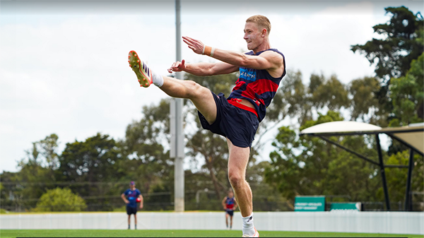
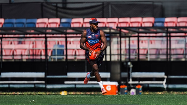
MATCH SIM: Friday 23rd January 2026
A couple of Demonland Trackwatchers managed to get ringside seats for Friday's Match SIM out at Casey Fields to bring you their observations of the intra-club contest.-
-
- 3 replies
-
-
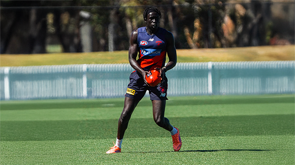
TRAINING: Wednesday 21st January 2026
Demonland Trackwatchers were out in force at Wednesday morning's open training session at Gosch's Paddock to bring you their observations of preseason training.-
-
- 3 replies
-
-
TRAINING: Friday 16th January 2026
Demonland Trackwatcher Pickett Fence made the trek out to Casey Fields to watch the session from behind the locked fence to bring you his observations from preseason training.-
-
- 0 replies
-
-
TRAINING: Wednesday 14th January 2026
A legion of Demonland Trackwatchers descended upon Gosch's Paddock for the first open session at the venue this year to bring you their observations from preseason training.-
-
- 0 replies
-
-
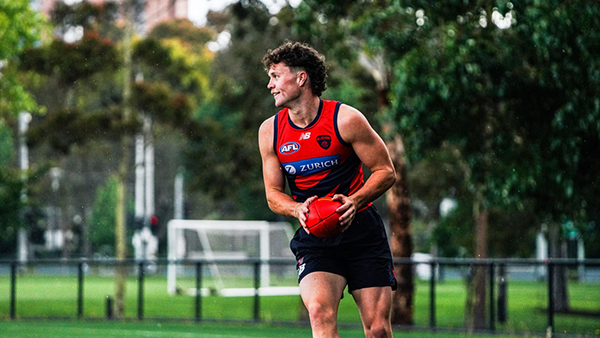
TRAINING: Monday 12th January 2026
Demonland Trackwatcher RedLeg23 ventured out to Casey for one of the first sessions of 2026 to bring you his Preseason Training observations.-
-
- 0 replies
-


|

|

|

|
 |
 |
 |
 |
 |
 |
 |
 |
Join the conversation
You can post now and register later. If you have an account, sign in now to post with your account.