-
-
 Recently Browsing
0 members
Recently Browsing
0 members
- No registered users viewing this page.
-
Demonland Forums


-
-
Match Previews, Reports & Articles

TRAINING: Friday 22nd November 2024
Demonland Trackwatchers were out in force on a scorching morning out at Gosch's Paddock for the final session before the whole squad reunites for the Preseason Training Camp. DEMONLAND'S PRESEASON TRAINING OBSERVATIONS It’s going to be a scorcher today but I’m in the shade at Gosch’s Paddock ready to bring you some observations from the final session before the Preseason Training Camp next week. Salem, Fritsch & Campbell are already on the track. Still no number on Campbell’s

UP IN LIGHTS by Whispering Jack
Those who watched the 2024 Marsh AFL National Championships closely this year would not be particularly surprised that Melbourne selected Victoria Country pair Harvey Langford and Xavier Lindsay on the first night of the AFL National Draft. The two left-footed midfielders are as different as chalk and cheese but they had similar impacts in their Coates Talent League teams and in the National Championships in 2024. Their interstate side was edged out at the very end of the tournament for tea
TRAINING: Wednesday 20th November 2024
It’s a beautiful cool morning down at Gosch’s Paddock and I’ve arrived early to bring you my observations from today’s session. DEMONLAND'S PRESEASON TRAINING OBSERVATIONS Reigning Keith Bluey Truscott champion Jack Viney is the first one out on the track. Jack’s wearing the red version of the new training guernsey which is the only version available for sale at the Demon Shop. TRAINING: Viney, Clarry, Lever, TMac, Rivers, Petty, McVee, Bowey, JVR, Hore, Tom Campbell (in tr
TRAINING: Monday 18th November 2024
Demonland Trackwatchers ventured down to Gosch's Paddock for the final week of training for the 1st to 4th Years until they are joined by the rest of the senior squad for Preseason Training Camp in Mansfield next week. WAYNE RUSSELL'S PRESEASON TRAINING OBSERVATIONS No Ollie, Chin, Riv today, but Rick & Spargs turned up and McDonald was there in casual attire. Seston, and Howes did a lot of boundary running, and Tom Campbell continued his work with individual trainer in non-MFC
2024 Player Reviews: #11 Max Gawn
Champion ruckman and brilliant leader, Max Gawn earned his seventh All-Australian team blazer and constantly held the team up on his shoulders in what was truly a difficult season for the Demons. Date of Birth: 30 December 1991 Height: 209cm Games MFC 2024: 21 Career Total: 224 Goals MFC 2024: 11 Career Total: 109 Brownlow Medal Votes: 13 Melbourne Football Club: 2nd Best & Fairest: 405 votes
2024 Player Reviews: #36 Kysaiah Pickett
The Demons’ aggressive small forward who kicks goals and defends the Demons’ ball in the forward arc. When he’s on song, he’s unstoppable but he did blot his copybook with a three week suspension in the final round. Date of Birth: 2 June 2001 Height: 171cm Games MFC 2024: 21 Career Total: 106 Goals MFC 2024: 36 Career Total: 161 Brownlow Medal Votes: 3 Melbourne Football Club: 4th Best & Fairest: 369 votes
TRAINING: Friday 15th November 2024
Demonland Trackwatchers took advantage of the beautiful sunshine to head down to Gosch's Paddock and witness the return of Clayton Oliver to club for his first session in the lead up to the 2025 season. DEMONLAND'S PRESEASON TRAINING OBSERVATIONS Clarry in the house!! Training: JVR, McVee, Windsor, Tholstrup, Woey, Brown, Petty, Adams, Chandler, Turner, Bowey, Seston, Kentfield, Laurie, Sparrow, Viney, Rivers, Jefferson, Hore, Howes, Verrall, AMW, Clarry Tom Campbell is here
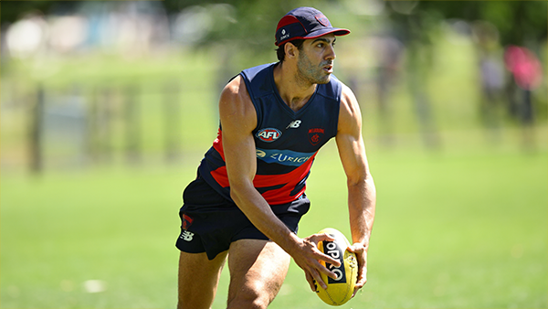
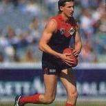
2024 Player Reviews: #7 Jack Viney
The tough on baller won his second Keith 'Bluey' Truscott Trophy in a narrow battle with skipper Max Gawn and Alex Neal-Bullen and battled on manfully in the face of a number of injury niggles. Date of Birth: 13 April 1994 Height: 178cm Games MFC 2024: 23 Career Total: 219 Goals MFC 2024: 10 Career Total: 66 Brownlow Medal Votes: 8
TRAINING: Wednesday 13th November 2024
A couple of Demonland Trackwatchers braved the rain and headed down to Gosch's paddock to bring you their observations from the second day of Preseason training for the 1st to 4th Year players. DITCHA'S PRESEASON TRAINING OBSERVATIONS I attended some of the training today. Richo spoke to me and said not to believe what is in the media, as we will good this year. Jefferson and Kentfield looked big and strong. Petty was doing all the training. Adams looked like he was in rehab. KE
-
Tell a friend
-
Podcast

-
-
Podcast


-
Podcast Stream
Open Stream in
New Window

-
-
Support Demonland


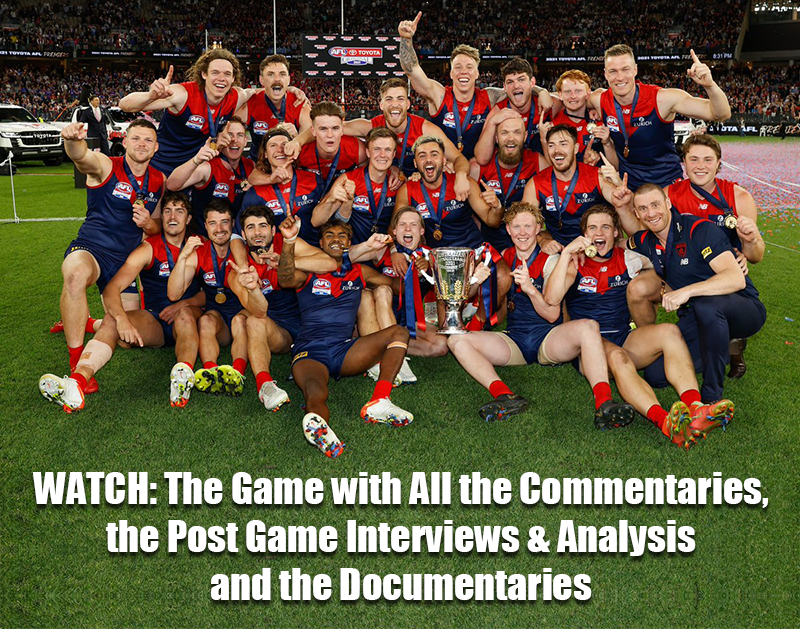
 2021 Premiership
 Social Media


 Trade & Draft Forum Preseason Training
Friday, 22nd November 2024
Demonland Trackwatchers were out in force on a scorching morning out at Gosch's Paddock for the final session before the whole squad reunites for the Preseason Training Camp ...
READ MORE
Demonland | November 22 
2024 AFL Draft 
UP IN LIGHTS by Whispering Jack
Those who watched the 2024 Marsh AFL National Championships closely this year would not be particularly surprised that Melbourne selected Victoria Country pair Harvey Langford and Xavier Lindsay on the first night of the AFL National Draft ...
READ MOREDemonland | November 21 
2024 AFL Draft 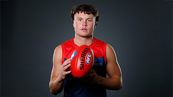
Welcome to Demonland: Harvey Langford
With the Demons first selection in the 2024 AFL Draft they took ready made midfielder Harvey Langdord from the Dandenong Stingrays at Pick 6 ...
READ MOREDemonland | November 21
2024 AFL Draft 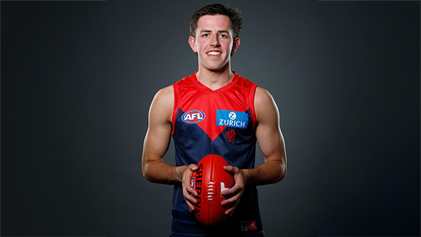
Welcome to Demonland: Xavier Lindsay
With their second selection in the 2024 AFL Draft the Demons selected Gippsland Power midfielder Xavier Lindsay at Pick 11 ...
READ MOREDemonland | November 21
Preseason Training 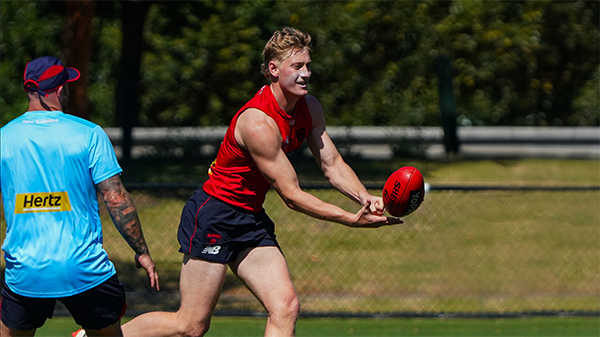
Wednesday, 20th November 2024
A plethora of Demonland Trackwatchers arrived on a beautiful cool morning down at Gosch’s Paddock to bring you their observations from today’s session ...
READ MOREDemonland | November 20
Preseason Training 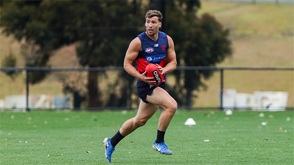
Monday, 18th November 2024
Demonland Trackwatchers ventured down to Gosch's Paddock for the final week of training for the 1st to 4th Years until they are joined by the rest of the senior squad for Preseason Training Camp in Mansfield next week ...
READ MOREDemonland | November 18
Player Reviews 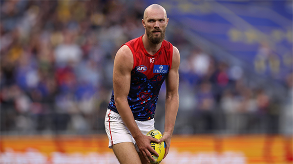
2024 PLAYER REVIEW: Max Gawn
Champion ruckman and brilliant leader, Max Gawn earned his seventh All-Australian team blazer and constantly held the team up on his shoulders in what was truly a difficult season for the Demons ...
READ MOREDemonland | November 18 
Preseason Training 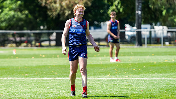
Friday, 15th November 2024
Demonland Trackwatchers took advantage of the beautiful sunshine to head down to Gosch's Paddock and witness the return of Clayton Oliver to club for his first session in the lead up to the 2025 season ...
READ MOREDemonland | November 15
Player Reviews 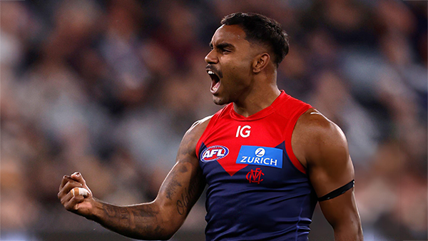
2024 PLAYER REVIEW: Kysaiah Pickett
The Demons’ aggressive small forward who kicks goals and defends the Demons’ ball in the forward arc ...
READ MOREDemonland | November 15
Player Reviews 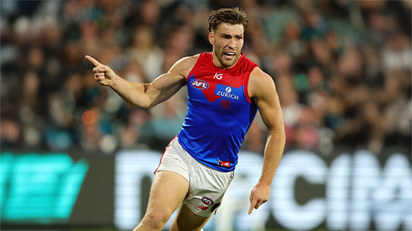
2024 PLAYER REVIEW: Jack Viney
The tough on baller won his second Keith 'Bluey' Truscott Trophy in a narrow battle with skipper Max Gawn and Alex Neal-Bullen and battled on manfully in the face of a number of injury niggles ...
READ MOREDemonland | November 14
Player Reviews 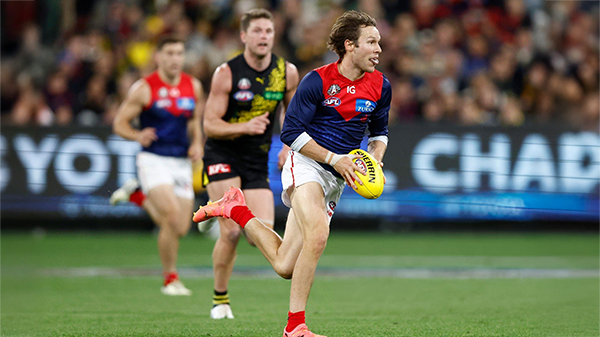
2024 PLAYER REVIEW: Ed Langdon
The Demon running machine came back with a vengeance after a leaner than usual year in 2023...
READ MOREDemonland | November 13
Player Reviews 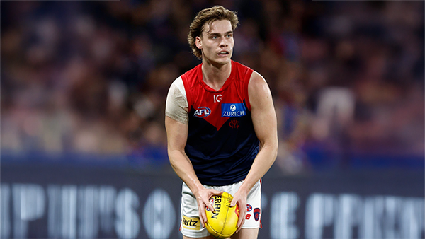
2024 PLAYER REVIEW: Trent Rivers
The premiership defender had his best year yet as he was given the opportunity to move into the midfield and made a good fist of it ...
READ MOREDemonland | November 13
Trade Week 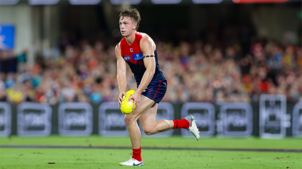
THE TRADING CHRONICLES Part 03 by Whispering Jack
It would be fair to say that when the Melbourne Football Club entered the free agency and trade period earlier this month, its reputation was flagging, if not in tatters ...
READ MOREDemonland | October 19
Trade Week 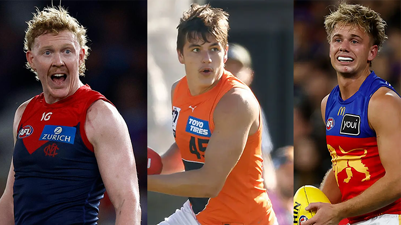
THE TRADING CHRONICLES Part 02 by Whispering Jack
Some critics find Test cricket boring, but the first week of the AFL trade period is even more tedious, often putting football fans to sleep. The past week has been no exception ...
READ MOREDemonland | October 12
Trade Week 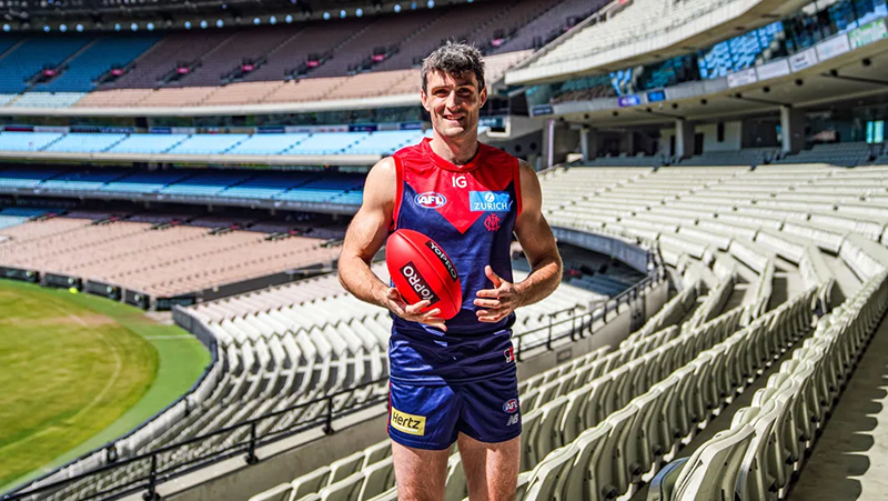
THE TRADING CHRONICLES Part One by Whispering Jack
The festival of player movement kicked off yesterday with the opening day of the Free Agency Period which resulted in six players changing clubs including journeyman ruckman Tom Campbell who landed at Melbourne, his fourth club after playing only 58 AFL games in 14 seasons ...
READ MOREDemonland | October 05
MFC Forum Match Previews & Reports Training Forum AFLW Forum 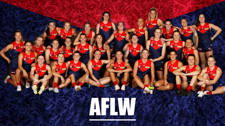 2024 Player Sponsorship
 TopicsPlayer of the Year
PLAYER VOTES 1 
Max Gawn 220 2 
Jack Viney 123 3 
Trent Rivers 112 4 
Steven May 104 5 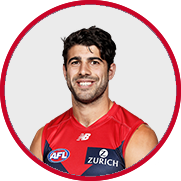
Christian Petracca 97 6 
Alex Neal-Bullen 93 7 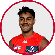
Kysaiah Pickett 81 8 
Ed Langdon 79 9 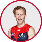
Clayton Oliver 65 10 
Christian Salem 60
FULL TABLEDemonland Interviews


 Upcoming Events


Recommended Posts
Join the conversation
You can post now and register later. If you have an account, sign in now to post with your account.