
-
-
 Recently Browsing
0 members
Recently Browsing
0 members
- No registered users viewing this page.
-
Demonland Forums

-
-
Match Previews, Reports & Articles

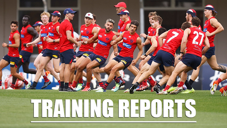
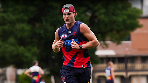
TRAINING: Wednesday 18th December 2024
It was the final session of 2024 before the Christmas/New Years break and the Demonland Trackwatchers were out in force to bring you the following preseason training observations from Wednesday's session at Gosch's Paddock. DEMONLAND'S PRESEASON TRAINING OBSERVATIONS TRAINING: Petracca, Oliver, Melksham, Woewodin, Langdon, Rivers, Billings, Sestan, Viney, Fullarton, Adams, Langford, Lever, Petty, Spargo, Fritsch, Bowey, Laurie, Kozzy, Mentha, George, May, Gawn, Turner Tholstrup, Kentfi

TRAINING: Monday 16th December 2024
Demonland Trackwatchers braved the sweltering heat to bring you their Preseason Training observations from Gosch's Paddock on Monday morning. SCOOP JUNIOR'S PRESEASON TRAINING OBSERVATIONS I went down today in what were pretty ordinary conditions - hot and windy. When I got there, they were doing repeat simulations of a stoppage on the wing and then moving the ball inside 50. There seemed to be an emphasis on handballing out of the stoppage, usually there were 3 or 4 handballs to
TRAINING: Friday 13th December 2024
With only a few sessions left before the Christmas break a number of Demonlander Trackwatchers headed down to Gosch's Paddock to bring you their observations from this morning's preseason training session. DEMONLAND'S PRESEASON TRAINING OBSERVATIONS PLAYERS IN ATTENDANCE: JVR, Salem, McVee, Petracca, Windsor, Viney, Lever, Spargo, Turner, Gawn, Tholstrup, Oliver, Billings, Langdon, Laurie, Bowey, Melksham, Langford, Lindsay, Jefferson, Howes, McAdam, Rivers, TMac, Adams, Hore, Verrall,
TRAINING: Wednesday 11th December 2024
A few new faces joined our veteran Demonland Trackwatchers on a beautiful morning out at Gosch's Paddock for another Preseason Training Session. BLWNBA'S PRESEASON TRAINING OBSERVATIONS I arrived at around 1015 and the squad was already out on the track. The rehab group consisted of XL, McAdam, Melksham, Spargo and Sestan. Lever was also on restricted duties and appeared to be in runners. The main group was doing end-to-end transition work in a simulated match situation. Ball mov
TRAINING: Monday 9th December 2024
Once again Demonland Trackwatchers were in attendance at the first preseason training session for the week at Gosch's Paddock to bring you their observations. WAYNE WUSSELL'S PRESEASON TRAINING OBSERVATIONS Looks like very close to 100% attendance. Kelani is back. Same group in rehab. REHAB: Spargo, Lever, Lindsay, Brown & McAdam. Haven’t laid eyes on Fritsch or AMW yet. Fritsch sighted. One unknown mature standing with Goody. Noticing Nathan Bassett much m
TRAINING: Friday 6th December 2024
Some veteran Demonland Trackwatchers ventured down to Gosch's Paddock to bring you the following observations from another Preseason Training Session. WAYNE WUSSELL'S PRESEASON TRAINING OBSERVATIONS Rehab: Lever, Spargo, McAdam, Lindsay, Brown Sinnema is excellent by foot and has a decent vertical leap. Windsor is training with the Defenders. Windsor's run won't be lost playing off half back. In 19 games in 2024 he kicked 8 goals as a winger. I see him getting shots at g
TRAINING: Wednesday 4th December 2024
A couple of intrepid Demonland Trackwatchers headed down to Gosch's Paddock for the midweek Preseason Training Session to bring you the following observations. Demonland's own Whispering Jack was not in attendance but he kicked off proceedings with the following summary of all the Preseason Training action to date. We’re already a month into the MFC preseason (if you started counting when the younger players in the group began the campaign along with some of the more keen older heads)
BEST OF THE REST by Meggs
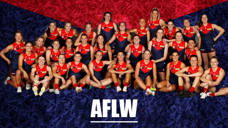
Meggs' Review of Melbourne's AFLW Season 9 ... Congratulations first off to the North Melbourne Kangaroos on winning the 2024 AFLW Premiership. Roos Coach Darren Crocker has assembled a team chock-full of competitive and highly skilful players who outclassed the Brisbane Lions in the Grand Final to remain undefeated throughout Season 9. A huge achievement in what was a dominant season by North. For Melbourne fans, the season was unfortunately one of frustration and disappointment
TRAINING: Monday 2nd December 2024
There were many Demonland Trackwatchers braving the morning heat at Gosch's Paddock today to witness the players go through the annual 2km time trials. DEMONLAND'S PRESEASON TRAINING OBSERVATIONS Max, TMac & Melksham the first ones out on the track. Runners are on. Guess they will be doing a lot of running. TRAINING: Max, TMac, Melksham, Woey, Rivers, AMW, May, Sharp, Kolt, Adams, Sparrow, Jefferson, Billings, Petty, chandler, Howes, Lever, Kozzy, Mentha, Fullarton, Sal
-
Tell a friend
-
Podcast

-
-
Podcast


-
Podcast Stream
Open Stream in
New Window

-
-
Support Demonland


 2021 Premiership
 Social Media


 Trade & Draft Forum
  Preseason Training
Wednesday, 18th December 2024
It was the final session of 2024 before the Christmas/New Years break and the Demonland Trackwatchers were out in force to bring you the following preseason training observations from Wednesday's session at Gosch's Paddock ...
READ MORE
Demonland | December 18 
Preseason Training 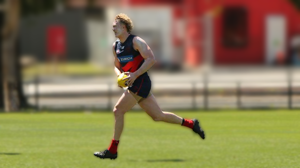
Monday, 16th December 2024
Demonland Trackwatchers braved the sweltering heat to bring you their Preseason Training observations from Gosch's Paddock on Monday morning ...
READ MOREDemonland | December 16
Preseason Training 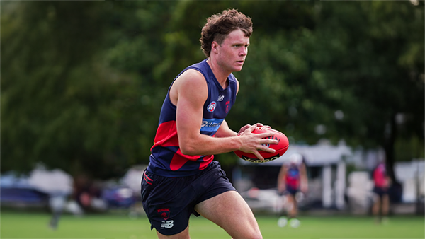
Friday, 13th December 2024
With only a few sessions left before the Christmas break a number of Demonlander Trackwatchers headed down to Gosch's Paddock to bring you their observations from this morning's preseason training session ...
READ MOREDemonland | December 13
Preseason Training 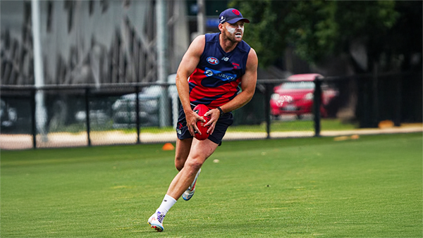
Wednesday, 11th December 2024
A few new faces joined our veteran Demonland Trackwatchers on a beautiful morning out at Gosch's Paddock for another Preseason Training Session ...
READ MOREDemonland | December 11
AFLW Season Review 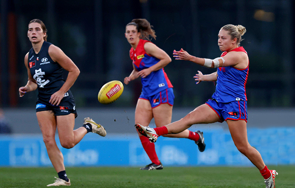
BEST OF THE REST by Meggs
The 2024 AFLW season was a challenging year marked by injuries, tough fixtures, and emerging young talent, with hopes for a brighter 2025 ...
READ MOREDemonland | December 04 
2024 AFL Draft 
UP IN LIGHTS by Whispering Jack
Those who watched the 2024 Marsh AFL National Championships closely this year would not be particularly surprised that Melbourne selected Victoria Country pair Harvey Langford and Xavier Lindsay on the first night of the AFL National Draft ...
READ MOREDemonland | November 21 
2024 AFL Draft 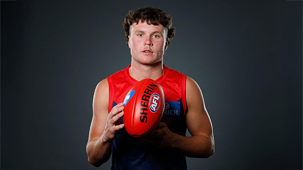
Welcome to Demonland: Harvey Langford
With the Demons first selection in the 2024 AFL Draft they took ready made midfielder Harvey Langdord from the Dandenong Stingrays at Pick 6 ...
READ MOREDemonland | November 21
2024 AFL Draft 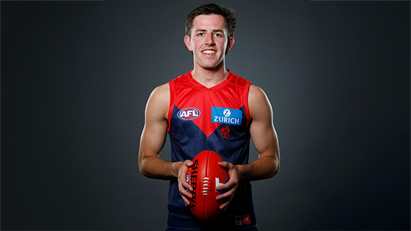
Welcome to Demonland: Xavier Lindsay
With their second selection in the 2024 AFL Draft the Demons selected Gippsland Power midfielder Xavier Lindsay at Pick 11 ...
READ MOREDemonland | November 21
MFC Forum Match Previews & Reports Training Forum AFLW Forum 2024 Player Sponsorship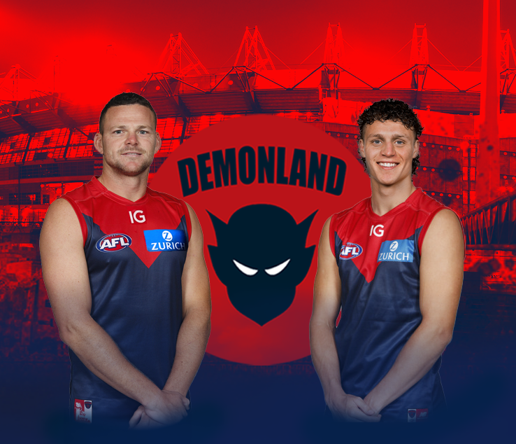 TopicsPlayer of the Year
PLAYER VOTES 1 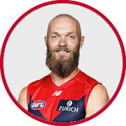
Max Gawn 220 2 
Jack Viney 123 3 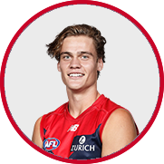
Trent Rivers 112 4 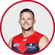
Steven May 104 5 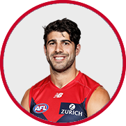
Christian Petracca 97 6 
Alex Neal-Bullen 93 7 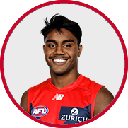
Kysaiah Pickett 81 8 
Ed Langdon 79 9 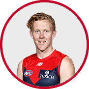
Clayton Oliver 65 10 
Christian Salem 60
FULL TABLEDemonland Interviews


 Upcoming Events


Recommended Posts
Join the conversation
You can post now and register later. If you have an account, sign in now to post with your account.