


2010 jumper

Featured Replies
Featured Content
-
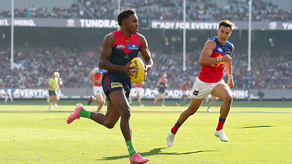
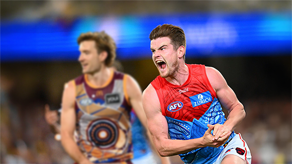
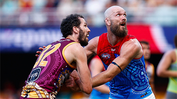
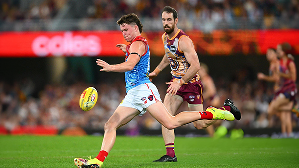
POSTGAME: Brisbane
MCG magic strikes again as the Demons unleash a devastating second-half surge to edge Brisbane in a thrilling two-point statement win. Never in doubt 🍀🔴🔵😈-
-
- 287 replies
-
-
PODCAST: Brisbane
Andy is still traveling but the boys will still be bringing you a podcast this week so get your questions and comments in for Binman and George as they dissect the thrilling win over the Lions at the G.-
-
- 9 replies
-
-
VOTES: Brisbane
Reigning Champion and Captain Max Gawn already has a healthly lead just 5 rounds in to the Demonland Player of the Year Award vote count. He leads from Kozzy Pickett, Jack Steele, Tom Sparrow & Jacob van Rooyen. Your votes please. 6, 5, 4, 3, 2 & 1.-
-
- 52 replies
-
-
GAMEDAY: Brisbane
It's Game Day and the Demons return to the MCG after a dismal performance in Gather Round to face the reigning dual Premiers Brisbane. What do expect to see from the Dees today?-
-
- 568 replies
-
-
PREVIEW: Brisbane
They really had me fooled when I picked them with great confidence to beat the Bombers at Gather Round last week. I should have recognised that nothing is more quintessentially Melbourne than defeating the undefeated early premiership favourite one week and losing to a winless cellar dweller on its way to establishing a record losing streak the next.-
-
- 6 replies
-
-
PREGAME: Brisbane
The Demons return to Melbourne and the hallowed turf of the MCG where they face dual reigning Premiers Brisbane on Sunday. Who comes in and who goes out?-
- 464 replies
-


|

|
|

|
 |
 |
 |
 |
 |
 |
 |
 |
Archived
This topic is now archived and is closed to further replies.