
-
-
 Recently Browsing
0 members
Recently Browsing
0 members
- No registered users viewing this page.
-
Demonland Forums


-
-
Match Previews, Reports & Articles

GETAWAY by Meggs
Calling all fit players. Expect every available Melbourne player to board the Virgin cross-continent flight to Perth for this Round 4 clash on Saturday afternoon at Fremantle Oval. It promises to be keenly contested, though Fremantle is the bookies clear favourite. If we lose, finals could be remoter than Rottnest Island especially following on from the Dees 50-point dismantlement by North Melbourne last Sunday. There are 8 remaining matches, over the next 7 weeks. To Meggs’

DRUBBING by Meggs
With Casey Fields basking in sunshine, an enthusiastic throng of young Demons fans formed a guard of honour for the evergreen and much admired 75-gamer Paxy Paxman. As the home team ran out to play, Paxy’s banner promised that the Demons would bounce back from last week’s loss to Brisbane and reign supreme. Disappointingly, the Kangaroos dominated the match to win by 50 points, but our Paxy certainly did her bit. She was clearly our best player, sweeping well in defence.
GARNER STRENGTH by Meggs
In keeping with our tough draw theme, Week 3 sees Melbourne take on flag favourites, North Melbourne, at Casey Fields this Sunday at 1:05pm. The weather forecast looks dry, a coolish 14 degrees and will be characteristically gusty. Remember when Casey Fields was considered our fortress? The Demons have lost two of their past three matches at the Field of Dreams, so opposition teams commute down the Princes Highway with more optimism these days. The Dees held the highe
ALLY’S FIELDS by Meggs
It was a sunny morning at Casey Fields, as Demon supporters young and old formed a guard of honour for fan favourite and 50-gamer Alyssa Bannan. Banno’s banner stated the speedster was the ‘fastest 50 games’ by an AFLW player ever. For Dees supporters, today was not our day and unfortunately not for Banno either. A couple of opportunities emerged for our number 6 but alas there was no sizzle. Brisbane atoned for last week’s record loss to North Melbourne, comprehensively out
GOOD MORNING by Meggs
If you are driving or training it to Cranbourne on Saturday, don’t forget to set your alarm clock. The Melbourne Demons play the reigning premiers Brisbane Lions at Casey Fields this Saturday, with the bounce of the ball at 11:05am. Yes, that’s AM. The AFLW fixture shows deference to the AFL men’s finals games. So, for the men it’s good afternoon and good evening and for the women it’s good morning. The Lions were wounded last week by 44 points, their highest ever los
HORE ON FIRE by Meggs
The 40,000 seat $319 million redeveloped Kardinia Park Stadium was nowhere near capacity last night but the strong, noisy contingent of Melbourne supporters led by the DeeArmy journeyed to Geelong to witness a high-quality battle between two of the best teams in AFLW. The Cats entered the arena to the blasting sounds of Zombie Nation and made a hot start kicking the first 2 goals. They brought tremendous forward half pressure, and our newly renovated defensive unit looked shaky.
REMATCH by Meggs
The Mighty Demons take on the confident Cats this Saturday night at the recently completed $319 million redeveloped GMHBA Stadium, with the bounce of the ball at 7:15pm. Our last game of 2023 was an agonisingly close 5-point semi-final loss to Geelong, and we look forward to Melbourne turning the tables this week. Practice match form was scratchy for both teams with the Demons losing practice matches to Carlton and Port Adelaide, while the Cats beat Collingwood but then lost to Essendo
WELCOME 2024 by Meggs
It’s been hard to miss the seismic global momentum happening in Women’s sport of late. The Matildas have been playing to record sell-out crowds across Australia and ‘Mary Fowler is God’ is chalked onto footpaths everywhere. WNBA basketball rookie sensation Caitlin Clark has almost single-handedly elevated her Indiana Fever team to unprecedented viewership, attendances and playoffs in the USA. Our female Aussie Paris 2024 Olympians won 13 out of Australia’s all-time record 18 gol
EPILOGUE by Whispering Jack
I sit huddled in near darkness, the only light coming through flickering embers in a damp fireplace, the room in total silence after the thunderstorm died. I wonder if they bothered to restart the game. No point really. It was over before it started. The team’s five star generals in defence and midfield ruled out of the fray, a few others missing in action against superior enemy firepower and too few left to fly the flag for the field marshal defiantly leading his outnumbered army int
-
Tell a friend
-
Podcast

-
-
Podcast


-
Podcast Stream
Open Stream in
New Window

-
-
Support Demonland


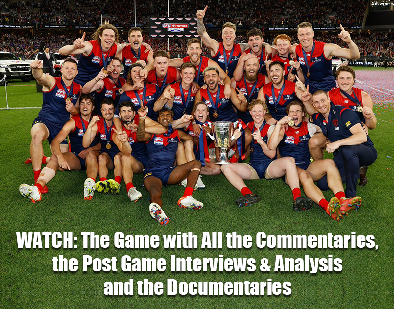
 2021 Premiership
 Social Media


 Trade & Draft Forum Upcoming Events
 Trade Week Begins
Monday 7th October 2024
@ 09:00am
Trade Week Ends
Wednesday 16th October 2024
@ 03:00pm
2025 Pre-Season Begins
Monday 11th November 2024
@ 10:00am
GRAND FINAL 
2024 GRAND FINAL
Discussion of the 2024 AFL Grand Final between the Sydney Swans and the Brisbane Lions. Who are you tipping to win? ...
READ MORE
Demonland | Grand Final 
AFLW Match Report 

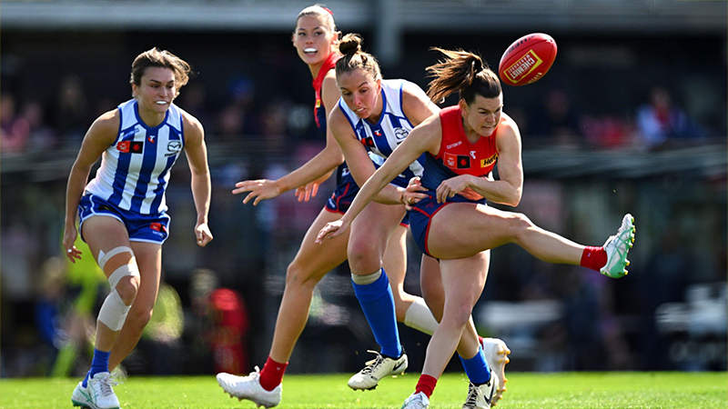
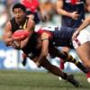
DRUBBING by Meggs
At a sunny Casey Fields, young Demons fans formed a guard of honor for Paxy Paxman, celebrating her 75th game. Despite Paxman's strong defensive efforts, the Kangaroos dominated the match, winning by 50 points ...
READ MOREDemonland | September 15 
AFLW Match Preview 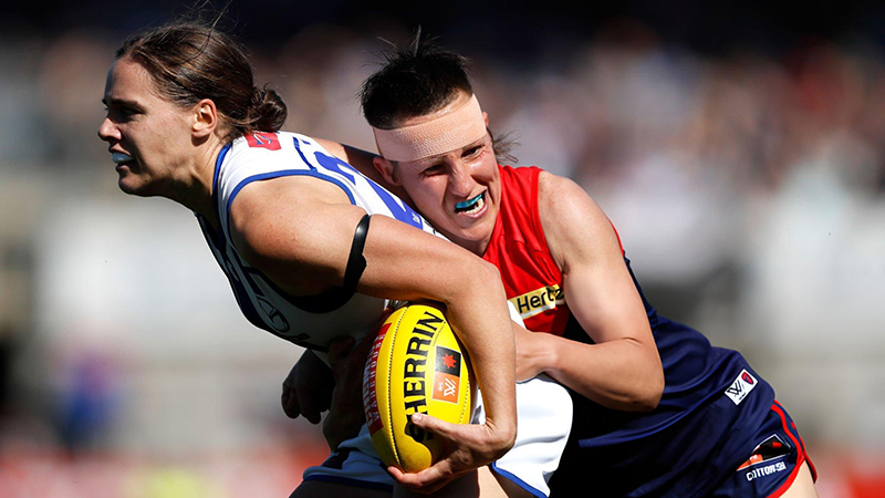
GARNER STRENGTH by Meggs
Continuing with our challenging fixture, Melbourne faces off against premiership favourites North Melbourne this Sunday at Casey Fields in dry blustery conditions. Remember when Casey Fields was our impenetrable stronghold?...
READ MOREDemonland | September 13 
AFLW Season Preview 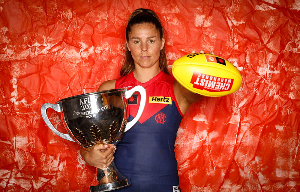
WELCOME 2024 by Meggs
This season promises to be closer than ever before with more teams realistically having a chance of finals. Encouragingly for spectators, the practice matches noticeably displayed higher levels of skills, speed and scoring ...
READ MOREDemonland | August 28
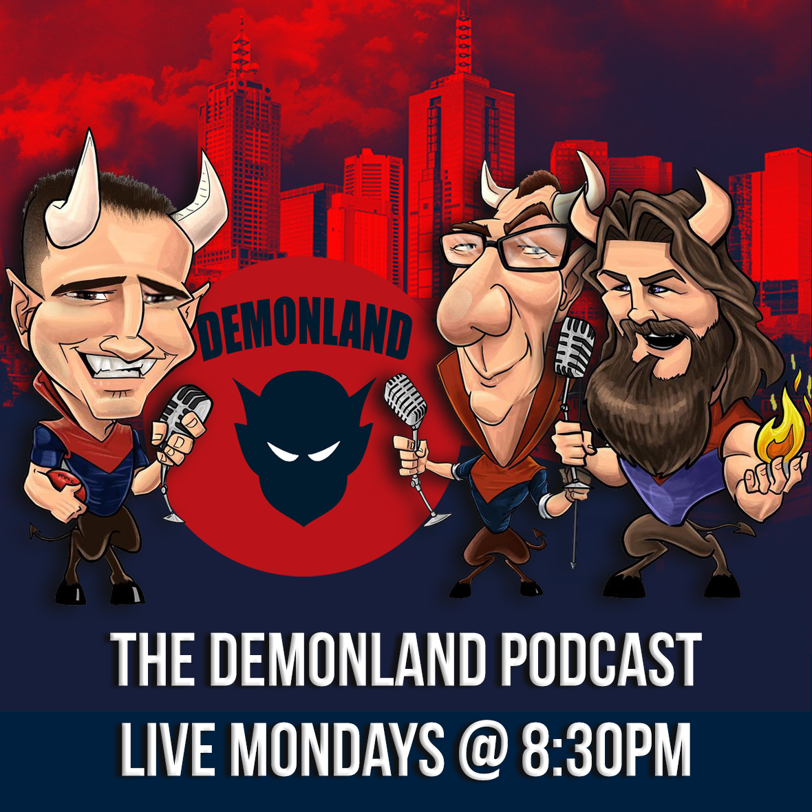
Latest Podcast 
PODCAST: Rd 24 vs Collingwood
The boys analysed our uninspiring, insipid end to the 2024 season before weighing on the Christian Petracca situation ...
LISTENDemonland | August 27 
MFC Forum Match Previews & Reports Training Forum  AFLW Forum 2024 Player Sponsorship
 TopicsInjury List
PLAYER INJURY LENGTH 
Steven May Ribs Season 
Clayton Oliver Ribs/Knee Season 
Christian Petracca Ribs Season 
Tom Sparrow Ankle Season 
Charlie Spargo Achilles Season 
Caleb Windsor Ankle Season 
Joel Smith Suspension TBA Player of the Year
PLAYER VOTES 1 
Max Gawn 220 2 
Jack Viney 123 3 
Trent Rivers 112 4 Steven May 104 5 Christian Petracca 97 6 
Alex Neal-Bullen 93 7 
Kysaiah Pickett 81 8 
Ed Langdon 79 9 Clayton Oliver 65 10 
Christian Salem 60
FULL TABLEDemonland Interviews


 Upcoming Events


Recommended Posts
Join the conversation
You can post now and register later. If you have an account, sign in now to post with your account.