Jump to content

Bringing Back the Demon


Mousey

Recommended Posts

Just wondering if anyone has heard anything about the possibility of the Demon Logo coming back next year.

I for one can not wait to get rid of our horrid current logo. It seriously looks like we are representing Winfield cigarettes.

I think also since we created this new logo steering away from the demon we have only won 4 games?

The current demon logo they are sporting on the alternative strips are ok, i have in a way learned to get used to it after initially not liking it at all.

I hope they give it another go and create something new and exciting, but is it right to think if we do go back to the demon the current demon logo on the alternative Guernseys will be our logo as we have to keep our alternative jerseys for at least 2 or 3 years?

Link to comment
Share on other sites

Not sure about the logo, although I think there was some mention in a thread earlier in the year somewhere, that the logo may be revisited.

Winfield cigarettes? :lol: I wouldn't know about that either, most likely because I don't smoke. However, strange comparison. Is that a bad thing?

winfield_cigarettes.jpg

I really really really think it should be a huge priority to get this right this time and change it as soon as the season ends, i want it to be done say no later than 2 weeks after the seasons end. So we have our new draftees wearing the new gear etc.

I know 3 of my friends who i have converted in to demon supporters want to buy merchandise for the club but will not buy them with the current logo.

Link to comment
Share on other sites

afl-melbourne-demons-casey-fields.jpg

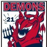
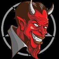
I loved this logo. Had no idea why they changed it. I haven't bought any merchandise with the new logo on it. Haven't bought a guernsey since '06 so might get one soon but would like one with a different logo to be honest.

Link to comment
Share on other sites

Yeah when you look in the Herald Hun on the page with the teams on a Friday morning every club has their individual logo and we have just the cigarette pack I actually thought it was a typo!!

Link to comment
Share on other sites


afl-melbourne-demons-casey-fields.jpg

I loved this logo. Had no idea why they changed it. I haven't bought any merchandise with the new logo on it. Haven't bought a guernsey since '06 so might get one soon but would like one with a different logo to be honest.

I agree, this Demon Logo Rocked. Looked Tough And Hard.

Yes the Latest effort does look like a cigarette packet. GET RID OF IT....................NOW!!!

Link to comment
Share on other sites

I actually think Melbourne can utilise both.

The square logo is more professional - clean cut. Looks good on mail headers, and classier publications.

The demon (which they have changed slightly) is more for merchandise and that sort of thing.

I like both.

Link to comment
Share on other sites

What about the idea of making a crest type logo kind of like what you see in the premier league with manchester united's one. So you would have a professional looking outside to it but also a logo of a demon inside it.

I just want it changed so bad and would love to know what the club is thinking moving forward regarding this matter

Link to comment
Share on other sites

Just wondering if anyone has heard anything about the possibility of the Demon Logo coming back next year.

I for one can not wait to get rid of our horrid current logo. It seriously looks like we are representing Winfield cigarettes.

Isn't it exactly like our jumper?

What do you think when we're running around.

Link to comment
Share on other sites

Yeah, I really don't understand all the negative comments about the current MelbourneFC logo, I think its fantastic.

It works brilliantly in the role of building a brand.

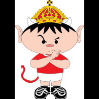
I love the demon logo, and there is room for that too, but I would not be caught dead in any demons gear if it had a stupid looking cartoony demon on it.

Anything with the classy MelbourneFC logo I'd be happy to wear.

Both logos need to exist side-by-side for different purposes.

Link to comment
Share on other sites

I actually think Melbourne can utilise both.

The square logo is more professional - clean cut. Looks good on mail headers, and classier publications.

The demon (which they have changed slightly) is more for merchandise and that sort of thing.

I like both.

I'm fairly sure we're using the MCC/MFC logo on letter heads these days. Which Is way more professional than the stupid square logo.

Link to comment
Share on other sites

They changed it because MFC were trying to push into China, and the demon logo would have turned off potential investors and supporters, as the demon is a strongly protested symbol in Chinese culture.

This is the only reason why they got rid of it. I won't accept any other reason.

The sooner they bring back the demon, the better. The 90s-2007 logo was brilliant. I loved it. It was emotionless, hard, striking and intimidating.

Link to comment
Share on other sites

Isn't it exactly like our jumper?

What do you think when we're running around.

Well a pack of 22 cigs..

lol nah jks, i love our jersey, but a logo is a whole different story. A logo should say something and represent more than showing people exactly what we are wearing.

I love the demon logo, and there is room for that too, but I would not be caught dead in any demons gear if it had a stupid looking cartoony demon on it.

Anything with the classy MelbourneFC logo I'd be happy to wear.

Not being mean and picky mate but im guessing you are on the side of the older generations of supporters?

I am 23 years old and i wouldnt be caught dead parading that logo on a piece of clothing , only a scarf, and thats about it. The Guernsey is a different story, its a playing strip.

I think its a known fact that the biggest problem our club faces going forward is attracting new members and kids to our footy club. The current logo will NEVER do this, im not sure if im the only one but when i was a kid the demon logo attracted me to the club to start with then my love for everything to do with the club flowered from there. Kids love logos! I have no problem with the club having that MCC/MFC logo on letter heads and business needs.

But.. yeh i stand a firm believer the current logo must go and we must bring back the demon :)

Link to comment
Share on other sites

Well a pack of 22 cigs..

lol nah jks, i love our jersey, but a logo is a whole different story. A logo should say something and represent more than showing people exactly what we are wearing.

Not being mean and picky mate but im guessing you are on the side of the older generations of supporters?

I am 23 years old and i wouldnt be caught dead parading that logo on a piece of clothing , only a scarf, and thats about it. The Guernsey is a different story, its a playing strip.

I think its a known fact that the biggest problem our club faces going forward is attracting new members and kids to our footy club. The current logo will NEVER do this, im not sure if im the only one but when i was a kid the demon logo attracted me to the club to start with then my love for everything to do with the club flowered from there. Kids love logos! I have no problem with the club having that MCC/MFC logo on letter heads and business needs.

But.. yeh i stand a firm believer the current logo must go and we must bring back the demon :)

Spot on mate. I'm the same age. When I was younger, certainly the colours and the logos attracted me. We have the best colours in the league and our logo was awesome. We are on a good wicket with navy and red, great colours and most kids' favourites, so get a marketable logo (i.e. the one we had two years ago) to go with and there's a few extra kids wearing Red and Blue.

Link to comment
Share on other sites

Not being mean and picky mate but im guessing you are on the side of the older generations of supporters?

I am 23 years old and i wouldnt be caught dead parading that logo on a piece of clothing , only a scarf, and thats about it. The Guernsey is a different story, its a playing strip.

I think its a known fact that the biggest problem our club faces going forward is attracting new members and kids to our footy club. The current logo will NEVER do this, im not sure if im the only one but when i was a kid the demon logo attracted me to the club to start with then my love for everything to do with the club flowered from there. Kids love logos! I have no problem with the club having that MCC/MFC logo on letter heads and business needs.

But.. yeh i stand a firm believer the current logo must go and we must bring back the demon :)

I'm 24. Maybe I'm a bit more style-conscious..?

For Kids, the demon is fine. Great in fact. This is why there is room for both.

For anyone over the age of 15, I can't see them wearing a cartoon demon mascot unless there is a serious revamp and it comes back nothing like its previous incarnations.

I want to wear something a bit more mature, I'd rather not look like I'm wearing over-sized kids' clothing.

I also want to be able to wear it & not look like I've just walked out of the MCG or from footy training. I want it to be subtle enough to have some versatility. So I can wear it to the pub.

Link to comment
Share on other sites


I'm fairly sure we're using the MCC/MFC logo on letter heads these days. Which Is way more professional than the stupid square logo.

just curious... how is it more professional?

Link to comment
Share on other sites

I've studied and worked in design and worked for a printers designing logos so maybe I have a different perspective.

To me, a lot of the old demons logos are unsophisticated with heaps of room for improvement.

The current MelbourneFC is a great corporate logo. The problem is that it maybe it should be seen as this and only this.

A more mature representation of the MFC brand.

There is room to have 2 logos with a second one more appealing to kids and using the demon, but this situation is not ideal.

The thing is, you can't have a handful of different logos for different purposes - the strongest way is to have just one versatile brand logo for everything.

Its about brand reinforcement - thats the important thing.

Link to comment
Share on other sites

I'm 24. Maybe I'm a bit more style-conscious..?

For Kids, the demon is fine. Great in fact. This is why there is room for both.

For anyone over the age of 15, I can't see them wearing a cartoon demon mascot unless there is a serious revamp and it comes back nothing like its previous incarnations.

I want to wear something a bit more mature, I'd rather not look like I'm wearing over-sized kids' clothing.

I also want to be able to wear it & not look like I've just walked out of the MCG or from footy training. I want it to be subtle enough to have some versatility. So I can wear it to the pub.

Sorry mate my bad on that.

Link to comment
Share on other sites

Sorry mate my bad on that.

Didn't mean it as a slight either with the 'style-conscious' thing.

Its more that I'm aware, being from a design background that we tend to be pathetically vain and concerned about the image we project.

Comes with the territory I guess.

Anyway, this is good!

I have 2 weeks off and its inspired me to dust off my old sketches for the new demon logo I was working on last year.

Gonna have a crack for real FOR REAL now.

Anyone else with ideas post them on this thread & i'll try to take it on board, although I have a pretty clear idea of what I intend to do.

Link to comment
Share on other sites

Sorry mate my bad on that.

Mousey, I don't mean to be rude in saying this, but does 'my bad on that', is that 'y-gen' for 'sorry, my mistake?' And if so, why don't you just say the latter?

Link to comment
Share on other sites

Mousey, I don't mean to be rude in saying this, but does 'my bad on that', is that 'y-gen' for 'sorry, my mistake?' And if so, why don't you just say the latter?

"My bad" is an old term from basketball for "my fault", essentially accepting the blame for your bad judgement.

Obviously being a sporting term it is short & sharp.

Over time it has translated into hip hop culture by association and then in turn popular culture.

I first started hearing it around 1996 (back when Penny played for the Maigc) in basketball related media but I'm sure it was around long before that.

Link to comment
Share on other sites

There is room to have 2 logos with a second one more appealing to kids and using the demon, but this situation is not ideal.

Geelong seem to get away with three:

  • they have their "Peter Chris" style (cat face) logo on most of their merchandise,
  • a retro style full bodied cat for their on flied clothing and staff,
  • and the "GFC" which looks like it is used more corporately.

I like the old style MFC monogram, but a Demon as a character / mascot must needs to be more appealing for kids and marketing.

Link to comment
Share on other sites

Join the conversation

You can post now and register later. If you have an account, sign in now to post with your account.

Guest
Unfortunately, your content contains terms that we do not allow. Please edit your content to remove the highlighted words below.
Reply to this topic...

×   Pasted as rich text.   Paste as plain text instead

  Only 75 emoji are allowed.

×   Your link has been automatically embedded.   Display as a link instead

×   Your previous content has been restored.   Clear editor

×   You cannot paste images directly. Upload or insert images from URL.

  • Recently Browsing   0 members

    • No registered users viewing this page.
  • Demonland Forums  

  • Match Previews, Reports & Articles  

    WARNING by William from Waalitj

    As a long term resident of Waalitj Marawar, I am moved to warn my fellow Narrm fans that a  danger game awaits. The locals are no longer the easybeats who stumbled, fumbled and bumbled their way to the good fortune of gathering the number one draft pick and a generational player in Harley Reid last year. They are definitely better than they were then.   Young Harley has already proven his worth with some stellar performances for a first year kid playing among men. He’s taken hangers, k

    Demonland
    Demonland |
    Melbourne Demons 20

    OVER YET? by KC from Casey

    The Friday evening rush hour clash of two of the VFL’s 2024 minnows, Carlton and the Casey Demons was excruciatingly painful to watch, even if it was for the most part a close encounter. I suppose that since the game had to produce a result (a tie would have done the game some justice), the four points that went to Casey with the win, were fully justified because they went to the best team. In that respect, my opinion is based on the fact that the Blues were a lopsided combination that had

    Demonland
    Demonland |
    Casey Articles

    CENTIMETRES by Whispering Jack

    Our game is one where the result is often decided by centimetres; the touch of a fingernail, a split-second decision made by a player or official, the angle of vision or the random movement of an oblong ball in flight or in its bounce and trajectory. There is one habit that Melbourne seems to have developed of late in its games against Carlton which is that the Demons keep finding themselves on the wrong end of the stick in terms of the fine line in close games at times when centimetres mak

    Demonland
    Demonland |
    Match Reports

    PREGAME: Rd 10 vs West Coast

    The Demons have a 10 day break before they head on the road to Perth to take on the West Coast Eagles at Optus Stadium on Sunday. Who comes in and who goes out?

    Demonland
    Demonland |
    Melbourne Demons 521

    PODCAST: Rd 09 vs Carlton

    The Demonland Podcast will air LIVE on Sunday, 12th May @ 8:30pm. Join George, Binman & I as we analyse the Demons loss at the MCG against the Blues in the Round 09. You questions and comments are a huge part of our podcast so please post anything you want to ask or say below and we'll give you a shout out on the show. If you would like to leave us a voicemail please call 03 9016 3666 and don't worry no body answers so you don't have to talk to a human. Listen & Chat LIVE:

    Demonland
    Demonland |
    Melbourne Demons 30

    VOTES: Rd 09 vs Carlton

    Last week Captain Max Gawn consolidated his lead over reigning champion Christian Petracca in the Demonland Player of the Year Award. Steven May, Jake Lever, Jack Viney & Clayton Oliver make up the Top 5. Your votes for the loss against the Blues. 6, 5, 4, 3, 2, 1.

    Demonland
    Demonland |
    Melbourne Demons 39

    POSTGAME: Rd 09 vs Carlton

    The Demons were blown out of the water in the first quarter and clawed their way back into the contest but it was a case of too little too late as they lost another close one to Carlton losing by 1 point at the MCG.  

    Demonland
    Demonland |
    Melbourne Demons 486

    GAMEDAY: Rd 09 vs Carlton

    It's Game Day and the Demons are once again headlining another blockbuster at the MCG to kick off the round of footy. The Dees take on the Blues and have the opportunity to win their third game on the trot to solidify a spot in the Top 4 in addition to handing the Blues their third consecutive defeat to bundle them out of the Top 8.

    Demonland
    Demonland |
    Melbourne Demons 959

    MELBOURNE BUSINESS by The Oracle

    In days of old, this week’s Thursday night AFL match up between the Demons and the Blues would be framed on the basis of the need to redress the fact that Carlton “stole” last year’s semi final away from Melbourne and with it, their hopes for the premiership.  A hot gospelling coach might point out to his charges that they were the better team on the night in all facets and that poor kicking for goal and a couple of lapses at the death cost them what was rightfully theirs. Moreover, now was

    Demonland
    Demonland |
    Match Previews 1
  • Tell a friend
    Love Demonland? Tell a friend!
×
×
  • Create New...