
-
IMPORTANT: PLEASE READ BEFORE POSTING The Demonland Terms of Service, which you have all recently agreed to, strictly prohibit discussions of ongoing legal matters, whether criminal or civil. Please ensure that all discussions on this forum remain focused solely on on-field & football related topics.
-
-
 Recently Browsing
0 members
Recently Browsing
0 members
- No registered users viewing this page.
-
Demonland Forums


-
-
Match Previews, Reports & Articles

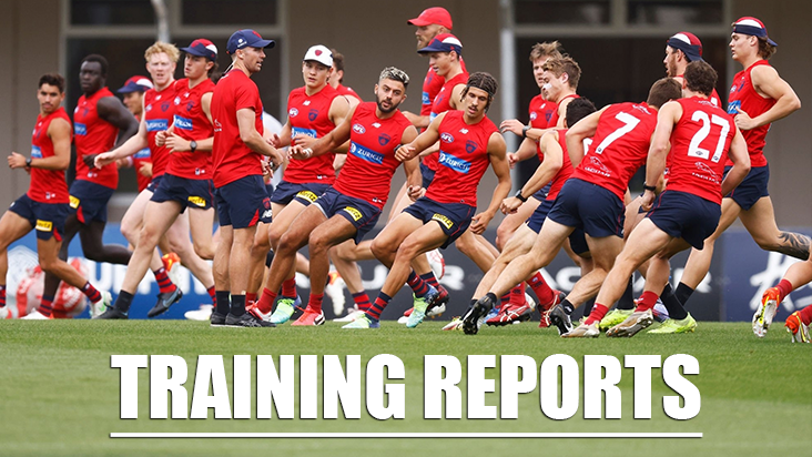
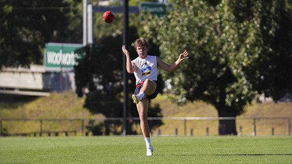
TRAINING: Monday 17th February 2025
Demonland Trackwatchers were on hand at Monday morning's preseason training at Gosch's Paddock to bring you their brief observations of the session. HARVEY WALLBANGER'S PRESEASON TRAINING OBSERVATIONS Gentle flush session at Gosch's this morning. Absent: May, Pickett (All Stars) McVee, McAdam. Rehabbing: Great to see Kentfield back (much slimmer), walking with Tholstrup, TMac (suspect just a management thing), Viney (still being cautious with that rib cartilage?), Melksham (

MATCH SIM: Friday 14th February 2025
A couple of Demonland Trackwatchers made their way out to Casey Field's for the Melbourne Football Club's Family Series day to bring you their observations on the Match Simulation. HARVEY WALLBANGER'S MATCH SIMULATION OBSERVATIONS Absent: May, Pickett (All Stars), McVee, Windor, Kentfield, Mentha Present but not playing: Petracca, Viney, Spargo, Tholstrup, Melksham Starting Blue 18 (+ just 2 interchange): B: Petty, TMac, Lever, Howes, Bowey Salem M: Gawn, Oliver, La
TRAINING: Wednesday 12th February 2025
Demonland Trackwatchers braved the scorching morning heat to bring you the following observations of Wednesday's preseason training session from Gosch's Paddock. HARVEY WALLBANGER'S PRESEASON TRAINING OBSERVATIONS Absent: Salem, Windsor (word is a foot rash going around), Viney, Bowey and Kentfield Train ons: Roy George, no Culley today. Firstly the bad news - McVee went down late, which does look like a bad hammy - towards the end of match sim, as he kicked the ball. Had to
MATCH SIM: Friday 7th February 2025
Demonland Trackwatcher Gator ventured down the freeway to bring you his observations from Friday morning's Match Simulation out at Casey Fields. Rehab: Jake Lever and Charlie Spargo running laps. Lever was running short distances at a fast click as well as having kick to kick with a trainer. He seems unimpeded. Christian Petracca, Kade Chandler, Shane McAdam and Tom Fullarton doing non-contact kicking and handball drills on the adjacent oval. All moving freely at pace. I didn’
TRAINING: Wednesday 5th February 2025
Demonland Trackwatchers were out in force as the Demons returned to Gosch's Paddock for preseason training on Wednesday morning. GHOSTWRITER'S PRESEASON TRAINING OBSERVATIONS Kozzie a no show. Tommy Sparrow was here last week in civvies and wearing sunnies. He didn’t train. Today he’s training but he’s wearing goggles so he’s likely got an eye injury. There’s a drill where Selwyn literally lies on top of Tracc, a trainer dribbles the ball towards them and Tracc has to g
THAT WAS THE YEAR THAT WAS: 2024
Whichever way you look at it, the Melbourne Football Club’s 2024 season can only be characterized as the year of its fall from grace. Whispering Jack looks back at the season from hell that was. After its 2021 benchmark premiership triumph, the men’s team still managed top four finishes in the next two seasons but straight sets finals losses consigned them to sixth place in both years. The big fall came in 2024 with a collapse into the bottom six and a 14th placing. At Casey, the 2022 VFL p
MATCH SIM: Friday 31st January 2025
Veteran Demonland Trackwatcher Picket Fence ventured down to Casey Fields to bring you his observations from Friday's Match Simulation. Greetings Demonlanders, beautiful Day at training and the boys were hard at it, here is my report. NO SHOWS: Luker Kentfield (recovering from pneumonia in WA), also not sure I noticed Melky (Hamstring) or Will Verrall?? MODIFIED DUTIES (No Contact): Sparrow, McVee (foot), Tracc (ribs), Chandler, (AC Joint), Fullarton Noticeable events (I’ll s
TRAINING: Wednesday 29th January 2025
A number of Demonland Trackwatchers swooped on Gosch's Paddock to bring you their observations from this morning's Preseason Training Session. DEMON JACK'S PRESEASON TRAINING OBSERVATIONS Beautiful morning at Gosch's Paddock. Very healthy crowd so far. REHAB: Fullerton, Spargo, Tholstrup, McVee Viney running laps. EDIT: JV looks to be back with the main group. Trac, Sparrow, Chandler and Verrell also training away from the main group. Currently kicking to each other ins
TRAINING: Wednesday 22nd January 2025
Demonland Trackwatchers were out in force for training at Gosch's Paddock on Wednesday morning for the MFC's School Holidays Open Training Session. DEMONLAND'S PRESEASON TRAINING OBSERVATIONS REHAB: TMac, Chandler, McVee, Tholstrup, Brown, Spargo Brown might have passed his fitness test as he’s back out with the main group. Sparrow not present. Kozzy not present either. Mini Rehab group has broken off from the match sim (contact) group: Max, Trac, Lever, Fullarton
-
Tell a friend
-
Podcast

-
-
Podcast


-
Podcast Stream
Open Stream in
New Window

-
-
Support Demonland


 2021 Premiership
 Social Media


 Training Forum Preseason Training
Monday, 17th February 2025
Demonland Trackwatchers were on hand at Monday morning's preseason training at Gosch's Paddock to bring you their brief observations of the session ...
READ MORE
Demonland | February 17 
Preseason Training 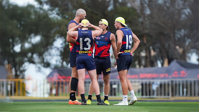
Friday, 14th February 2025
A couple of Demonland Trackwatchers made their way out to Casey Field's for the Melbourne Football Club's Family Series day to bring you their observations on the Match Simulation ...
READ MOREDemonland | February 14
Preseason Training 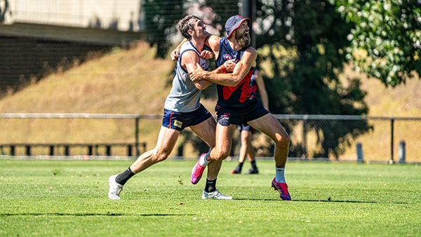
Wednesday, 12th February 2025
Demonland Trackwatchers braved the scorching morning heat to bring you the following observations of Wednesday's preseason training session from Gosch's Paddock ...
READ MOREDemonland | February 12
Preseason Training 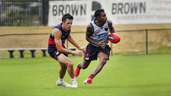
Friday, 7th February 2025
Demonland Trackwatcher Gator ventured down to the freeway to bring you his observations from Friday morning's Match Simulation out at Casey Fields ...
READ MOREDemonland | February 07
2024 Season Review 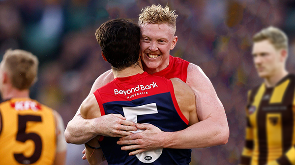
THAT WAS THE YEAR THAT WAS: 2024 by Whispering Jack
Whichever way you look at it, the Melbourne Football Club’s 2024 season can only be characterized as the year of its fall from grace. Whispering Jack looks back at the season from hell that was ...
READ MOREDemonland | February 05 
2024 AFL Draft 
UP IN LIGHTS by Whispering Jack
Those who watched the 2024 Marsh AFL National Championships closely this year would not be particularly surprised that Melbourne selected Victoria Country pair Harvey Langford and Xavier Lindsay on the first night of the AFL National Draft ...
READ MOREDemonland | November 21 
2024 AFL Draft 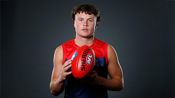
Welcome to Demonland: Harvey Langford
With the Demons first selection in the 2024 AFL Draft they took ready made midfielder Harvey Langdord from the Dandenong Stingrays at Pick 6 ...
READ MOREDemonland | November 21
2024 AFL Draft 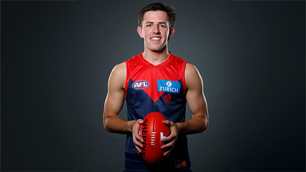
Welcome to Demonland: Xavier Lindsay
With their second selection in the 2024 AFL Draft the Demons selected Gippsland Power midfielder Xavier Lindsay at Pick 11 ...
READ MOREDemonland | November 21
MFC Forum Match Previews & Reports AFLW Forum 2024 Player Sponsorship TopicsPlayer of the Year
PLAYER VOTES 1 
Max Gawn 220 2 
Jack Viney 123 3 
Trent Rivers 112 4 
Steven May 104 5 
Christian Petracca 97 6 
Alex Neal-Bullen 93 7 
Kysaiah Pickett 81 8 
Ed Langdon 79 9 
Clayton Oliver 65 10 
Christian Salem 60
FULL TABLEDemonland Interviews


 Upcoming Events


.thumb.jpg.ef82ebb9e23aa5dc10fd1fa3072ff65c.jpg)

Recommended Posts
Archived
This topic is now archived and is closed to further replies.