


Club Emblem

Featured Replies
Featured Content
-
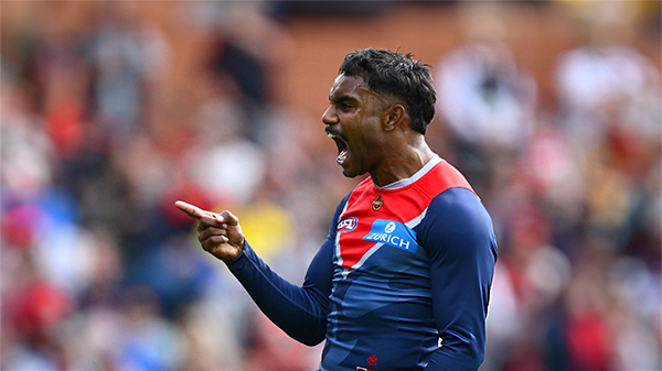
REPORT: Essendon
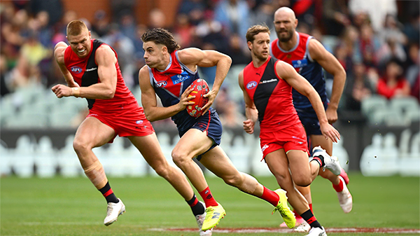
Melbourne’s much vaunted finishing power evaporated at Adelaide Oval on Saturday afternoon, exposed for the third time in four years by its Essendon Gather Round hoodoo.-
-
- 15 replies
-
-
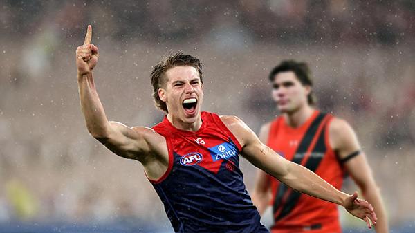
POSTGAME: Essendon
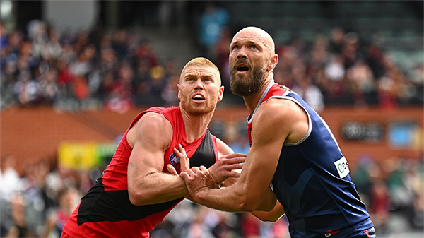
From knocking off a Premiership contender to getting embarrassed by the winless Bombers who were on a 17 game losing streak .... Welcome Back MFCSS.-
-
- 383 replies
-
-
PODCAST: Essendon
Andy is still away on holidays for the next two weeks but the Demonland Podcast will proceed with Binman at the helm and this week joined by George to bring you their analysis of the disappointing loss to the Bombers.
-
-
- 22 replies
-
-
VOTES: Essendon
Captain Max Gawn has built a commanding lead in the Demonland Player of the Year Award from Kozzy Pickett & Jack Steele followed by Jacob van Rooyen and Tom Sparrow. Your votes please from the loss to the Bombers. 6, 5, 4, 3, 2 & 1.-
-
- 31 replies
-
-
PREVIEW: Essendon
Not long ago, the narrative surrounding Melbourne was steeped in pessimism. There was some concern among the pundits (and even some fans) that the club would arrive at the AFL’s Gather Round still winless, vulnerable to a familiar adversary in the Essendon Football Club, and facing significant scrutiny from an ever-critical media on a national stage. Things have changed.-
-
- 19 replies
-
-
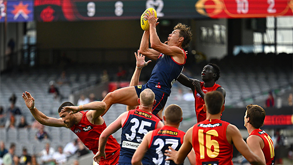
REPORT: Gold Coast
Steven King astutely identified the issues that had plagued the Melbourne Football Club over the past two and a half seasons when he auditioned for the newly created coaching role. The side that had claimed the 2021 premiership had become stodgy, slow-paced, and hesitant to take the initiative.-
-
- 4 replies
-


|

|
|

|
 |
 |
 |
 |
 |
 |
 |
 |
Join the conversation
You can post now and register later. If you have an account, sign in now to post with your account.