


Club Emblem

Featured Replies
Featured Content
-
PREGAME: Fremantle
After a stunning victory over the Saints in the first round of the Season the Demons head over to Perth to take on the Dockers who choked in their first match against the Cats. Who comes in and who goes out?-
-
- 102 replies
-
-
REPORT: St. Kilda
One of the big stories of the AFL off-season was the spending spree of Melbourne’s Round 1 opponent, St Kilda. They splashed out heavily, first to retain Nasiah Wanganeen-Milera - the hero of last year’s epic come-from-behind miracle victory -turning him into a $2 million man. They then effectively took out an expensive overdraft to recruit a string of expensive players from other clubs. It was a risky investment strategy and, although it’s still early days, it certainly failed to pay off in Sunday’s season opener, with much of the glitter turning to fool’s gold.-
-
- 2 replies
-
-
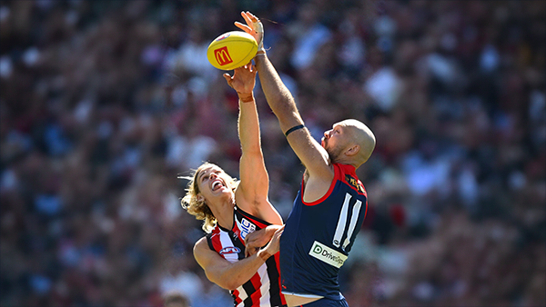
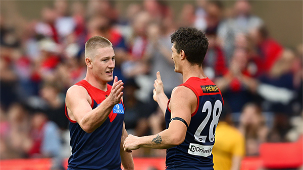
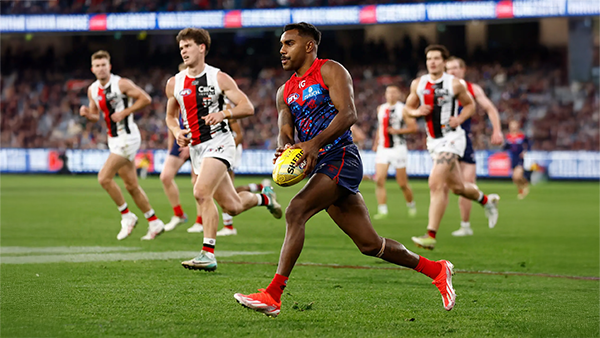
POSTGAME: St. Kilda
Never in doubt!!! In Steven King’s first game at the helm of the Melbourne Football Club, the Dees outlasted Saints in a wild, momentum-swinging thriller at the MCG, running out 13-point winners.-
-
- 479 replies
-
-
PODCAST: St. Kilda
The Demonland Podcast will air LIVE on Monday, 16th March @ 8:00pm. Join Binman, George & I as we dissect the Dees stunning victory over the Saints at the MCG.
Your questions and comments are a huge part of our podcast so please post anything you want to ask or say below and we'll give you a shout out on the show.-
-
- 32 replies
-
-
VOTES: St. Kilda
Max Gawn is gunning for his 5th Demonland Player of the Year award after going back to back for the past two season. Your votes for the Dees thrilling win over the Saints at the MCG. 6, 5, 4, 3, 2 & 1.-
-
- 69 replies
-
-
GAMEDAY: St. Kilda
It’s Game Day, and 205 days have passed since the final siren sounded at the MCG, bringing Melbourne’s 2025 season to a close and marking the end of an era. In just a few hours, a new chapter begins for the Demons. What are you most hoping to see from Melbourne today?-
-
- 579 replies
-


|

|

|

|
 |
 |
 |
 |
 |
 |
 |
 |
Join the conversation
You can post now and register later. If you have an account, sign in now to post with your account.