
-


-


-
IMPORTANT: PLEASE READ BEFORE POSTING Posting unsubstantiated rumours on this website is strictly forbidden.
Demonland has made the difficult decision to not permit this platform to be used to discuss & debate the off-field issues relating to the Melbourne Football Club including matters currently being litigated between the Club & former Board members, board elections, the issue of illicit drugs in footy, the culture at the club & the personal issues & allegations against some of our players & officials ...
We do not take these issues & this decision lightly & of course we believe that these serious matters affecting the club we love & are so passionate about are worthy of discussion & debate & I wish we could provide a place where these matters can be discussed in a civil & respectful manner.
However these discussions unfortunately invariably devolve into areas that may be defamatory, libelous, spread unsubstantiated rumours & can effect the mental health of those involved. Even discussion & debate of known facts or media reports can lead to finger pointing, blame & personal attacks.
The repercussion is that these discussions can open this website, it’s owners & it’s users to legal action & may result in this website being forced to shutdown.
Our moderating team are all volunteers & cannot moderate the forum 24/7 & as a consequence problematic content that contravenes our rules & standards may go unnoticed for some time before it can be removed.
We reserve the right to delete posts that offend against our above policy & indeed, to ban posters who are repeat offenders or who breach our code of conduct.
WE HAVE BUILT A FANTASTIC ONLINE COMMUNITY AT DEMONLAND OVER THE PAST 23 YEARS & WE WOULD LIKE TO CONTINUE TO BE ABLE TO DISCUSS THE CLUB WE LOVE & ARE SO PASSIONATE ABOUT.
Thank you for your continued support & understanding. Go Dees.

-
-
 Recently Browsing
0 members
Recently Browsing
0 members
- No registered users viewing this page.
-
Demonland Forums


-
-
Match Previews, Reports & Articles

OVER YET? by KC from Casey
The Friday evening rush hour clash of two of the VFL’s 2024 minnows, Carlton and the Casey Demons was excruciatingly painful to watch, even if it was for the most part a close encounter. I suppose that since the game had to produce a result (a tie would have done the game some justice), the four points that went to Casey with the win, were fully justified because they went to the best team. In that respect, my opinion is based on the fact that the Blues were a lopsided combination that had

CENTIMETRES by Whispering Jack
Our game is one where the result is often decided by centimetres; the touch of a fingernail, a split-second decision made by a player or official, the angle of vision or the random movement of an oblong ball in flight or in its bounce and trajectory. There is one habit that Melbourne seems to have developed of late in its games against Carlton which is that the Demons keep finding themselves on the wrong end of the stick in terms of the fine line in close games at times when centimetres mak
PREGAME: Rd 10 vs West Coast Eagles
The Demons have a 10 day break before they head on the road to Perth to take on the West Coast Eagles at Optus Stadium on Sunday. Who comes in and who goes out?
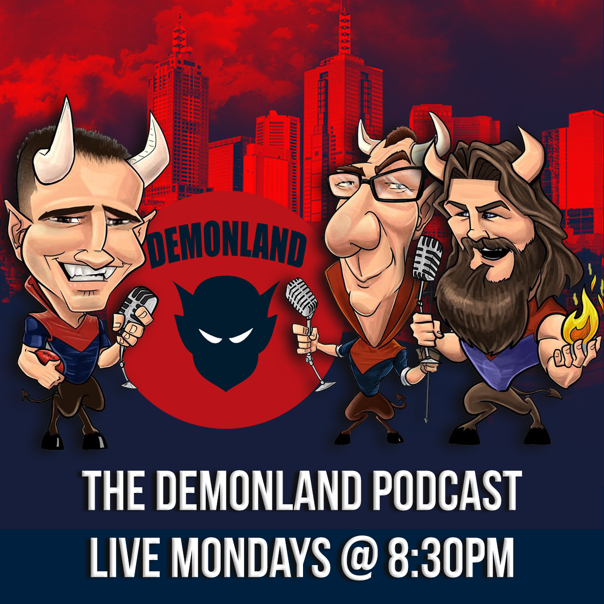
PODCAST: Rd 09 vs Carlton
The Demonland Podcast will air LIVE on Sunday, 12th May @ 8:30pm. Join George, Binman & I as we analyse the Demons loss at the MCG against the Blues in the Round 09. You questions and comments are a huge part of our podcast so please post anything you want to ask or say below and we'll give you a shout out on the show. If you would like to leave us a voicemail please call 03 9016 3666 and don't worry no body answers so you don't have to talk to a human. Listen & Chat LIVE:
VOTES: Rd 09 vs Carlton
Last week Captain Max Gawn consolidated his lead over reigning champion Christian Petracca in the Demonland Player of the Year Award. Steven May, Jake Lever, Jack Viney & Clayton Oliver make up the Top 5. Your votes for the loss against the Blues. 6, 5, 4, 3, 2, 1.
POSTGAME: Rd 09 vs Carlton
The Demons were blown out of the water in the first quarter and clawed their way back into the contest but it was a case of too little too late as they lost another close one to Carlton losing by 1 point at the MCG.
GAMEDAY: Rd 09 vs Carlton
It's Game Day and the Demons are once again headlining another blockbuster at the MCG to kick off the round of footy. The Dees take on the Blues and have the opportunity to win their third game on the trot to solidify a spot in the Top 4 in addition to handing the Blues their third consecutive defeat to bundle them out of the Top 8.
MELBOURNE BUSINESS by The Oracle
In days of old, this week’s Thursday night AFL match up between the Demons and the Blues would be framed on the basis of the need to redress the fact that Carlton “stole” last year’s semi final away from Melbourne and with it, their hopes for the premiership. A hot gospelling coach might point out to his charges that they were the better team on the night in all facets and that poor kicking for goal and a couple of lapses at the death cost them what was rightfully theirs. Moreover, now was
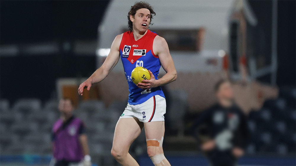
UNDER THE PUMP by KC from Casey
The Casey Demons have been left languishing near the bottom of the VFL table after suffering a 32-point defeat at the hands of stand alone club Williamstown at Casey Fields on Sunday. The Demons suffered a major setback before the game even started when AFL listed players Ben Brown, Marty Hore and Josh Schache were withdrawn from the selected side. Only Schache was confirmed as an injury replacement, the other two held over as possible injury replacements for Melbourne’s Thursday night fixt
-
Tell a friend
-
Podcast

-
-
Podcast

-
Podcast Stream
Open Stream in
New Window

-
-
Support Demonland


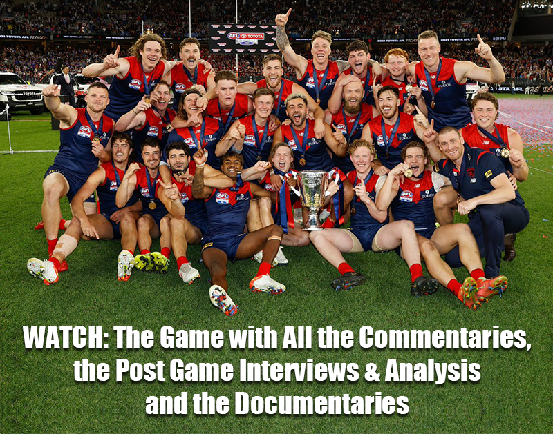
 2021 Premiership
 Social Media
  Non MFC Games
NON-MFC: Round 10
Discussion of all the other games that don't involve the Demons in Round 10 ...
READ MORE
Demonland | Round 10 
Latest Podcast 


PODCAST: Rd 09 vs Carlton
The boys dissected the agonisingly disappointing 1 point loss to Carlton lamenting giving the Blues a 6 goal head start and praising Trac for almost single handedly snatching victory from the jaws of defeat ...
LISTENDemonland | May 13 
Casey Report 
OVER YET? by KC from Casey
The Friday evening rush hour clash of two of the VFL’s 2024 minnows, Carlton and the Casey Demons was excruciatingly painful to watch, even if it was for the most part a close encounter ...
READ MOREDemonland | May 12 
Match Report 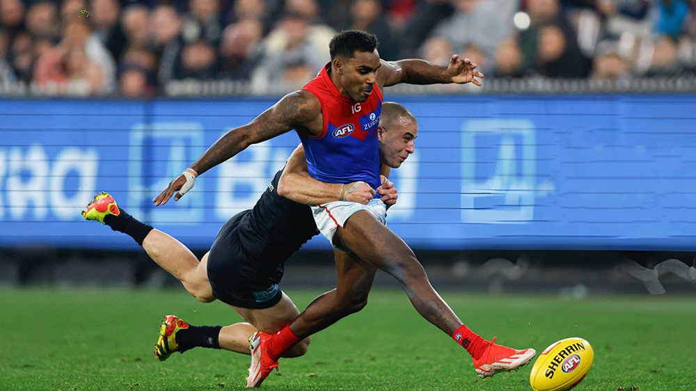
CENTIMETRES by Whispering Jack
Our game is one where the result is often decided by centimetres; the touch of a fingernail, a split-second decision made by a player or official, the angle of vision or the random movement of an oblong ball in flight or in its bounce and trajectory ...
READ MOREDemonland | May 10 
PreGame 
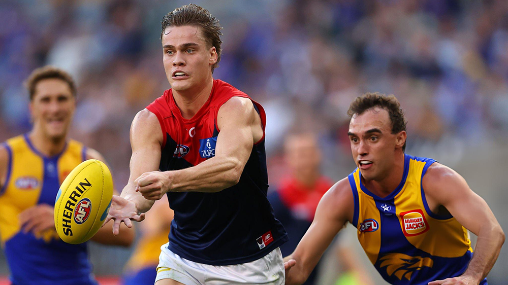
PREGAME: Rd 10 vs West Coast
The Demons have a 10 day break before they head on the road to Perth to take on the West Coast Eagles at Optus Stadium on Sunday. Who comes in and who goes out? ...
READ MOREDemonland | May 09 
Post Game 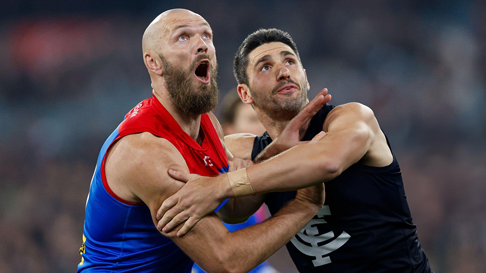
POSTGAME: Rd 09 vs Carlton
The Demons were blown out of the water in the first quarter and clawed their way back into the contest but it was a case of too little too late as they lost another close one to Carlton losing by 1 point at the MCG ...
READ MOREDemonland | May 09 
Votes 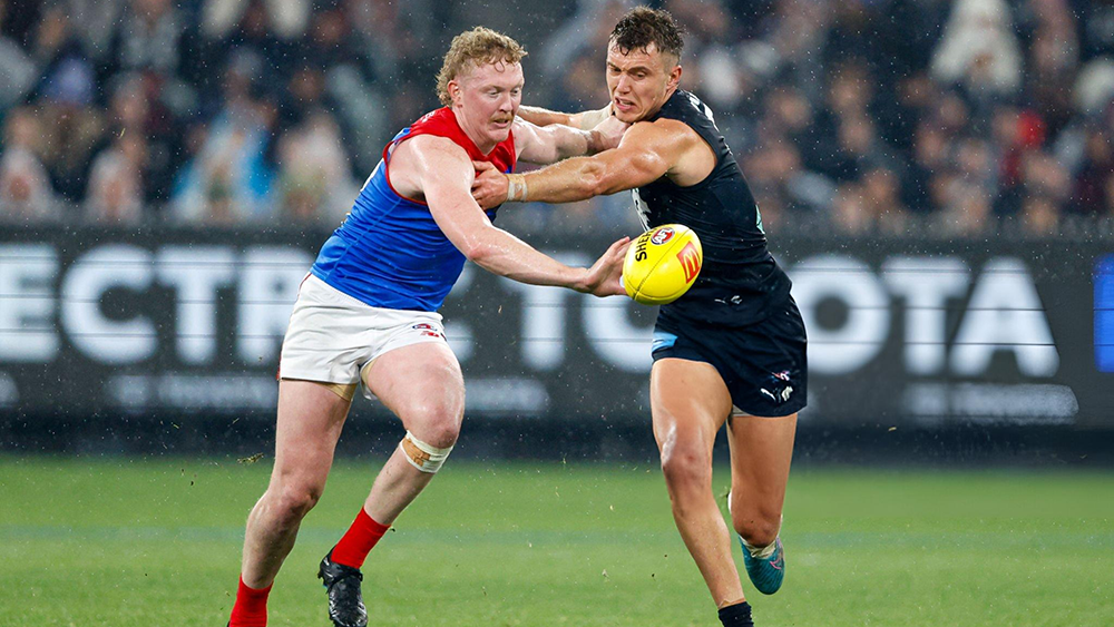
VOTES: Rd 09 vs Carlton
Last week Captain Max Gawn consolidated his lead over reigning champion Christian Petracca in the Demonland Player of the Year Award. Steven May, Jake Lever, Jack Viney & Clayton Oliver make up the Top 5. Your votes for the loss against the Blues. 6, 5, 4, 3, 2, 1 ...
READ MOREDemonland | May 09 
Game Day 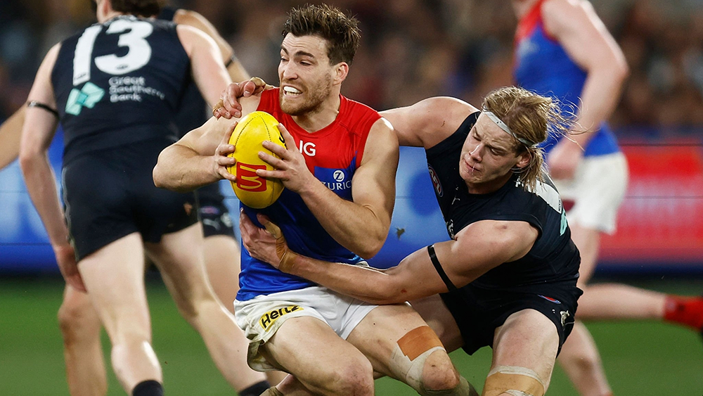
GAMEDAY: Rd 09 vs Carlton
It's Game Day and the Demons are once again headlining another blockbuster at the MCG to kick off the round of footy. The Dees take on the Blues and have the opportunity to win their third game on the trot to solidify a spot in the Top 4 in addition to handing the Blues their third consecutive defeat to bundle them out of the Top 8 ...
READ MOREDemonland | May 09 
Match Preview 
MELBOURNE BUSINESS by The Oracle
In days of old, this week’s Thursday night AFL match up between the Demons and the Blues would be framed on the basis of the need to redress the fact that Carlton “stole” last year’s semi final away from Melbourne and with it, their hopes for the premiership ...
READ MOREDemonland | May 07 
Player Interview 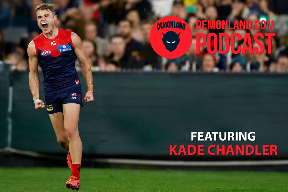
PODCAST: Kade Chandler Interview
I interview Kade Chandler about his road from being overlooked in the draft to his rookie listing to his apprenticeship as a sub to VFL premiership player to his breakout 2023 season to mainstay in the Forward line and much more ...
LISTENDemonland | May 01
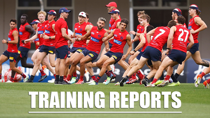
Training 
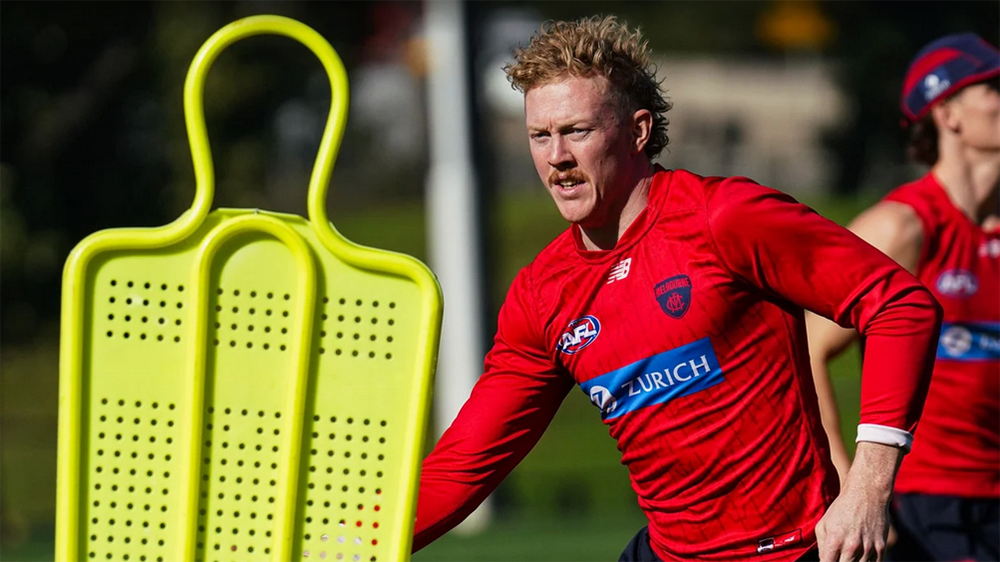
Monday, 29th April 2024
Demonland Trackwatcher Kev Martin was on hand at Gosch's Paddock for Monday's training session and made the following observations ...
READ MOREDemonland | April 29 
Next Match . Round 10
vs
Sunday 19th May 2024
@ 06:20pm (OS)
MFC Forum Match Previews & Reports Training Forum AFLW Forum 2024 Player Sponsorship TopicsInjury List
PLAYER INJURY LENGTH 
Jake Bowey Shoulder Available 
Josh Schache Achilles Test 
Christian Salem Hamstring 1-2 Weeks 
Charlie Spargo Achilles 2-3 Weeks 
Jake Melksham ACL 5-7 Weeks 
Joel Smith Suspension TBA Player of the Year
PLAYER VOTES 1 
Max Gawn 102 2 
Christian Petracca 78 3 
Steven May 66 4 
Alex Neal-Bullen 41 5 
Jake Lever 40 6 
Jack Viney 33 7 
Clayton Oliver 28 =8 
Bayley Fritsch 21 =8 
Trent Rivers 21 10 
Ed Langdon 20
FULL TABLEDemonland Interviews


 Upcoming Events


Recommended Posts
Join the conversation
You can post now and register later. If you have an account, sign in now to post with your account.