Jump to content

Alternative Strip Suggestions


Yencks

Recommended Posts

  • Replies 143
  • Created
  • Last Reply

Top Posters In This Topic

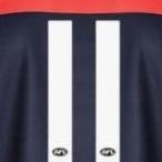
Something along these lines???

MelbourneFCAltStrip2.jpg

Looking back I probably would of had the band higher up (where the sponsorship rests... and include the sponsorship in the blue), but is this sort of what you were thinking of mate?

That looks great. With all these awesome looking designs on here (i reckon i'd buy each of them if they were put out), its a complete mystery how we ended up with the thing we have now.

Link to comment
Share on other sites

its a complete mystery how we ended up with the thing we have now.

Trust me..you re not alone by a country mile in that thinking !! :lol: :lol: :lol:

Link to comment
Share on other sites

Age Article

Hey- there it is.

Apologies if this link is already in.

Now all we have to do is trawl through the posts to find exactly who suggested this first - I definately remember seeing exactly this design (simple reversal of red and blue) being mentoined by someone.

The extra red looks pretty damn good, actually.

Stranger, come forward and receive your acclamation!

As to how we ended up the the travesty-wear -

The club slipped it into a member survey, giving us the option of three designs, each worse than the previous. They really were all shocking. I think even I picked the silver as best of a bad lot. There was no 'anything else, please' option. So, they had their handy feedback telling them what they wanted (it was clear a decision had already been made before the consultation) and they off and ran with 'awful design number three'.

I would like the individual to step forward, who not only proposed the design, but also biased the survey structure so grossly to favour that option. It rankles of not only incompetence but even of some kind of shifty trading.

Come to think of it.

I WANT TO KNOW WHO HAS BEEN MAKING THE STEADY STREAM OF IDIOTIC DECISIONS AT THE MELBOURNE FOOTBALL CLUB.

1. the clash jumper and survey design.

2. the failure to run quality assurance on the stickers and merchandise last year.

3. the damn foolery of obliging members to accept a crappy tie or half baked pashmena scarf (stinks of kickback from makers) instead of making their own major merchandise decisions.

4. the apparent failure to invite the current players to the 150th dinner (thank Chroist and McNamee that has been corrected)

5. the routine faliure to properly promote events to supporters - to the point where players are coming to undersubscribed events and fans are wondering why they never get to see players.

6. the decision to actually promote the sterotype undermining our reputation, with the snow day at the 'G, the mini-promotions at perisher and so forth. Do people not understand that developing our brand in a self-destructive direction actually reduces our other sponsorship options.

7. the failure to develop Team Melbourne into anything meaningful.

8. the pursuit of the China 'Strategy' like it was a mild whim, and the failure to bring any substance to it.

9. the complete absence of grass-roots network marketing, promotions, or even recognition for members.

10 and where the f$%# is my 'signed birthday card'? Seven years a member and still never got one. :wacko:

We have half a dozen event managers on our staff! WTF? What do they do all day?

I want some frickin accountability. I'M MAD AS HELL AND I'M NOT GOING TO TAKE IT ANY MORE.

McNamee give me hope, but next time I get down to Melbourne I'm gonna physically sit in people's offices until I get some answers. I'll notify on here and we can form a crowd.

Link to comment
Share on other sites

Age Article

Hey- there it is.

Apologies if this link is already in.

Now all we have to do is trawl through the posts to find exactly who suggested this first - I definately remember seeing exactly this design (simple reversal of red and blue) being mentoined by someone.

The extra red looks pretty damn good, actually.

Stranger, come forward and receive your acclamation!

The inverted design was initially suggested by Nugget_Jones, who was the originator of this post. If i recall correctly, it wasn't the first time he/she had raised the suggestion.

Hopefully that jumper, or the all red jumper with MFC logo, get the go ahead sooner rather than later.

I'll vomit if i have to see that silver montrosity again this season.

Link to comment
Share on other sites

Age Article

Hey- there it is.

Apologies if this link is already in.

Now all we have to do is trawl through the posts to find exactly who suggested this first - I definately remember seeing exactly this design (simple reversal of red and blue) being mentoined by someone.

The extra red looks pretty damn good, actually.

Stranger, come forward and receive your acclamation!

wouldnt mind that.. be nice with teh MFC logo in blue on front also.

Link to comment
Share on other sites

The inverted design was initially suggested by Nugget_Jones, who was the originator of this post. If i recall correctly, it wasn't the first time he/she had raised the suggestion.

Hopefully that jumper, or the all red jumper with MFC logo, get the go ahead sooner rather than later.

I'll vomit if i have to see that silver montrosity again this season.

Well get a bucket ready for rounds 16 and 18 Doggo: according to the article, there isn't enough time to come up with a suitable idea and make it into a jumper by round 16 when we play Freo.

Link to comment
Share on other sites

Well get a bucket ready for rounds 16 and 18 Doggo: according to the article, there isn't enough time to come up with a suitable idea and make it into a jumper by round 16 when we play Freo.

I would have thought in todays era of computer controlled machinery that they could do this overnight if the will was there.

Ever seen how clothes are made these days.. bit different from Granny and Mum sewing a dress etc..hehe :)

Al layout etc ( talking teh bih guns here now ) is laid out controlled by CNC ..then assogned vatious buckets.. fa;;sto teh assemblers.. and presto..a jumper.

Machines dont care what colour or shape..they just do !!

Link to comment
Share on other sites


Well get a bucket ready for rounds 16 and 18 Doggo: according to the article, there isn't enough time to come up with a suitable idea and make it into a jumper by round 16 when we play Freo.

:angry:

haha

Link to comment
Share on other sites

No more coffee for you belzebub, your typing errors are doing my head in!

possibly not enough coffee is the problem.. I'll try to ammend !! lol

Link to comment
Share on other sites

Age Article

Hey- there it is.

Apologies if this link is already in.

Now all we have to do is trawl through the posts to find exactly who suggested this first - I definately remember seeing exactly this design (simple reversal of red and blue) being mentoined by someone.

The extra red looks pretty damn good, actually.

DD, i suggested it back in this thread...

http://demonland.ugbox.net/forum/index.php...=8270&st=40

its interesting to read todays article in The Age, would love know if i gave them the idea, however i wouldnt be surprised if people had been thinking about just reversing the colours for a while...interesting

anyway, thanks for all the suggestions, keep up the good work

Link to comment
Share on other sites

NJ Id be inclined to agree that many have also thought of the reversal.. but its up to folks to continually plug for it etc. .You are commended :)

Link to comment
Share on other sites

BINGO !!! :)

(well done )

Band higher might be good as you suggest

it draws upon our heritage in a fresh approach.

Something old..is now something new :)

Importantly for me.. its a FOOTY jumper...not a pajama top!!! :lol:

Fixed up the band... a tad higher now.

MelbourneFCAltStrip3.jpg

Agreed, anything looks better than what we have now... on the one hand we have a simplistic boring thing for our club logo, and on the other hand we have an over-complicated monstrosity for our clash jumper. Hopefully both can be rectified as soon as possible.

Let the members have a say in what they want... don't leave it up to graphic designers who honestly have no idea about the heritage of the club, and draw up absolute crap.

Link to comment
Share on other sites

Fixed up the band... a tad higher now.

MelbourneFCAltStrip3.jpg

Agreed, anything looks better than what we have now... on the one hand we have a simplistic boring thing for our club logo, and on the other hand we have an over-complicated monstrosity for our clash jumper. Hopefully both can be rectified as soon as possible.

Let the members have a say in what they want... don't leave it up to graphic designers who honestly have no idea about the heritage of the club, and draw up absolute crap.

ooooooooooh Noice !!!!!! I like it :) ( Im biased..lol )

thanks for effort

that just reeks FOOTBALL..in al the right ways...dead right about the arty ones.. invariably no feeling for the game.

Link to comment
Share on other sites

I don't have the ability to do it but how would it look if it the blue band was a sash (similar to Essendon/Richmond)?

not to take anything away from that idea....but Id like to keep a distance from anyone else style ( club ) something like mfcrocx's is pure Melb. it echos a jumper we have worn..just in reversal with augmentation..but subltly done.. Done with decorum dare I suggest.. I want us to look like Melbourne...not another team.

just my view..respectfully

Link to comment
Share on other sites

The club slipped it into a member survey, giving us the option of three designs, each worse than the previous. They really were all shocking. I think even I picked the silver as best of a bad lot. There was no 'anything else, please' option. So, they had their handy feedback telling them what they wanted (it was clear a decision had already been made before the consultation) and they off and ran with 'awful design number three'.

Same here. And if you think this one is bad you should have seen the other two.

Link to comment
Share on other sites


I just wrote to the Footy Show with the following letter via Sam's Mailbag.

Please direct this to Garry Lyon.

Dear Legend,

Further to your comments regarding the MFC's alternative strip last Monday on Footy Classified, a number of Demons fans have been coming up with alternative strips for the MFC on the Demonland Fan website.

Please click on the following link to see a few of the more popular designs, http://demonland.ugbox.net/forum/index.php...=10415&st=0.

Clearly the one in all red, with blue MFC logo and blue numbers is far superior and is gaining considerably far more support on the fan websites than the absolute trashbag second rate rubbish our club has come up with.

Can you please show this on the Footy Show and request the club and the AFL to allow us to immediately change to something more atune to our traditionally colours before our club implodes.

I would also propose we would wear red shorts and red socks or blue shorts and blue socks or a mix when required depending on who we play.

Can we please get some common sense in our club?

It can't be that difficult.

Regards Haydo.

Looks like it didn't get on tonight. At least the AFL have let up, and the jumper has been scrapped.

Link to comment
Share on other sites

Great work mfc4life, Doggo and mfcrox, those two designs are great.

Hopefully someone from the club sees it and puts them forward. They are great Melbourne designs, they fit the clash jumper criteria and boldly say Melbourne Football Club. Not "MelbourneFC", not some white or grey garbage lacking any soul, but genuinely Melbourne.

Great job.

Link to comment
Share on other sites

i think the predominantly red strips look great, however according to the AFL a predominantly red strip clashes with other clubs like essendon (barely), the bulldogs (have hardly any red) and sydney (we don't clash wearing our original jumper)... think they may be colour blind...

while these strips look great, if we could get a predominantly red strip, it should be the inverted jumper... i really hope the AFL head down to the optomitrist, get their eyes checked, and work out that the inverted jumper will do the job...

Link to comment
Share on other sites

Exactly we don't clash with sydney, only our socks did. An away strip of mostly red will not clash with the bullies or essendon either.

I like the designs here, the reverse is noce, the red with MFC logo is nice and the one just above with the small blue V and hte stripe with MFC is excellent I think. I'd buy one of those jumpers.

I think we should in a few weeks time run a poll with all the desings we come up with and see which is the most liked jumper and let the club know.

Link to comment
Share on other sites

Join the conversation

You can post now and register later. If you have an account, sign in now to post with your account.

Guest
Unfortunately, your content contains terms that we do not allow. Please edit your content to remove the highlighted words below.
Reply to this topic...

×   Pasted as rich text.   Paste as plain text instead

  Only 75 emoji are allowed.

×   Your link has been automatically embedded.   Display as a link instead

×   Your previous content has been restored.   Clear editor

×   You cannot paste images directly. Upload or insert images from URL.

  • Recently Browsing   0 members

    • No registered users viewing this page.
  • Demonland Forums  

  • Match Previews, Reports & Articles  

    DELUGE by KC from Casey

    The Casey Demons overcame their inaccuracy and the wet inhospitable conditions to overrun the lowly Northern Bullants at Genis Steel Oval in Cramer Street, Preston on Saturday. It was an eerie feeling entering the ground that in the past hosted many VFA/VFL greats of the past including the legendary Roy Cazaly. The cold and drizzly rain and the sparse crowd were enough to make one want to escape to the nearby Preston Market and hang out there for the afternoon. In the event, the fans

    Demonland
    Demonland |
    Casey Articles

    INSANITY by Whispering Jack

    Somehow, the Melbourne Football Club managed it twice in the course of a week. Coach Simon Goodwin admitted it in his press conference after the loss against the Brisbane Lions in a game where his team held a four goal lead in the third term:   "In reality we went a bit safe. Big occasion, a lot of young players playing. We probably just went into our shell a bit. "There's a bit to unpack in that last quarter … whether we go into our shells a bit late in the game."   Well

    Demonland
    Demonland |
    Melbourne Demons 10

    PREGAME: Rd 17 vs West Coast

    The Demons return to Melbourne in Round 17 to take on the Eagles on Sunday as they look to bounce back from a devastating and heartbreaking last minute loss to the Lions at the Gabba. Who comes in and who goes out?

    Demonland
    Demonland |
    Melbourne Demons 81

    PODCAST: Rd 16 vs Brisbane

    The Demonland Podcast will air LIVE on Monday, 1st July @ 8:30pm. Join George, Binman & I as we analyse the Demons loss at the Gabba against the Lions in the Round 16. You questions and comments are a huge part of our podcast so please post anything you want to ask or say below and we'll give you a shout out on the show. If you would like to leave us a voicemail please call 03 9016 3666 and don't worry no body answers so you don't have to talk to a human. Listen & Chat LIV

    Demonland
    Demonland |
    Melbourne Demons 21

    VOTES: Rd 16 vs Brisbane

    Captain Max Gawn has a considerable lead over the injured reigning champion Christian Petracca in the Demonland Player of the Year Award. Steven May, Alex Neal-Bullen & Jack Viney make up the Top 5. Your votes for the loss against the Lions. 6, 5, 4, 3, 2, 1.

    Demonland
    Demonland |
    Melbourne Demons 30

    POSTGAME: Rd 16 vs Brisbane

    The Demons once again went goalless in the last quarter and were run down by the Lions at the Gabba in the final minutes of the match ultimately losing the game by 5 points as their percentage dips below 100 for the first time since 2020. 

    Demonland
    Demonland |
    Melbourne Demons 439

    GAMEDAY: Rd 16 vs Brisbane

    It's Game Day and the Dees are deep in the heart of enemy territory as they take on the Lions in Brisbane under the Friday Night Lights at the Gabba. Will the Demon finally be awakened and the season get back on track or will they meekly be sacrificed like lambs to the slaughter?

    Demonland
    Demonland |
    Melbourne Demons 920

    UNBACKABLE by The Oracle

    They’re billing the Brisbane Lions as a sleeping giant — the best team outside the top eight —and based on their form this month they’re a definite contender for September AFL action. Which is not exactly the best of news if you happen to be Melbourne, the visiting team this week up at the Gabba.  Even though they are placed ahead of their opponent on the AFL table, and they managed to stave off defeat in their last round victory over North Melbourne, this week’s visitors to the Sunshi

    Demonland
    Demonland |
    Match Previews

    WILDCARDS by KC from Casey

    Casey’s season continued to drift into helplessness on Sunday when they lost another home game by a narrow margin, this time six points, in their Round 13 clash with North Melbourne’s VFL combination. The game was in stunning contrast to their last meeting at the same venue when Casey won the VFL Wildcard Match by 101 points. Back then, their standout players were Brodie Grundy and James Jordon who are starring in the AFL with ladder leaders, the Sydney Swans (it turned out to be their last

    Demonland
    Demonland |
    Casey Articles
  • Tell a friend
    Love Demonland? Tell a friend!

×
×
  • Create New...