


Club Emblem

Featured Replies
Featured Content
-
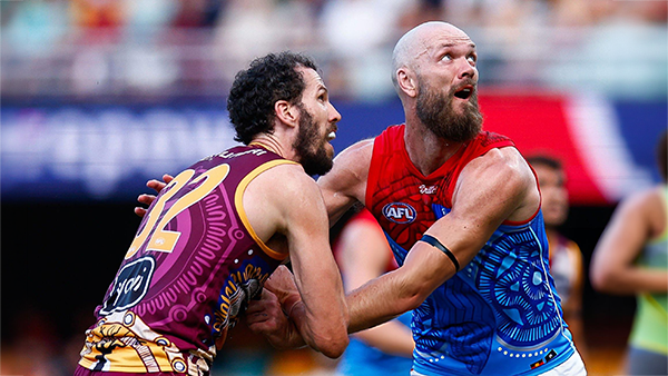
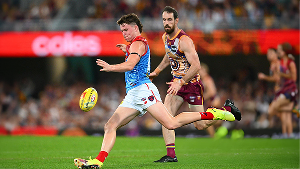
PREVIEW: Brisbnae
They really had me fooled when I picked them with great confidence to beat the Bombers at Gather Round last week. I should have recognised that nothing is more quintessentially Melbourne than defeating the undefeated early premiership favourite one week and losing to a winless cellar dweller on its way to establishing a record losing streak the next.- 6 replies
-
PREGAME: Brisbane
The Demons return to Melbourne and the hallowed turf of the MCG where they face dual reigning Premiers Brisbane on Sunday. Who comes in and who goes out?-
- 428 replies
-
-
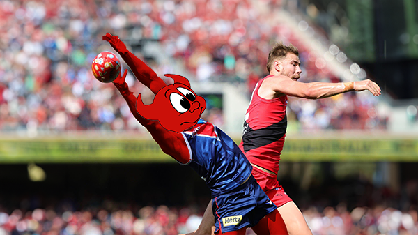
REPORT: Essendon
Melbourne’s much vaunted finishing power evaporated at Adelaide Oval on Saturday afternoon, exposed for the third time in four years by its Essendon Gather Round hoodoo.- 15 replies
-
POSTGAME: Essendon
From knocking off a Premiership contender to getting embarrassed by the winless Bombers who were on a 17 game losing streak .... Welcome Back MFCSS.-
-
- 384 replies
-
-
PODCAST: Essendon
Andy is still away on holidays for the next two weeks but the Demonland Podcast will proceed with Binman at the helm and this week joined by George to bring you their analysis of the disappointing loss to the Bombers.
-
-
- 22 replies
-
-
VOTES: Essendon
Captain Max Gawn has built a commanding lead in the Demonland Player of the Year Award from Kozzy Pickett & Jack Steele followed by Jacob van Rooyen and Tom Sparrow. Your votes please from the loss to the Bombers. 6, 5, 4, 3, 2 & 1.-
-
- 31 replies
-


|

|
|

|
 |
 |
 |
 |
 |
 |
 |
 |
Join the conversation
You can post now and register later. If you have an account, sign in now to post with your account.