
-
-
 Recently Browsing
0 members
Recently Browsing
0 members
- No registered users viewing this page.
-
Demonland Forums


-
-
Match Previews, Reports & Articles

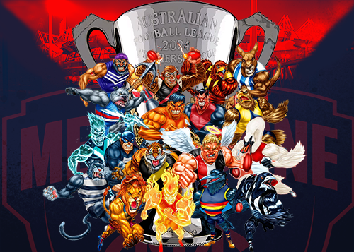
THE BLOW by Whispering Jack
Narrm’s finals prospects took a crushing blow after the team’s insipid performance at Optus Stadium against a confident Waaljit Marawar in the first of its Doug Nicholls Round outings for 2024. I use the description “crushing blow” advisedly because, although the season is not yet at it’s halfway mark, the Demons have now failed abysmally in two of their games against teams currently occupying bottom eight places on the ladder. The manner in which these losing games were played out w

HALF FULL by KC from Casey
It was a case of the Casey Demons going into a game with a glass half full in their match up against the Brisbane Lions at Casey Fields on Saturday. As the list of injured and unavailable AFL and VFL listed players continues to grow and with Melbourne taking all three emergencies to Perth for the weekend on a “just in case” basis, its little brother was always destined to struggle. Casey was left with only eight AFL listed players from who to select their team but only two - an out-of-form
PREGAME: Rd 11 vs St. Kilda
The Demons return to the MCG to take on the Saints in Round 11 on the back of two straight losses in a row. With Jake Lever out with concussion who comes in and who goes out?
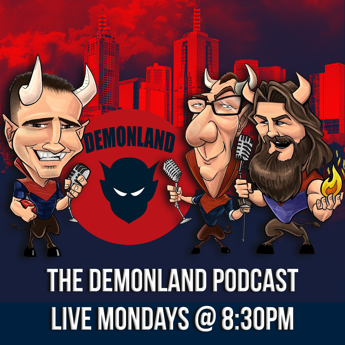
PODCAST: Rd 10 vs West Coast
The Demonland Podcast will air LIVE on Monday, 20th May @ 8:30pm. Join George, Binman & I as we dissect the Demons disaapoiting performance against the Eagles at Optus Stadium in Round 10. You questions and comments are a huge part of our podcast so please post anything you want to ask or say below and we'll give you a shout out on the show. If you would like to leave us a voicemail please call 03 9016 3666 and don't worry no body answers so you don't have to talk to a human.
VOTES: Rd 10 vs West Coast
Last week Captain Max Gawn consolidated his lead over reigning champion Christian Petracca in the Demonland Player of the Year Award. Steven May, Alex Neal-Bullen & Jake Lever make up the Top 5. Your votes for the loss against the Blues. 6, 5, 4, 3, 2, 1.
POSTGAME: Rd 10 vs West Coast
Many warned that this was a danger game and the Demons were totally outclassed all game by a young Eagles team at Optus Stadium in Perth as they were defeated by 35 points.
GAMEDAY: Rd 10 vs West Coast
It's Game Day and the Demons have returned to the site of their drought breaking Premiership to take on the West Coast Eagles in what could very well be a danger game for Narrm at Optus Stadium. A win and a percentage boost will keep the Dees in top four contention whilst a loss will cast doubt on the Dees flag credentials and bring them back to the pack fighting for a spot in the 8 as we fast approach the halfway point of the season.
WARNING by William from Waalitj
As a long term resident of Waalitj Marawar, I am moved to warn my fellow Narrm fans that a danger game awaits. The locals are no longer the easybeats who stumbled, fumbled and bumbled their way to the good fortune of gathering the number one draft pick and a generational player in Harley Reid last year. They are definitely better than they were then. Young Harley has already proven his worth with some stellar performances for a first year kid playing among men. He’s taken hangers, k
OVER YET? by KC from Casey
The Friday evening rush hour clash of two of the VFL’s 2024 minnows, Carlton and the Casey Demons was excruciatingly painful to watch, even if it was for the most part a close encounter. I suppose that since the game had to produce a result (a tie would have done the game some justice), the four points that went to Casey with the win, were fully justified because they went to the best team. In that respect, my opinion is based on the fact that the Blues were a lopsided combination that had
-
Tell a friend
-
Podcast

-
-
Podcast


-
Podcast Stream
Open Stream in
New Window

-
-
Support Demonland


 2021 Premiership
 Social Media


 Non MFC Games
NON-MFC: Round 10
Discussion of all the other games that don't involve the Demons in Round 10 ...
READ MORE
Demonland | Round 10 
Match Report 


THE BLOW by Whispering Jack
Narrm’s finals prospects took a crushing blow after the team’s insipid performance at Optus Stadium against a confident Waaljit Marawar in the first of its Doug Nicholls Round outings for 2024 ...
READ MOREDemonland | May 20 
Casey Report 


HALF FULL by KC from Casey
It was a case of the Casey Demons going into a game with a glass half full in their match up against the Brisbane Lions at Casey Fields on Saturday ...
READ MOREDemonland | May 20 
Post Game 
POSTGAME: Rd 10 vs West Coast
Many warned that this was a danger game and the Demons were totally outclassed all game by a young Eagles team at Optus Stadium in Perth as they were defeated by 35 points ...
READ MOREDemonland | May 19 
Votes 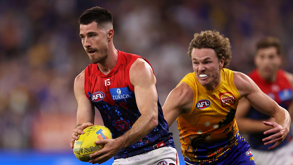
VOTES: Rd 10 vs West Coast
Last week Captain Max Gawn consolidated his lead over reigning champion Christian Petracca in the Demonland Player of the Year Award. Steven May, Alex Neal-Bullen & Jake Lever make up the Top 5. Your votes for the loss against the Blues. 6, 5, 4, 3, 2, 1 ...
READ MOREDemonland | May 19 
PreGame 
PREGAME: Rd 11 vs St. Kilda
The Demons return to the MCG to take on the Saints in Round 11 on the back of two straight losses in a row. With Jake Lever out with concussion who comes in and who goes out? ...
READ MOREDemonland | May 19 
Game Day 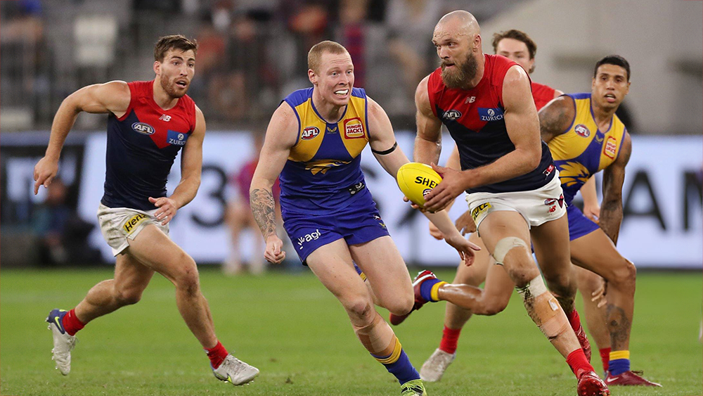
GAMEDAY: Rd 10 vs West Coast
It's Game Day and the Demons have returned to the site of their drought breaking Premiership to take on the West Coast Eagles in what could very well be a danger game for Narrm at Optus Stadium in Perth ...
READ MOREDemonland | May 19 
Match Preview 
WARNING by William from Waalitj
As a long term resident of Waalitj Marawar, I am moved to warn my fellow Narrm fans that a danger game awaits ...
READ MOREDemonland | May 16 
Latest Podcast 
PODCAST: Rd 10 vs West Coast
The boys analysed the disastrous loss to the West Coast Eagles in Perth and what it means for our Top 4 aspirations and how we respond ...
LISTENDemonland | May 21 
Player Interview 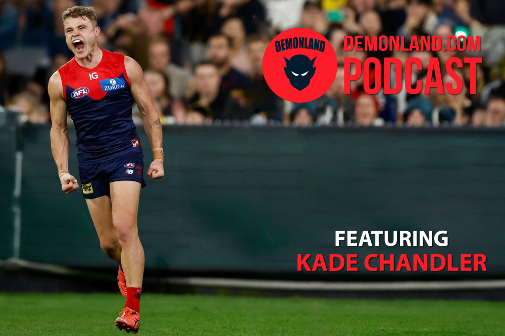
PODCAST: Kade Chandler Interview
I interview Kade Chandler about his road from being overlooked in the draft to his rookie listing to his apprenticeship as a sub to VFL premiership player to his breakout 2023 season to mainstay in the Forward line and much more ...
LISTENDemonland | May 01
Next Match . Round 11
vs
Sunday 26th May 2024
@ 03:20pm (MCG)
MFC Forum Match Previews & Reports Training Forum AFLW Forum 2024 Player Sponsorship TopicsInjury List
PLAYER INJURY LENGTH 
Jacob Van Rooyen Concussion Test 
Josh Schache Achilles TBC 
Charlie Spargo Achilles 2-3 Weeks 
Daniel Turner Calf 3-4 Weeks 
Jake Lever Knee 4 Weeks 
Marty Hore Calf 4-6 Weeks 
Jake Melksham ACL 5-7 Weeks 
Joel Smith Suspension TBA Player of the Year
PLAYER VOTES 1 
Max Gawn 111 2 
Christian Petracca 79 3 
Steven May 66 4 
Alex Neal-Bullen 58 5 Jake Lever 40 6 
Jack Viney 36 7 
Clayton Oliver 34 8 
Bayley Fritsch 31 9 
Kysaiah Pickett 23 10 
Trent Rivers 22
FULL TABLEDemonland Interviews


 Upcoming Events


Recommended Posts
Join the conversation
You can post now and register later. If you have an account, sign in now to post with your account.