Jump to content

New Emblem?


stuie

Recommended Posts

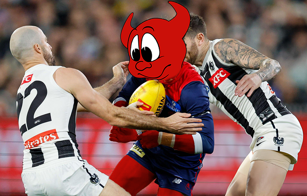
The current emblem is a dogs breakfast of symbolism. New one should definitely have a cartoon pic of Roosy with horns on his head. All class.

Nice, the couple of artists we have on here are working feverishly as we speak, it's probably already posted as I am typing this

Edited by Satyriconhome
Link to comment
Share on other sites

The team on the park reflects where we want to go, not an emblem, the emblem was introduced to replace that horrid modern red V and blue abomination, want to go back to that?......I do not want a Demon anywhere near the emblem/badge/brand....it is Americanised, cartoonish and childish

agreed we don't have to reinvent Our wheel, we just have to see where its gone 'off'; & re-spoke it to make it truer, & helpful to All who want to ride above it.

Link to comment
Share on other sites

Without want to rant here, I feel like this has Schwab's fingerprints all over it. I'm only speculating, but surely the designer would have said, 'you need to focus on a strong central theme'. I remember when they wheeled it out on the club website and they had a little video to explain every aspect. Every element seemed to be as important as the other. That doesn't speak designer to me. That speaks of an executive that doesn't understand design. Anyway, I still think that logo looks classy.

I agree. It's linked with our past failures, but I'd like to get away from that really. That said, I loved how Roos was conscious of the 'bloods' nickname and what it stood for. Even if he can something remotely similar with the Demon, I'll be a very happy man. But as you say, M, the connotation of the 'Demon' will change with our performances.

I actually spoke to an acquaintance from the company that worked on the logo, shortly before release.

I thought she was acting a bit funny based on the fact I was so interested in a boring football club logo.

When I spoke to her again not too long after, it was clear it was one of those graphic design client briefs where the designer wants to bang their head against a wall repeatedly. She was embarrassed by the eventual outcome.

I can see why people don't like it, and I agree that it is too busy, especially if you fancy yourself as a design guru.

I also think it works in a lot of ways.

The key is that it can work a lot better.

I'm all for change, as long as its an improvement.

  • Like 3
Link to comment
Share on other sites

Comes from a Toffee Lady who used to walk around the ground before kick off throwing toffees into the crowd. I have been an Evertonian since 1976 and was there when we won our last FA Cup, magical day

Pity you couldn't hand your cross town rivals the title this season. :P

Link to comment
Share on other sites


Maybe we can take the large sum of money out of football operations it would cost to think tank and design an emblem to everyone's taste.

Honestly we have far more important things to attend to, and put our limited funds toward, than a new logo.

I want to win games of footy and don't give two stuffs what emblem is on our polo shirts while we do so.

Brand is key to business success. The logo is linked to the brand. We are a business. Now that some of the basics are in place, I'm sure PJ sees this as an important platform to launch a new MFC. Metaphorically, next season we will be a different club. We'll also most importantly be competitive onfield.

Link to comment
Share on other sites

You've obviously never played a round at St Andrews

It's an emblem, it says to me MFC, that's all it is supposed to say, what do you want something Americanised, it asks you how you are and how your are feeling

Indeed, I've never played at the original Royal and Ancient. If you have, it might help to explain your otherwise bizarre defence of whatever the status quo happens to be. Don't know why you drag the Yanks in to bolster your case, but if you do really want to lose the demon, how about a nice traditional flower device? A stylised fuchsia?

  • Like 1
Link to comment
Share on other sites

As a City fan (since the early 90s so save the wisecracks :) ), I'm quite thankful they didn't.

I used to like City when they were little and non threatening. Now they're a McClub. Like Chel$ea. It's still great seeing them maul United though. Not going to congratulate you though, P. :P We lost it at Anfield with a Gerrard slip and why the heck didn't Rodgers play for a draw. Idiot.

Pity Liverpool couldn't have honoured Suarez' buy-out clause and handed the title to Arsenal.

Very happy we put our foot down on that one.

  • Like 1
Link to comment
Share on other sites

I actually spoke to an acquaintance from the company that worked on the logo, shortly before release.

I thought she was acting a bit funny based on the fact I was so interested in a boring football club logo.

When I spoke to her again not too long after, it was clear it was one of those graphic design client briefs where the designer wants to bang their head against a wall repeatedly. She was embarrassed by the eventual outcome.

I can see why people don't like it, and I agree that it is too busy, especially if you fancy yourself as a design guru.

I also think it works in a lot of ways.

The key is that it can work a lot better.

I'm all for change, as long as its an improvement.

Oh right, so she was a designer given a brief which she didn't like, she could have turned it down......commercial decision?

  • Like 1
Link to comment
Share on other sites

Without want to rant here, I feel like this has Schwab's fingerprints all over it. I'm only speculating, but surely the designer would have said, 'you need to focus on a strong central theme'. I remember when they wheeled it out on the club website and they had a little video to explain every aspect. Every element seemed to be as important as the other. That doesn't speak designer to me. That speaks of an executive that doesn't understand design. Anyway, I still think that logo looks classy.

I agree. It's linked with our past failures, but I'd like to get away from that really. That said, I loved how Roos was conscious of the 'bloods' nickname and what it stood for. Even if he can something remotely similar with the Demon, I'll be a very happy man. But as you say, M, the connotation of the 'Demon' will change with our performances.

Perhaps Roos would like it if we re-branded to the "red and bluebloods". Works on a number of levels.

Link to comment
Share on other sites

I used to like City when they were little and non threatening. Now they're a McClub. Like Chel$ea. It's still great seeing them maul United though. Not going to congratulate you though, P. :P We lost it at Anfield with a Gerrard slip and why the heck didn't Rodgers play for a draw. [censored].

Very happy we put our foot down on that one.

Yes but I support the People's Club,once a Blue always a Blue (I remember somebody from the Scully school of loyalty saying that once), you do know Suarez is about to leave again

I reckon Gerrard slipped (fell) coz he thought somebody was going to throw a punch at him, tried that one on my never missed a game in the KOP for over 50 years brother, not impressed

Indeed, I've never played at the original Royal and Ancient. If you have, it might help to explain your otherwise bizarre defence of whatever the status quo happens to be. Don't know why you drag the Yanks in to bolster your case, but if you do really want to lose the demon, how about a nice traditional flower device? A stylised fuchsia?

No, I just prefer classy, which the emblem is now, can appreciate people would like a change but let's spend the money on the FD, unless one of our graphic designers on here is willing to offer up the work for nothing

Link to comment
Share on other sites

Oh right, so she was a designer given a brief which she didn't like, she could have turned it down......commercial decision?

What? Do you have any understanding of graphic design?

The ever-changing mind-bogglingly-stupid brief is ubiquitous in graphic design.

The industry is littered with ignoramus clients who don't really have a clue what they really want, nor what good design is.

I'm not a graphic designer myself, and I'm glad of that.

They go through a lot of pain.

Do you EVER not defend the club as if it is some divine entity beyond reproach?

But instead of acknowledging what was clearly a messy conflicted brief trying to achieve far too many objectives, you choose to attack the designer for being supposedly money hungry?

You really are [censored] up.

Btw, my acquaintance didn't do the graphic design herself to my knowledge.

She just works there and was involved in it in some capacity.

I didn't push for details.

Link to comment
Share on other sites

I used to like City when they were little and non threatening. Now they're a McClub. Like Chel$ea. It's still great seeing them maul United though. Not going to congratulate you though, P. :P We lost it at Anfield with a Gerrard slip and why the heck didn't Rodgers play for a draw. [censored].

Meh, people are entitled to that opinion . I supported them when they dropped down to third tier so I'm not about to complain over getting to now watch them compete for European titles ever year. Unfortunately in the modern game you need money to be successful, pending on your definition of success.

Whilst I enjoyed the title, I arguably got more pleasure this season watching United's fall from "grace" :) The title win last season was something very special though.

I think many found BR's tactics both in that game and at Palace to be perplexing. Perhaps showing signing of his inexperience at the pointy end. Admirable effort from your mob though. I don't hate Liverpool like others do, possibly because I just really like the city and the people. Have been there a couple of times.

Anyhow, back on topic.

Link to comment
Share on other sites

What? Do you have any understanding of graphic design?

The ever-changing mind-bogglingly-stupid brief is ubiquitous in graphic design.

The industry is littered with ignoramus clients who don't really have a clue what they really want, nor what good design is.

I'm not a graphic designer myself, and I'm glad of that.

They go through a lot of pain.

Do you EVER not defend the club as if it is some divine entity beyond reproach?

But instead of acknowledging what was clearly a messy conflicted brief trying to achieve far too many objectives, you choose to attack the designer for being supposedly money hungry?

You really are [censored] up.

Btw, my acquaintance didn't do the graphic design herself to my knowledge.

She just works there and was involved in it in some capacity.

I didn't push for details.

You used it to launch an attack and justify your opinion on the emblem, so therefore I have the right to reply, it is quite simple, as I said in a previous post I was asked for my opinion on an earlier version before it went into production, a few of us were, we gave some input and it was listened to, what the Club got was exactly what it asked for, not as you say a messy conflicted brief.

If you friend is not the designer, then how do you know it was as you described

Edited by Satyriconhome
Link to comment
Share on other sites


Meh, people are entitled to that opinion . I supported them when they dropped down to third tier so I'm not about to complain over getting to now watch them compete for European titles ever year. Unfortunately in the modern game you need money to be successful, pending on your definition of success.

Whilst I enjoyed the title, I arguably got more pleasure this season watching United's fall from "grace" :) The title win last season was something very special though.

I think many found BR's tactics both in that game and at Palace to be perplexing. Perhaps showing signing of his inexperience at the pointy end. Admirable effort from your mob though. I don't hate Liverpool like others do, possibly because I just really like the city and the people. Have been there a couple of times.

Anyhow, back on topic.

what...and they let you live....Scousers must be mellowing!!!!

Link to comment
Share on other sites

I too knew someone who worked on the current emblem. Not that closely. But he knew I was a Melbourne supporter, was not proud to show me the finished product. Indicated that they preferred it pared down, but that the directive was to include the symbols that were offered by the club. Ours is the busiest looking logo/emblem in the AFL IMO.

Those indicating that the resources put into this are at the expense of the FD are kidding themselves. PJ is all over the books and wouldn't change too much unless it was financially prudent and viable. The brand helps sell the club, a poor brand does this poorly. If it is done well, it will pay itself back. Couple this with a rise up the ladder and our marketing will proffer.

  • Like 1
Link to comment
Share on other sites

You used it to launch an attack and justify your opinion on the emblem, so therefore I have the right to reply, it is quite simple, as I said in a previous post I was asked for my opinion on an earlier version before it went into production, a few of us were, we gave some input and it was listened to, what the Club got was exactly what it asked for, not as you say a messy conflicted brief.

If you friend is not the designer, then how do you know it was as you described

What world do you live in? "Launch an attack"??

You act as if you have a "right of reply" because it's your job to defend the club, not matter how shaky the ground is that you're taking your stance on.

I don't know that she did it herself, and she clearly wanted to distance herself from it.

Whether she did the design or not, I cannot say.

It was inferred that she didn't and I didn't want to press the issue.

As I said, an acquaintance, brief discussion that she didnt want to discuss too much, wasn't a very pleasant experience, and the final product was not of the standard that you'd usually want your name associated with.

But all of that is immaterial.

I've worked in places with in-house graphic designers before, and I didn't need to be one to see how painful and misguided a lot of clients are. How often they can change their mind or be completely rigid in what they want, irrespective of how it will look.

Schwab may have got exactly what he asked for, as he should expect to - that does not mean it wasn't an inherently flawed brief.

As I said previously, the emblem works on some levels.

But at the end of the day, it is outdated, too busy and could work better.

There's nothing wrong with admitting that.

And finally - you may have given feedback that was implemented.

That's exactly what you should expect as a proxy for the client, giving feedback to the designer.

But your feedback was still shite.

Link to comment
Share on other sites

You used it to launch an attack and justify your opinion on the emblem, so therefore I have the right to reply, it is quite simple, as I said in a previous post I was asked for my opinion on an earlier version before it went into production, a few of us were, we gave some input and it was listened to, what the Club got was exactly what it asked for, not as you say a messy conflicted brief.

If you friend is not the designer, then how do you know it was as you described

With all due respect, therein lies the problem.

You're a supporter Sat, just like me, and whilst we might think we know what's good for an emblem people are paid to make those decisions. If Schwab et.al were actually asking supporters who regularly rocked up to training for emblem advice we were far more in strife than I ever anticipated.

  • Like 3
Link to comment
Share on other sites

With all due respect, therein lies the problem.

You're a supporter Sat, just like me, and whilst we might think we know what's good for an emblem people are paid to make those decisions. If Schwab et.al were actually asking supporters who regularly rocked up to training for emblem advice we were far more in strife than I ever anticipated.

Bang on.

Link to comment
Share on other sites

What world do you live in? "Launch an attack"??

You act as if you have a "right of reply" because it's your job to defend the club, not matter how shaky the ground is that you're taking your stance on.

I don't know that she did it herself, and she clearly wanted to distance herself from it.

Whether she did the design or not, I cannot say.

It was inferred that she didn't and I didn't want to press the issue.

As I said, an acquaintance, brief discussion that she didnt want to discuss too much, wasn't a very pleasant experience, and the final product was not of the standard that you'd usually want your name associated with.

But all of that is immaterial.

I've worked in places with in-house graphic designers before, and I didn't need to be one to see how painful and misguided a lot of clients are. How often they can change their mind or be completely rigid in what they want, irrespective of how it will look.

Schwab may have got exactly what he asked for, as he should expect to - that does not mean it wasn't an inherently flawed brief.

As I said previously, the emblem works on some levels.

But at the end of the day, it is outdated, too busy and could work better.

There's nothing wrong with admitting that.

And finally - you may have given feedback that was implemented.

That's exactly what you should expect as a proxy for the client, giving feedback to the designer.

But your feedback was still shite.

I didn't give my feedback to the designer, I gave it to the Club, so you are wrong again, I am not defending the Club, your opinion is that it is outdated, too busy and could work better, I don't agree....horror upon horror but then again I think Barcelona's design upon which it is based is one of the best in Europe, each to their own

Any commercial design enterprise can turn down a brief, or they can accept it and then whinge about it, classy

Link to comment
Share on other sites

Oh good, let's break even this season, but look at putting more money into the Footy Dept next season or let's get a new emblem again after four years and have to spend money on changing everything again, jumpers, signage, letterheads, merchandising...sigh and sigh...any way agree must we go back to cartoonish emblems..why?....and besides which if it is going to have a name on surely the name should be Dees, don't hear many people calling MFC the Demons these days....

What is a 'Dee' ? [censored] idea

Link to comment
Share on other sites

Join the conversation

You can post now and register later. If you have an account, sign in now to post with your account.

Guest
Unfortunately, your content contains terms that we do not allow. Please edit your content to remove the highlighted words below.
Reply to this topic...

×   Pasted as rich text.   Paste as plain text instead

  Only 75 emoji are allowed.

×   Your link has been automatically embedded.   Display as a link instead

×   Your previous content has been restored.   Clear editor

×   You cannot paste images directly. Upload or insert images from URL.

  • Recently Browsing   0 members

    • No registered users viewing this page.
  • Demonland Forums  

  • Match Previews, Reports & Articles  

    GETAWAY by Meggs

    Calling all fit players. Expect every available Melbourne player to board the Virgin cross-continent flight to Perth for this Round 4 clash on Saturday afternoon at Fremantle Oval. It promises to be keenly contested, though Fremantle is the bookies clear favourite.  If we lose, finals could be remoter than Rottnest Island especially following on from the Dees 50-point dismantlement by North Melbourne last Sunday.  There are 8 remaining matches, over the next 7 weeks.  To Meggs’

    Demonland
    Demonland |
    AFLW Melbourne Demons

    DRUBBING by Meggs

    With Casey Fields basking in sunshine, an enthusiastic throng of young Demons fans formed a guard of honour for the evergreen and much admired 75-gamer Paxy Paxman. As the home team ran out to play, Paxy’s banner promised that the Demons would bounce back from last week’s loss to Brisbane and reign supreme.   Disappointingly, the Kangaroos dominated the match to win by 50 points, but our Paxy certainly did her bit.  She was clearly our best player, sweeping well in defence.

    Demonland
    Demonland |
    AFLW Melbourne Demons 4

    GARNER STRENGTH by Meggs

    In keeping with our tough draw theme, Week 3 sees Melbourne take on flag favourites, North Melbourne, at Casey Fields this Sunday at 1:05pm.  The weather forecast looks dry, a coolish 14 degrees and will be characteristically gusty.  Remember when Casey Fields was considered our fortress?  The Demons have lost two of their past three matches at the Field of Dreams, so opposition teams commute down the Princes Highway with more optimism these days.  The Dees held the highe

    Demonland
    Demonland |
    AFLW Melbourne Demons 1

    ALLY’S FIELDS by Meggs

    It was a sunny morning at Casey Fields, as Demon supporters young and old formed a guard of honour for fan favourite and 50-gamer Alyssa Bannan.  Banno’s banner stated the speedster was the ‘fastest 50 games’ by an AFLW player ever.   For Dees supporters, today was not our day and unfortunately not for Banno either. A couple of opportunities emerged for our number 6 but alas there was no sizzle.   Brisbane atoned for last week’s record loss to North Melbourne, comprehensively out

    Demonland
    Demonland |
    AFLW Melbourne Demons 1

    GOOD MORNING by Meggs

    If you are driving or training it to Cranbourne on Saturday, don’t forget to set your alarm clock. The Melbourne Demons play the reigning premiers Brisbane Lions at Casey Fields this Saturday, with the bounce of the ball at 11:05am.  Yes, that’s AM.   The AFLW fixture shows deference to the AFL men’s finals games.  So, for the men it’s good afternoon and good evening and for the women it’s good morning.     The Lions were wounded last week by 44 points, their highest ever los

    Demonland
    Demonland |
    AFLW Melbourne Demons 3

    HORE ON FIRE by Meggs

    The 40,000 seat $319 million redeveloped Kardinia Park Stadium was nowhere near capacity last night but the strong, noisy contingent of Melbourne supporters led by the DeeArmy journeyed to Geelong to witness a high-quality battle between two of the best teams in AFLW.   The Cats entered the arena to the blasting sounds of Zombie Nation and made a hot start kicking the first 2 goals. They brought tremendous forward half pressure, and our newly renovated defensive unit looked shaky.

    Demonland
    Demonland |
    AFLW Melbourne Demons 11

    REMATCH by Meggs

    The Mighty Demons take on the confident Cats this Saturday night at the recently completed $319 million redeveloped GMHBA Stadium, with the bounce of the ball at 7:15pm. Our last game of 2023 was an agonisingly close 5-point semi-final loss to Geelong, and we look forward to Melbourne turning the tables this week. Practice match form was scratchy for both teams with the Demons losing practice matches to Carlton and Port Adelaide, while the Cats beat Collingwood but then lost to Essendo

    Demonland
    Demonland |
    AFLW Melbourne Demons

    WELCOME 2024 by Meggs

    It’s been hard to miss the seismic global momentum happening in Women’s sport of late. The Matildas have been playing to record sell-out crowds across Australia and ‘Mary Fowler is God’ is chalked onto footpaths everywhere. WNBA basketball rookie sensation Caitlin Clark has almost single-handedly elevated her Indiana Fever team to unprecedented viewership, attendances and playoffs in the USA.   Our female Aussie Paris 2024 Olympians won 13 out of Australia’s all-time record 18 gol

    Demonland
    Demonland |
    AFLW Melbourne Demons 3

    EPILOGUE by Whispering Jack

    I sit huddled in near darkness, the only light coming through flickering embers in a damp fireplace, the room in total silence after the thunderstorm died. I wonder if they bothered to restart the game.  No point really. It was over before it started. The team’s five star generals in defence and midfield ruled out of the fray, a few others missing in action against superior enemy firepower and too few left to fly the flag for the field marshal defiantly leading his outnumbered army int

    Demonland
    Demonland |
    Match Reports 6
  • Tell a friend

    Love Demonland? Tell a friend!

×
×
  • Create New...