
-
-
 Recently Browsing
0 members
Recently Browsing
0 members
- No registered users viewing this page.
-
Demonland Forums


-
-
Match Previews, Reports & Articles

CLEAN HANDS by KC from Casey
The Casey Demons headed into town and up Sydney Road to take on the lowly Coburg Lions who have been perennial VFL easy beats and sitting on one win for the season. Last year, Casey beat them in a practice match when resting their AFL listed players. That’s how bad they were. Nobody respected them on Saturday and clearly not the Demons who came to the game with 22 players (ten MFC), but whether they came out to play is another matter because for the most part, their intensity was lacking an

ALAS SPRINGS by Whispering Jack
I got the word on Saturday from someone who knows someone inside the Fremantle camp that the Dockers were pumped and supremely confident about getting the W the next day against Melbourne at TIO Traeger Park in the red heart of the country. I was informed that the Dockers were extremely confident for a number of reasons. They had beaten the Demons on their home territory at the MCG at their last two meetings so they didn’t see beating them at Alice Springs as a problem. They belie
PREGAME: Rd 13 vs Collingwood
The Demons head back to Melbourne after an embarrassing loss to the Dockers to take on the Magpies at the MCG on Kings Birthday. With a calf injury to Lachie Hunter and Jacob van Rooyen possibly returning from injury who comes in and who goes out?
PODCAST: Rd 12 vs Fremantle
The Demonland Podcast will air LIVE on Monday, 3rd June @ 8:30pm. Join George, Binman & I as we dissect the Demons embarrasing loss to Fremantle in Alice Springs. You questions and comments are a huge part of our podcast so please post anything you want to ask or say below and we'll give you a shout out on the show. If you would like to leave us a voicemail please call 03 9016 3666 and don't worry no body answers so you don't have to talk to a human. Listen & Chat LIVE: ht
VOTES: Rd 12 vs Fremantle
Captain Max Gawn has a considerable lead over reigning champion Christian Petracca in the Demonland Player of the Year Award. Steven May, Alex Neal-Bullen & Jack Viney make up the Top 5. Your votes for the embarrassing loss against the Dockers. 6, 5, 4, 3, 2, 1.
POSTGAME: Rd 12 vs Fremantle
The Demons were blown out of the water and were absolutely embarrassing against the Fremantle Dockers in Alice Springs ultimately going down by 92 points and getting bundled out of the Top 8 for the first time since 2020.
GAMEDAY: Rd 12 vs Fremantle
It's Game Day and the Demons and the Dockers meet on halfway on neutral territory in the heart of the country in Alice Springs and the Dees need to win to hold onto a place in the Top 4.
TROUBLE by The Oracle
Situated roughly in Australia's geographic centre, Alice Springs has for many years been a troubled town suffering from intermittent crime waves, particularly among its younger residents. There was a time a little while ago when things were so bad that some even doubted the annual AFL game in the town would proceed. Now, the hope is that this Sunday’s Melbourne vs Fremantle encounter will bring joy to the residents of the town and that through the sport and the example of the participants,
Welcome to Demonland: Luker Kentfield
With the Melbourne Football Club's first pick in the 2024 AFL Mid-Season Draft and pick number 11 overall the Demon's selected Western Australian key forward Luker Kentfield from Subiaco.
-
Tell a friend
-
Podcast

-
-
Podcast


-
Podcast Stream
Open Stream in
New Window

-
-
Support Demonland


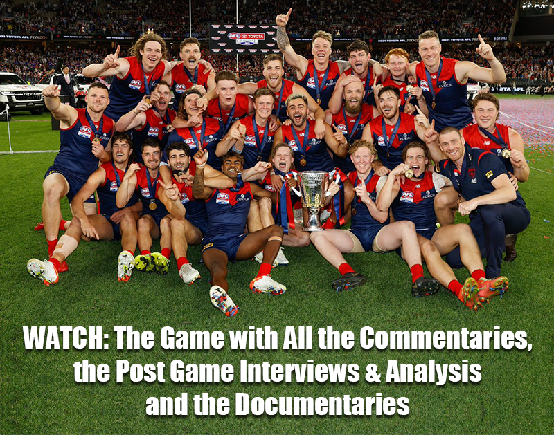
 2021 Premiership
 Social Media


 Non MFC Games
NON-MFC: Round 13
Discussion of all the other games that don't involve the Demons in Round 13 ...
READ MORE
Demonland | Round 13 
Latest Podcast 


PODCAST: Rd 12 vs Fremantle
The boys analysed the embarrassing loss to the Fremantle Dockers in Alice Springs before previewing how we bounce back against the Pies on Kings Birthday ...
LISTENDemonland | June 04 
PreGame 

PREGAME: Rd 13 vs Collingwood
The Demons head back to Melbourne after an embarrassing loss to the Dockers to take on the Magpies at the MCG on Kings Birthday. With a calf injury to Lachie Hunter and Jacob van Rooyen possibly returning from injury who comes in and who goes out? ...
READ MOREDemonland | June 04 
Match Report 
ALAS SPRINGS by Whispering Jack
I got the word on Saturday from someone who knows someone inside the Fremantle camp that the Dockers were pumped and supremely confident about getting the W the next day against Melbourne at TIO Traeger Park in the red heart of the country ...
READ MOREDemonland | June 03 
Casey Report 


CLEAN HANDS by KC from Casey
The Casey Demons headed into town and up Sydney Road to take on the lowly Coburg Lions who have been perennial VFL easy beats and sitting on one win for the season ...
READ MOREDemonland | June 03 
Post Game 
POSTGAME: Rd 12 vs Fremantle
The Demons were blown out of the water and were absolutely embarrassing against the Fremantle Dockers in Alice Springs ultimately going down by 92 points and getting bundled out of the Top 8 for the first time since 2020 ...
READ MOREDemonland | June 02 
Votes 
VOTES: Rd 12 vs Fremantle
Captain Max Gawn has a considerable lead over reigning champion Christian Petracca in the Demonland Player of the Year Award. Steven May, Alex Neal-Bullen & Jack Viney make up the Top 5. Your votes for the embarrassing loss against the Dockers. 6, 5, 4, 3, 2, 1 ...
READ MOREDemonland | June 02 
Game Day 
GAMEDAY: Rd 12 vs Fremantle
It's Game Day and the Demons and the Dockers meet on halfway on neutral territory in the heart of the country in Alice Springs and the Dees need to win to hold onto a place in the Top 4 ...
READ MOREDemonland | June 02 
Match Preview 
TROUBLE by The Oracle
This week’s round involves the first of the second group of byes in 2024 and added attention to the two teams fighting for ascendancy in the logjam of clubs in the race for one of the competition’s vital top four spots ...
READ MOREDemonland | May 30 
2024 Midseason Draft 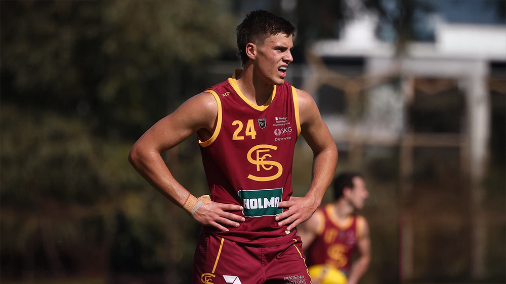
Welcome to Demonland: Luker Kentfield
With the Melbourne Football Club's first pick in the 2024 AFL Midseason Draft and pick number 11 overall the Demon's selected key forward Luker Kentfield from Subiaco ...
READ MOREDemonland | May 29 
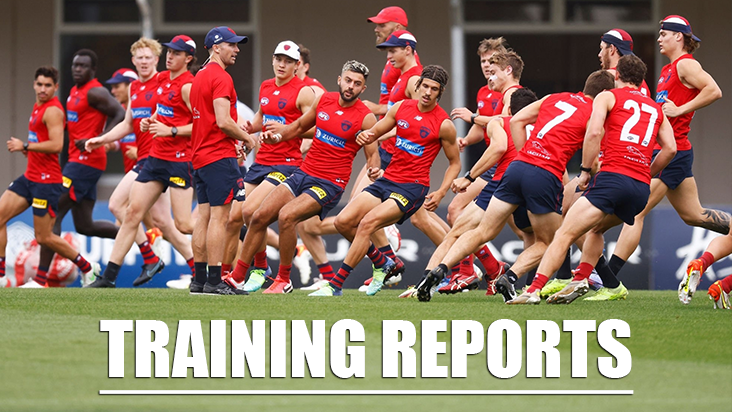
Training 

Tuesday, 28th May 2024
Veteran Demonland Trackwatcher Kev Martin returned to the training track to bring you the following observations from Gosch's Paddock this morning ...
READ MOREDemonland | May 28 
Player Interview 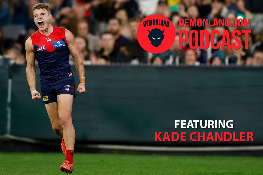
PODCAST: Kade Chandler Interview
I interview Kade Chandler about his road from being overlooked in the draft to his rookie listing to his apprenticeship as a sub to VFL premiership player to his breakout 2023 season to mainstay in the Forward line and much more ...
LISTENDemonland | May 01
Next Match . Round 13
vs
Monday 10th June 2024
@ 03:20pm (MCG)
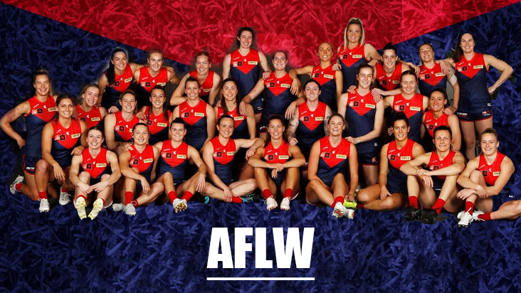
MFC Forum Match Previews & Reports Training Forum AFLW Forum 2024 Player Sponsorship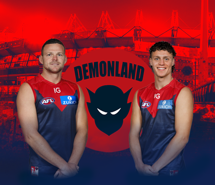 TopicsInjury List
PLAYER INJURY LENGTH 
Jacob van Rooyen Adductor Test 
Marty Hore Calf 1-2 Weeks 
Josh Schache Foot 1-2 Weeks 
Jake Lever Knee 2-3 Weeks 
Jake Melksham ACL 2-4 Weeks 
Lachie Hunter Calf 4-6 Weeks 
Charlie Spargo Achilles TBC 
Joel Smith Suspension TBA Player of the Year
PLAYER VOTES 1 
Max Gawn 138 2 
Christian Petracca 97 3 
Steven May 70 4 
Alex Neal-Bullen 64 5 
Jack Viney 49 6 Jake Lever 40 7 
Clayton Oliver 36 8 
Christian Salem 35 9 
Bayley Fritsch 31 10 
Judd McVee 27
FULL TABLEDemonland Interviews


 Upcoming Events


Recommended Posts
Join the conversation
You can post now and register later. If you have an account, sign in now to post with your account.