
Clash Strip 2011
152 members have voted
-
-
 Recently Browsing
0 members
Recently Browsing
0 members
- No registered users viewing this page.
-
Demonland Forums


-
-
Match Previews, Reports & Articles

WILDCARDS by KC from Casey
Casey’s season continued to drift into helplessness on Sunday when they lost another home game by a narrow margin, this time six points, in their Round 13 clash with North Melbourne’s VFL combination. The game was in stunning contrast to their last meeting at the same venue when Casey won the VFL Wildcard Match by 101 points. Back then, their standout players were Brodie Grundy and James Jordon who are starring in the AFL with ladder leaders, the Sydney Swans (it turned out to be their last

LIFE SUPPORT by Whispering Jack
With Melbourne’s season hanging on a thread, Saturday night’s game against North Melbourne unfolded like a scene in a hospital emergency department. The patient presented to the ward in a bad way. Doctors and nurses pumped life-saving medication into his body and, in the ensuing half hour, he responded with blood returning to his cheeks as he stirred back to life. After a slight relapse, the nurses pumped further medication into the bloodstream and the prognosis started looking good as the
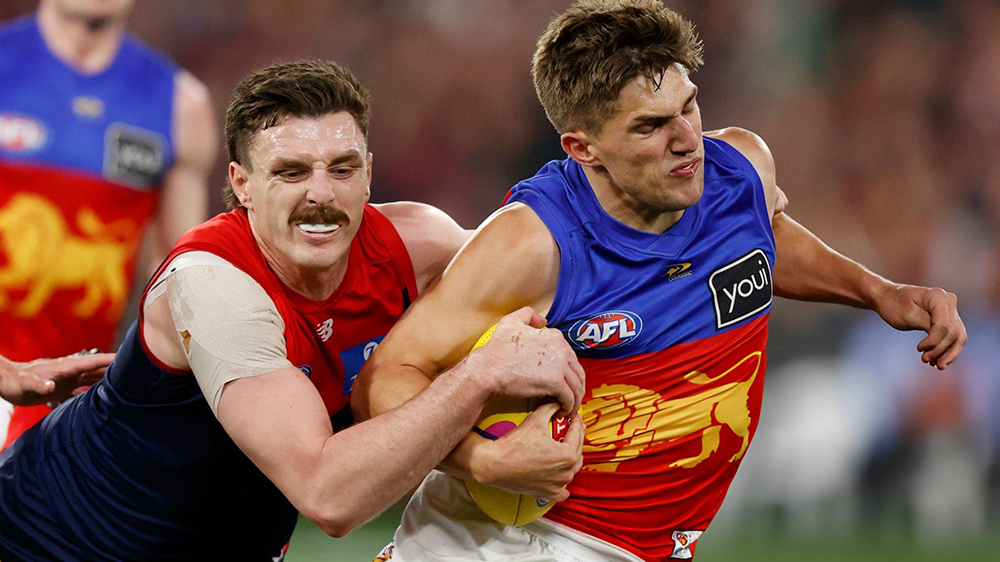
PREGAME: Rd 16 vs Brisbane
The Demons head back on the road for their fifth interstate trip this season when they head up to Brisbane to take on the Lions under lights on Friday night at the Gabba. Who comes in and who goes out?
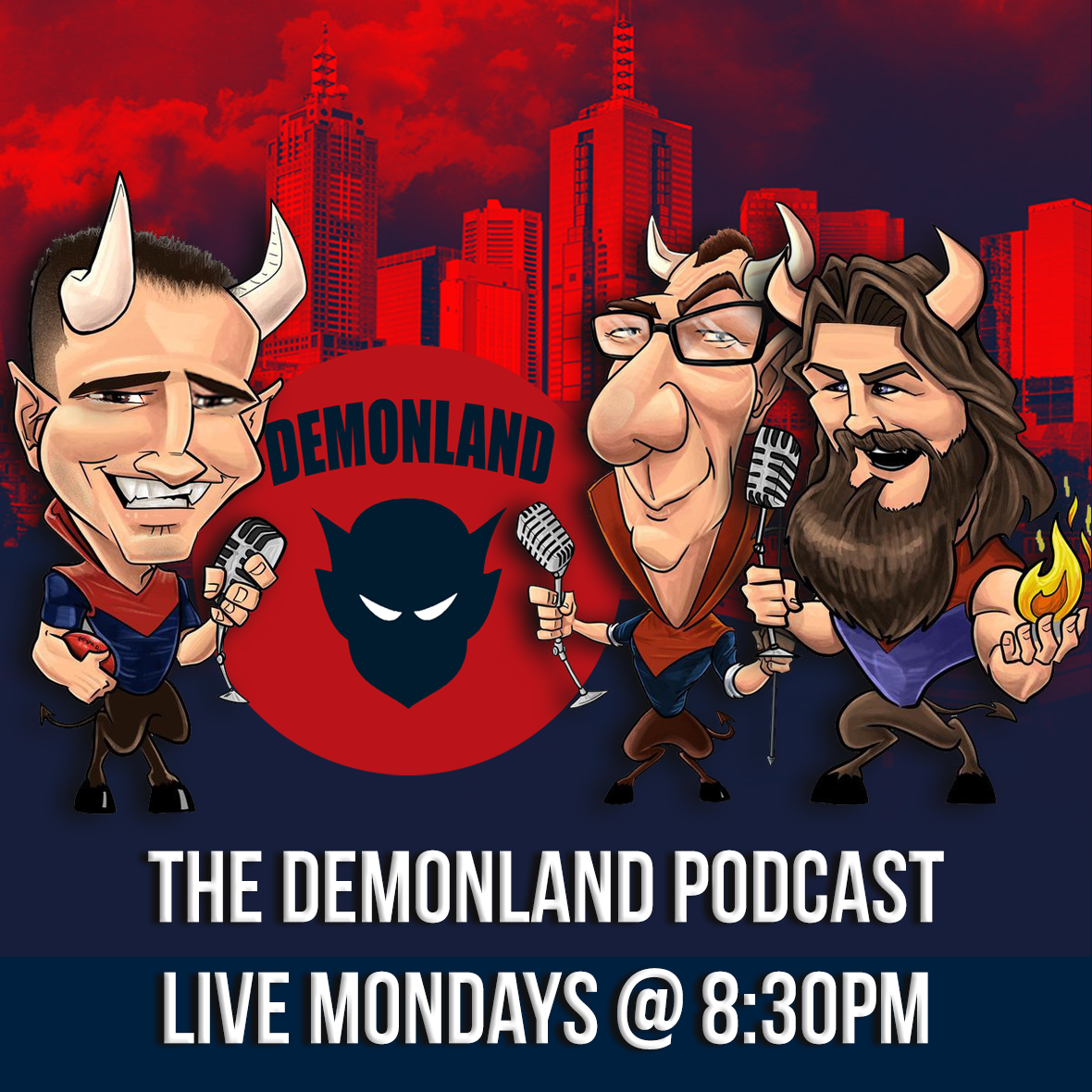
PODCAST: Rd 15 vs North Melbourne
The Demonland Podcast will air LIVE on Tuesday, 25th June @ 8:30pm. Join George, Binman & I as we analyse the Demons victory at the MCG over the Kangaroos in the Round 15. You questions and comments are a huge part of our podcast so please post anything you want to ask or say below and we'll give you a shout out on the show. If you would like to leave us a voicemail please call 03 9016 3666 and don't worry no body answers so you don't have to talk to a human. Listen & Chat
VOTES: Rd 15 vs North Melbourne
Captain Max Gawn has a considerable lead over the injured reigning champion Christian Petracca in the Demonland Player of the Year Award. Alex Neal-Bullen, Steven May, & Jack Viney make up the Top 5. Your votes for the loss against the Kangaroos. 6, 5, 4, 3, 2, 1.
POSTGAME: Rd 15 vs North Melbourne
The Demons almost blew a six goal lead and ultimately hung on to win by three points over the North Melbourne Kangaroos at the MCG and have temporarily jumped back into the Top 8.
GAMEDAY: Rd 15 vs North Melbourne
It's Game Day and it very well could be the last roll of the dice for the Demon's finals aspirations in 2024. A loss to the bottom side would be another embarrassing moment in a cursed year for the Dees whilst a win could be the spark they need to reignite the fire in the belly.
THE HUNTER by The Oracle
Something struck me as I sat on the couch watching the tragedy of North Melbourne’s attempt to beat Collingwood unfold on Sunday afternoon at the MCG. It was three quarter time, the scoreboard had the Pies on 12.7.79, a respectable 63.16% in terms of goal kicking ratio. Meanwhile, the Roos’ 18.2.110 was off the charts at 90.00% shooting accuracy. I was thinking at the same time of Melbourne’s final score only six days before, a woeful 6.15.51 or 28.57% against Collingwood’s 14.5.89
FROZEN by Whispering Jack
Who would have thought? Collingwood had a depleted side with several star players out injured, Max Gawn was in stellar form, Christian Petracca at the top of his game and Simon Goodwin was about to pull off a masterstroke in setting Alex Neal-Bullen onto him to do a fantastic job in subduing the Magpies' best player. Goody had his charges primed to respond robustly to the challenge of turning around their disappointing performance against Fremantle in Alice Springs. And if not that, t
-
Tell a friend
-
Podcast

-
-
Podcast


-
Podcast Stream
Open Stream in
New Window

-
-
Support Demonland


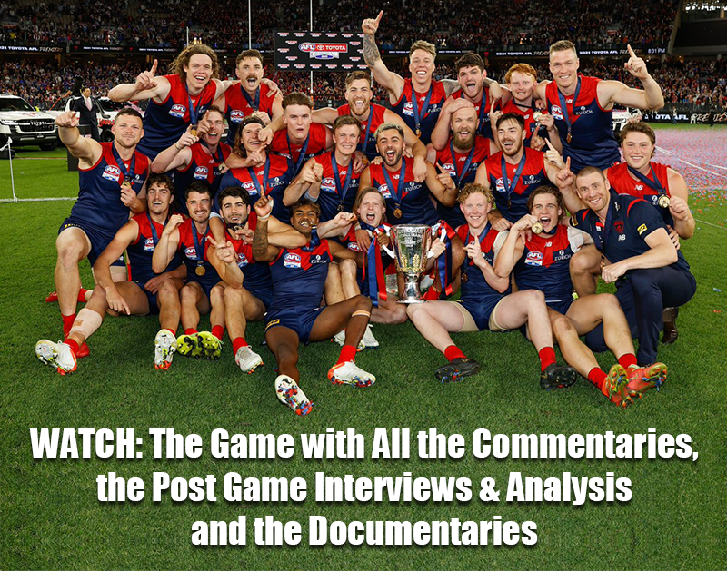
 2021 Premiership
 Social Media


 Non MFC Games
NON-MFC: Round 15
Discussion of all the other games that don't involve the Demons in Round 15 ...
READ MORE
Demonland | Round 15 
Latest Podcast 

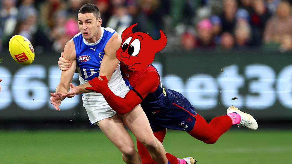
PODCAST: Rd 15 vs North Melbourne
The boys dissected the Dees win which felt like a loss over the Kangaroos and pondered whether season 2024 is slipping from our grasp ...
LISTENDemonland | June 26 
Casey Report 
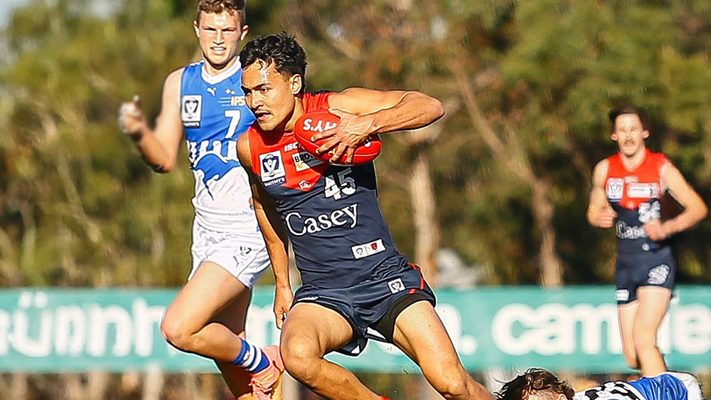
WILDCARDS by KC from Casey
Casey’s season continued to drift into helplessness on Sunday when they lost another home game by a narrow margin, this time six points, in their Round 13 clash with North Melbourne’s VFL combination ...
READ MOREDemonland | June 25 
Match Report 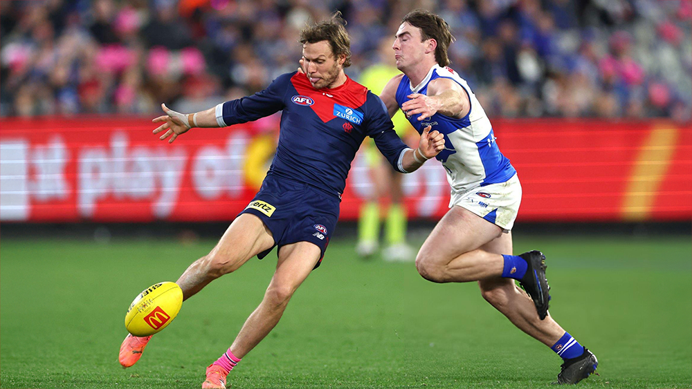
LIFE SUPPORT by Whispering Jack
With Melbourne’s season hanging on a thread, Saturday night’s game against North Melbourne unfolded like a scene in a hospital emergency department ...
READ MOREDemonland | June 24 
Post Game 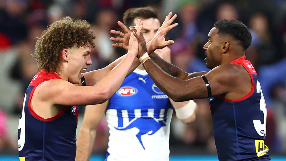
POSTGAME: Rd 15 vs North Melbourne
The Demons almost blew a six goal lead and ultimately hung on to win by three points over the North Melbourne Kangaroos at the MCG and have temporarily jumped back into the Top 8 ...
READ MOREDemonland | June 22 
Votes 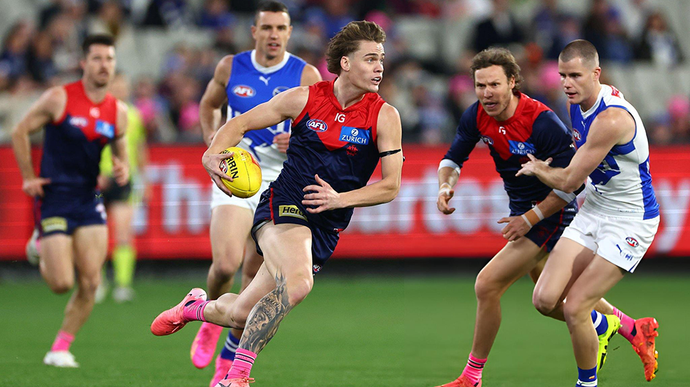
VOTES: Rd 15 vs North Melbourne
Captain Max Gawn has a considerable lead over the injured reigning champion Christian Petracca in the Demonland Player of the Year Award. Alex Neal-Bullen, Steven May, & Jack Viney make up the Top 5. Your votes for the loss against the Kangaroos. 6, 5, 4, 3, 2, 1 ...
READ MOREDemonland | June 22 
PreGame 
PREGAME: Rd 16 vs Brisbane
The Demons head back on the road for their fifth interstate trip this season when they head up to Brisbane to take on the Lions under lights on Friday night at the Gabba. Who comes in and who goes out? ...
READ MOREDemonland | June 22 
Game Day 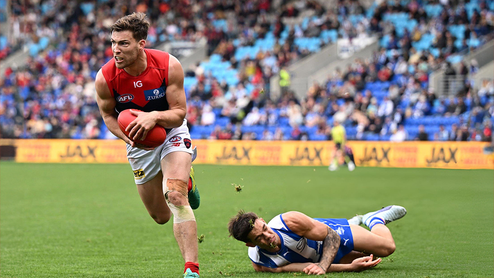
GAMEDAY: Rd 15 vs North Melbourne
IIt's Game Day and it very well could be the last roll of the dice for the Demon's finals aspirations in 2024. A loss to the bottom side would be another embarrassing moment in a cursed year for the Dees whilst a win could be the spark they need to reignite the fire in the belly ...
READ MOREDemonland | June 22 
Match Preview 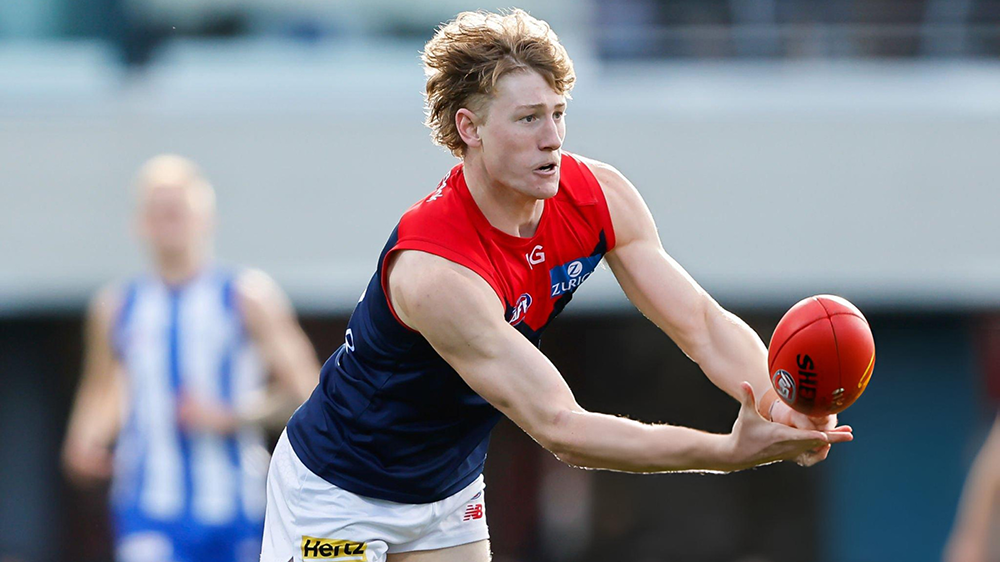
THE HUNTER by The Oracle
Something struck me as I sat on the couch watching the tragedy of North Melbourne’s attempt to beat Collingwood unfold on Sunday afternoon at the MCG ...
READ MOREDemonland | June 19 
Next Match . Round 16
vs
Friday 28th June 2024
@ 07:40pm (Gabba)
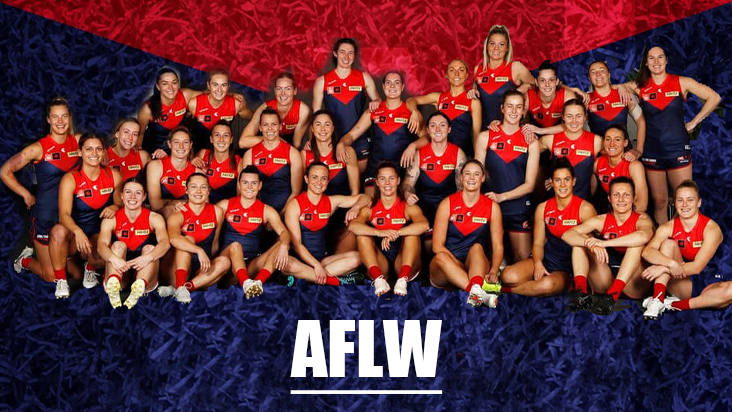
MFC Forum Match Previews & Reports Training Forum AFLW Forum 2024 Player Sponsorship TopicsInjury List
PLAYER INJURY LENGTH 
Lachie Hunter Calf Available 
Jake Lever Knee Available 
Christian Salem Knee Test 
Marty Hore Calf 1 Week 
Jake Melksham ACL 1-2 Weeks 
Will Verrall Concussion 1-2 Weeks 
Ben Brown Knee TBC 
Charlie Spargo Achilles TBC 
Joel Smith Suspension TBA 
Christian Petracca Ribs Season Player of the Year
PLAYER VOTES 1 
Max Gawn 158 2 Christian Petracca 97 3 
Steven May 83 4 
Alex Neal-Bullen 80 5 
Jack Viney 66 6 Christian Salem 44 7 
Trent Rivers 42 8 Jake Lever 40 9 
Clayton Oliver 36 10 
Kysaiah Pickett 33
FULL TABLEDemonland Interviews


 Upcoming Events


.thumb.jpg.ef82ebb9e23aa5dc10fd1fa3072ff65c.jpg)


Recommended Posts