


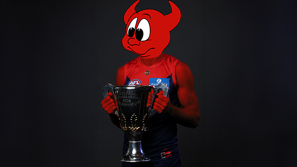
Cryptic Message on MFC Social Media - New MFC Logo

Featured Replies
Featured Content
-
PODCAST: 2026 Season Preview
The boys previewed the 2026 Season sharing their early impressions of the new coach, the new players, observations from preseason training, and what they've made of the new game style. They also look ahead to the season with their predictions, the players they expect to rise, their expectations for the team, and what they see as a realistic pass mark for Melbourne in 2026.- 6 replies
-
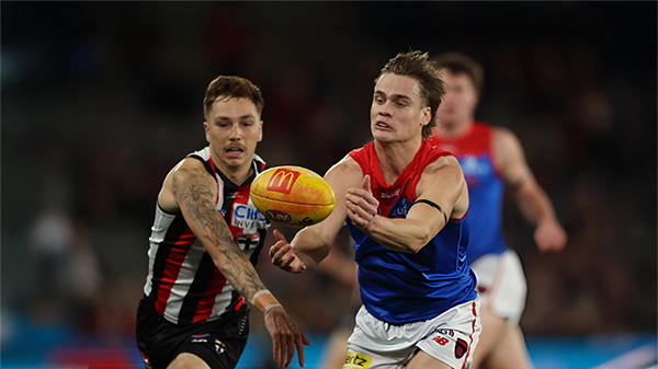
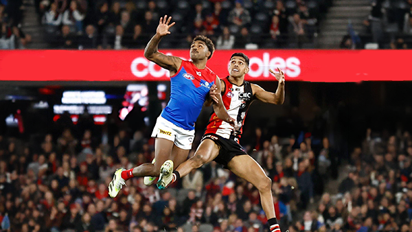
PREVIEW: St. Kilda
When the Demons blew their 46-point lead at Marvel Stadium in Round 20 last year, the fallout was enormous. Like an event straight out of a Shakespearean tragedy, Melbourne’s final-quarter collapse left fans reeling and the club grappling with the aftermath.- 2 replies
-
PREGAME: St. Kilda
With just over two weeks until their opening match of the 2026 AFL Premiership season, the Demons are already well on the path to redemption and have the Saints firmly in their sights ahead of their mid-March clash at the MCG. What do you think the team will look like when they run out on to the G?-
-
- 379 replies
-
-
NON-MFC: 2026 Opening Round
Finally the 2026 AFL Premiership Season is upon us. While Melbourne sits out Opening Round, there is still plenty of footy to enjoy with five non-MFC clashes to kick off the new season. It all begins on Thursday night with a blockbuster at the SCG as Sydney hosts Carlton in what should be a strong early test for both sides. On Friday night, Gold Coast gets its chance to open the season in front of a home crowd when the Suns and Christian Petracca take on Geelong at People First Stadium. Saturday features a double-header, starting in the afternoon with Greater Western Sydney and Clayton Oliver meeting the Hawks at Engie Stadium. That is followed on Saturday night by Brisbane Lions hosting the Western Bulldogs at the Gabba, with the Lions embarking on their campaign to win the Threepeat. Opening Round wraps up on Sunday night at the MCG, where St Kilda takes on Collingwood in the only game in town in the first week of the season. There is no shortage of storylines across the round, so discuss all the action from the non-MFC games of Opening Round.-
- 557 replies
-
-
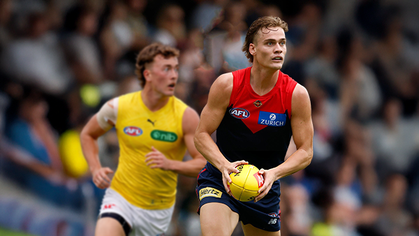
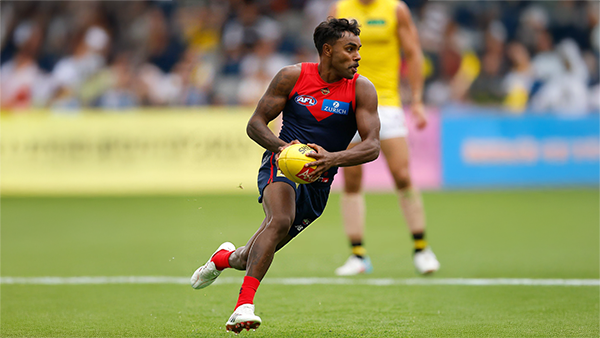
REPORT: Richmond
Mars is not usually a place known for lighting strikes but on Friday evening it happened twice in the vicinity of the stadium in Ballarat that carries the name and is a half completed building site with limited capacity for spectators.- 4 replies
-
POSTGAME: Richmond
The Dees ran another clinic for the second week in a row as they easily accounted for the Tigers in the lightning interrupted shortened match at Mars Stadium in Ballarat.-
-
- 118 replies
-


|

|
|

|
 |
 |
 |
 |
 |
 |
 |
 |
Archived
This topic is now archived and is closed to further replies.