


Featured Content
-
PREVIEW: Essendon
Not long ago, the narrative surrounding Melbourne was steeped in pessimism. There was some concern among the pundits (and even some fans) that the club would arrive at the AFL’s Gather Round still winless, vulnerable to a familiar adversary in the Essendon Football Club, and facing significant scrutiny from an ever-critical media on a national stage. Things have changed.-
-
- 2 replies
-
-
REPORT: Gold Coast
Steven King astutely identified the issues that had plagued the Melbourne Football Club over the past two and a half seasons when he auditioned for the newly created coaching role. The side that had claimed the 2021 premiership had become stodgy, slow-paced, and hesitant to take the initiative.-
-
- 4 replies
-
-
PREGAME: Essendon
Gather Round is upon us and the Demons face off against the Bombers who are on a 17 game losing streak. Who comes in and who goes out?-
-
- 244 replies
-
-
CASEY: Box Hill
The Casey Demons secured their first win of the season by the narrow margin of four points against the Box Hill Hawks at Casey Fields on Easter Sunday morning.-
-
- 0 replies
-
-
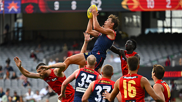
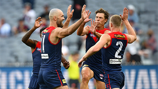
POSTGAME: Gold Coast
The Demons put four quarters of hard contested, fast running and high pressure football to knock off the ladder leaders and early premiership contenders the Gold Suns by 20 points at the MCG on Easter Sunday.-
-
- 506 replies
-
-
PODCAST: Gold Coast
I’ll be away for the next few weeks, so Binman will be holding the fort for our podcasts covering the Suns, Bombers and Lions matches. As a result, there will be no live podcasts during this period, and we won’t be taking calls or voicemails. Binman will still be dipping into this thread to select a few questions to answer, while also combining the long-form Stats Files podcast with the Demonland Podcast for these shows. Your questions and comments are a huge part of what makes the podcast work, so please post anything you’d like to ask or say below and we’ll do our best to give you a shout-out on the show. Please try to keep each post focused on one specific topic or player to make podcast preparation a little easier. If you have multiple topics you’d like to raise, please put them in separate posts.-
-
- 28 replies
-


|

|

|

|
 |
 |
 |
 |
 |
 |
 |
 |
Archived
This topic is now archived and is closed to further replies.