


Alternative Away Guernsey

Featured Replies
Featured Content
-
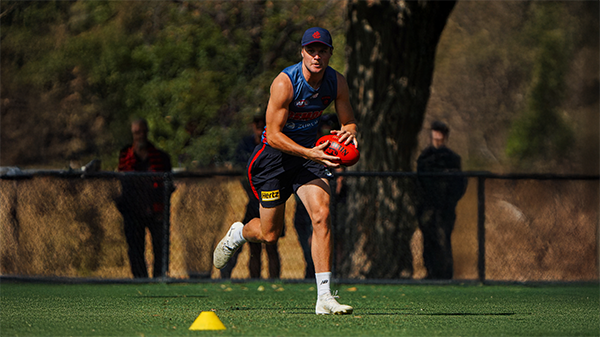
TRAINING: Wednesday 18th February 2026
A couple of Demonland Trackwatchers were blessed with some beautiful Wednesday morning weather to give their observations of one of the final open training session at Gosch's Paddock prior to our first practice hit out against another team this weekend.- 0 replies
-
NON-MFC: 2026 Practice Matches
We are just weeks away from the start of the 2026 Premiership Season and the first Practice Matches are about to begin. Discuss all the games that don't involve the Demons in the lead up to Opening Round.-
-
- 26 replies
-
-
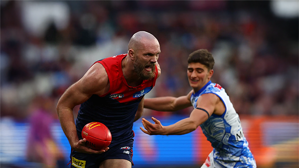
PREGAME: North Melbourne
After 182 long days since the end of the disastrous 2025 season the Demons will finally take the field again for new coach Steven King's first hit out against real opposition when the Demons take on the Kangaroos in their first practice match of 2026. What are you hoping to see from the Demons on Friday afternoon?-
-
- 71 replies
-
-
REPORT: Intraclub Match
The so-called 'match simulation' at Casey Fields today was more like a casual kickaround with the lids off. With State of Origin stars missing, injuries galore, and players coming back from rehab, the Dees even had to dig deep into their VFL squad. The result? Not exactly a thrilling high class spectacle, more like a waltz with your little sister.- 0 replies
-
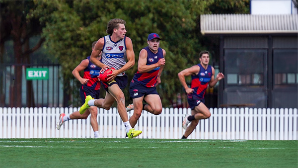
INTRACLUB: Friday 13th February 2026
The Demons hit the track for their final intraclub match before they take on North Melbourne and Richmond in the Community Series Practice Matches in the lead up to the 2026 AFL Premiership Season.-
-
- 414 replies
-
-
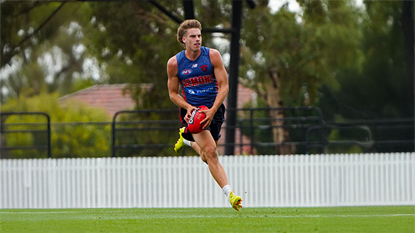
TRAINING: Wednesday 11th February 2026
It was a hot and muggy morning as the boys hit the track and a couple of Demonland Trackwatchers were on hand to bring you their observations from Wednesday's preseason training session at Gosch's Paddock.- 2 replies


|

|

|

|
 |
 |
 |
 |
 |
 |
 |
 |
Archived
This topic is now archived and is closed to further replies.