


The new MFC emblem
Featured Replies
Featured Content
-
REPORT: Gold Coast
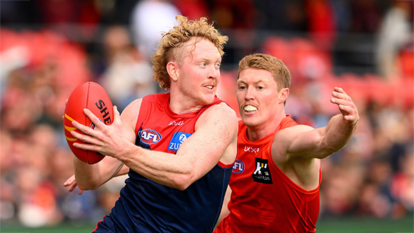
From the start, Melbourne’s performance against the Gold Coast Suns at Peoples First Stadium was nothing short of a massive botch up and it came down in the first instance to poor preparation. Rather than adequately preparing the team for battle against an opponent potentially on the skids after suffering three consecutive losses, the Demons looking anything but sharp and ready to play in the opening minutes of the game. By way of contrast, the Suns demonstrated a clear sense of purpose and will to win. From the very first bounce of the ball they were back to where they left off earlier in the season in Round Three when the teams met at the MCG. They ran rings around the Demons and finished the game off with a dominant six goal final term. This time, they produced another dominant quarter to start the game, restricting Melbourne to a solitary point to lead by six goals at the first break, by which time, the game was all but over.-
-
- 0 replies
-
-
CASEY: Gold Coast
Coming off four consecutive victories and with a team filled with 17 AFL listed players, the Casey Demons took to their early morning encounter with the lowly Gold Coast Suns at People First Stadium with the swagger of a team that thought a win was inevitable. They were smashing it for the first twenty minutes of the game after Tom Fullarton booted the first two goals but they then descended into an abyss of frustrating poor form and lackadaisical effort that saw the swagger and the early arrogance disappear by quarter time when their lead was overtaken by a more intense and committed opponent. The Suns continued to apply the pressure in the second quarter and got out to a three goal lead in mid term before the Demons fought back. A late goal to the home side before the half time bell saw them ten points up at the break and another surge in the third quarter saw them comfortably up with a 23 point lead at the final break.-
- 0 replies
-
-
PREGAME: Rd 17 vs Adelaide
With their season all over bar the shouting the Demons head back on the road for the third week in a row as they return to Adelaide to take on the Crows. Who comes in and who goes out?-
- 61 replies
-
-
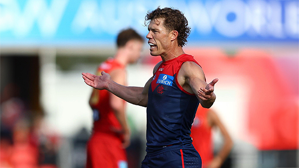
POSTGAME: Rd 16 vs Gold Coast
The Demons did not come to play from the opening bounce and let the Gold Coast kick the first 5 goals of the match. They then outscored the Suns for the next 3 quarters but it was too little too late and their season is now effectively over.-
-
- 231 replies
-
-
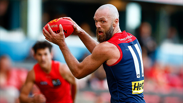
VOTES: Rd 16 vs Gold Coast
Max Gawn has a massive lead in the Demonland Player of the Year award ahead of Jake Bowey, Christian Petracca, Clayton Oliver and Kysaiah Pickett. Your votes please. 6, 5, 4, 3, 2 & 1.-
-
- 41 replies
-
-
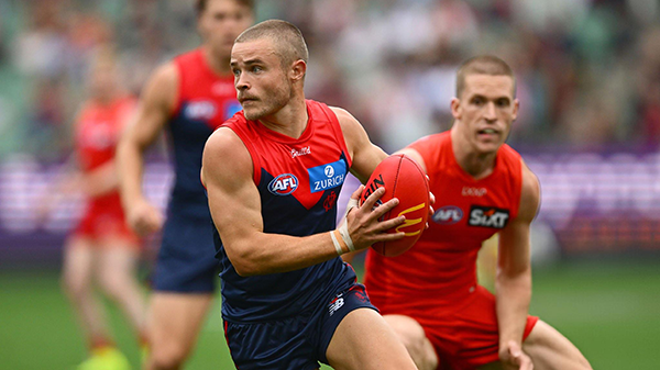
GAMEDAY: Rd 16 vs Gold Coast
It's Game Day and the Demons are back on the road again and this may be the last roll of the dice to get their 2025 season back on track as they take on the Gold Coast Suns at People First Stadium.-
-
- 546 replies
-


|

|

|

|
 |
 |
 |
 |
 |
 |
 |
 |
Archived
This topic is now archived and is closed to further replies.