


2024 Demons Jumper

Featured Replies
Featured Content
-
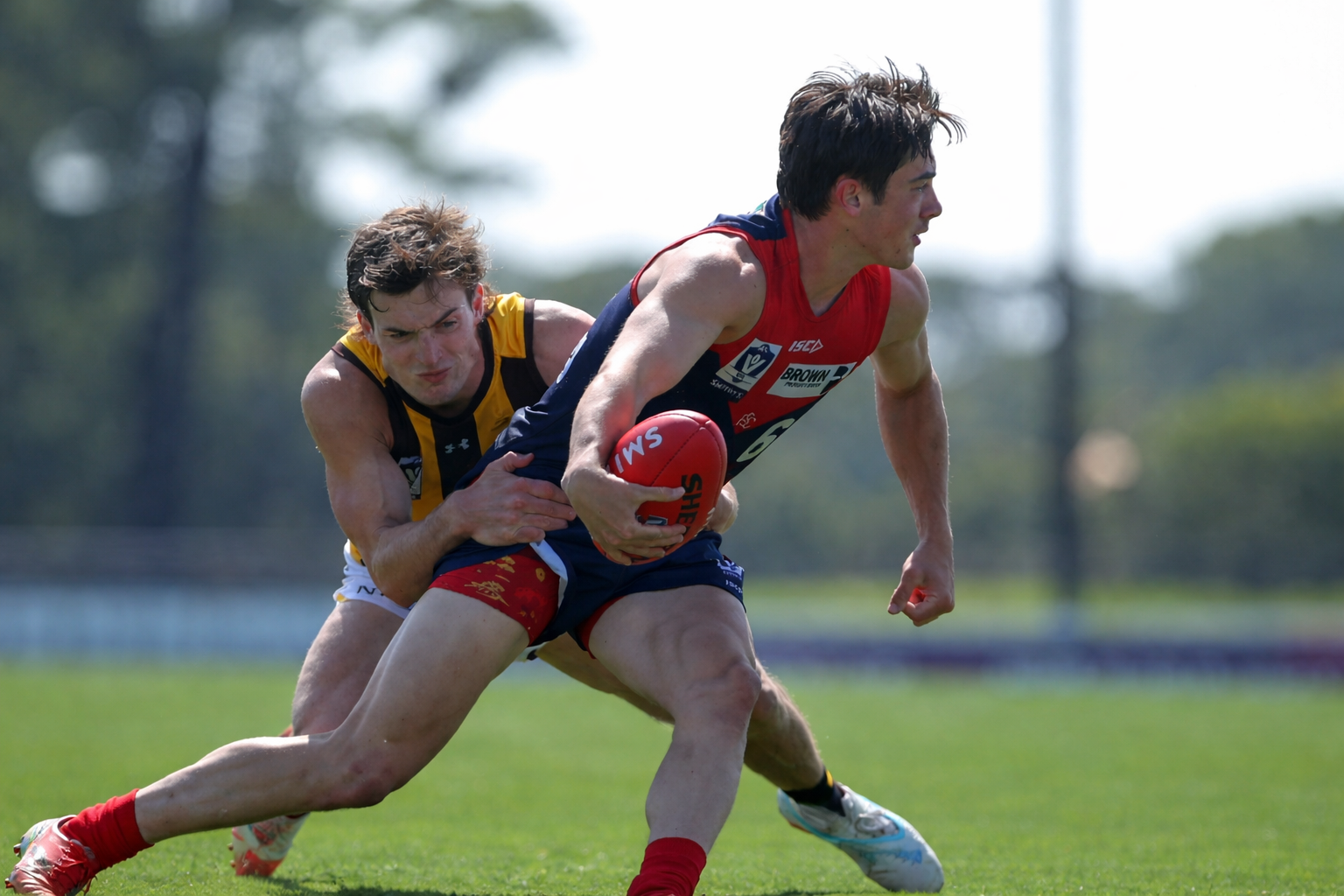
CASEY: Box Hill
The Casey Demons secured their first win of the season by the narrow margin of four points against the Box Hill Hawks at Casey Fields on Easter Sunday morning.- 0 replies
-
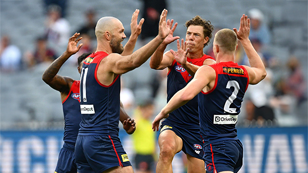
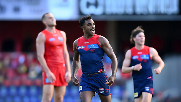
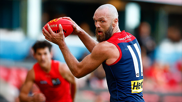
POSTGAME: Gold Coast
The Demons put four quarters of hard contested, fast running and high pressure football to knock off the ladder leaders and early premiership contenders the Gold Suns by 20 points at the MCG on Easter Sunday.-
-
- 374 replies
-
-
PODCAST: Gold Coast
I’ll be away for the next few weeks, so Binman will be holding the fort for our podcasts covering the Suns, Bombers and Lions matches. As a result, there will be no live podcasts during this period, and we won’t be taking calls or voicemails. Binman will still be dipping into this thread to select a few questions to answer, while also combining the long-form Stats Files podcast with the Demonland Podcast for these shows. Your questions and comments are a huge part of what makes the podcast work, so please post anything you’d like to ask or say below and we’ll do our best to give you a shout-out on the show. Please try to keep each post focused on one specific topic or player to make podcast preparation a little easier. If you have multiple topics you’d like to raise, please put them in separate posts.-
- 10 replies
-
-
VOTES: Gold Coast
Dual Reigning Champion Max Gawn has an early lead in the Demonland Player of the Year Award. He leads new recruit Jack Steele, forward Jacob van Rooyen and veteran Christian Salem. Your votes please. 6, 5, 4, 3, 2, & 1.-
-
- 62 replies
-
-
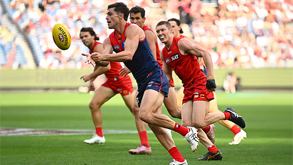
GAMEDAY: Gold Coast
It's Game Day and the Demons are back at the MCG and have a massive challenge ahead of them as they take on Premiership contender the Gold Coast Suns. What do you want to see from the Dees today?-
-
- 431 replies
-
-
PREVIEW: Gold Coast
Melbourne’s slow starts have been a troubling theme for a while. Against the Suns, they started slowly in both of their games, they trailed by 5.7.37 to 0.1.1 at quarter time at Peoples First Stadium in Round 16. This season, the story has remained the same and if the Demons fail to shake off this issue against the unbeaten Gold Coast Suns, they will be in serious danger of capitulating once again in their Easter Sunday showdown.-
-
- 10 replies
-


|

|

|

|
 |
 |
 |
 |
 |
 |
 |
 |
Join the conversation
You can post now and register later. If you have an account, sign in now to post with your account.