


Clash jumper 2011

Guest Redleg_24
Clash Strip 2011 152 members have voted
Featured Replies
Featured Content
-
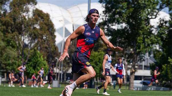
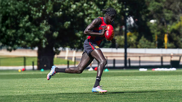
TRAINING: Wednesday 17th December 2025
It's the last preseason training session of the year and Demonland Trackwatchers braved the rising heat to witness a gruelling session that included a proper Match SIM. Farewell 2025. Bring on 2026.- 1 reply
-
TRAINING: Monday 15th December 2025
A couple of Demonland Trackwatchers ventured down to Gosch's Paddock for the penultimate preseason training session of 2025 before the boys take their end of year break.- 0 replies
-
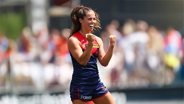
AFLW 2025 SEASON REVIEW
Only one team came close to toppling the royal blue and whites: the mighty Demons, who led by six points at the final change of Preliminary Final 1. Alas, North held firm while Melbourne fatigued to lose by 10 points. Take comfort — none of the other 16 teams got anywhere near this close.-
-
- 5 replies
-
-
TRAINING: Friday 12th December 2025
The temperature was rising throughout todays preseason training session at Gosch's Park and two umpires were in attendance to officiate the first official Match Simulation of the Preseason.- 0 replies
-
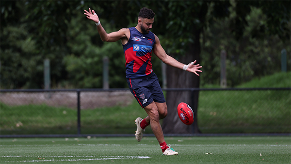
TRAINING: Wednesday 10th December 2025
Demonland Trackwatchers descended upon Gosch's Paddock on a brisk Wednesday Morning to bring you their observations from another Preseason Training session.- 0 replies
-
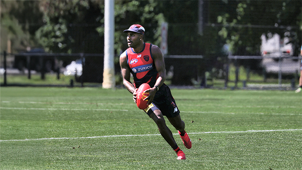
TRAINING: Monday 8th December 2025
Some of our dedicated Demonland Trackwatchers made their way down to Gosch’s Paddock on a magnificent Monday morning to kick off another week of preseason training coverage.- 0 replies


|

|

|

|
 |
 |
 |
 |
 |
 |
 |
 |
Archived
This topic is now archived and is closed to further replies.