


Retro gear

Featured Replies
Featured Content
-
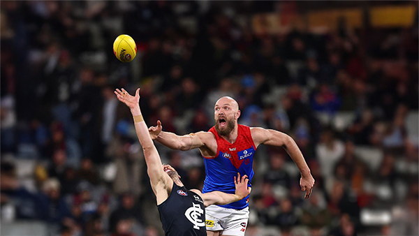
PREGAME: Carlton
The Demons return to the MCG next week and will be looking to atone for a dismal performance in Perth as they take on the under the pump Blues. Who comes in and who goes out for our Round 3 match against the Carlton?-
-
- 118 replies
-
-
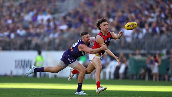
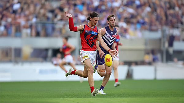
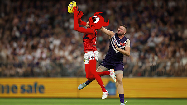
REPORT: Fremantle
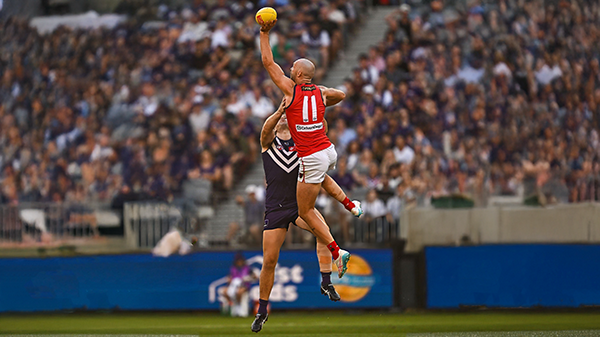
Melbourne’s early surge of optimism came crashing back to reality in its clash with Fremantle at Optus Stadium on Saturday night. Just six days after unveiling its fun-filled, attack-minded style against the Saints, the Demons were met by a Dockers outfit determined to shut it down with a blend of speed, pressure, and physicality.- 0 replies
-
CASEY: Footscray
The Casey Demons faced a tough first up task taking on reigning VFL premiers Footscray at Mission Whitten Oval. The Bulldogs, who unfurled their premiership flag pre-game, had 15 AFL-listed players and their top VFL talent available, setting them up for their 15th consecutive win.- 5 replies
-
POSTGAME: Fremantle
The Demons were fumbly, inefficient, outrun and outgunned all over the field as they went down to the Dockers by 48 points at Optus Stadium in Perth.-
-
- 282 replies
-
-
PODCAST: Fremantle
The Demonland Podcast will air LIVE on Monday, 23rd March @ 8:00pm. Join Binman, George & I as we dissect the Dees dismal loss to the Dockers in Perth.
Your questions and comments are a huge part of our podcast so please post anything you want to ask or say below and we'll give you a shout out on the show.
PLEASE TRY TO KEEP THE QUESTIONS/COMMENTS TO ONE SPECIFIC TOPIC/PLAYER IN ORDER TO MAKE THE PREPARATION FOR THE PODCAST EASIER.-
-
- 29 replies
-
-
VOTES: Fremantle
Coming off Back to Back Demonland Player of the Year Award wins Captain Max Gawn is already in the lead followed by Jacob van Rooyen, Jai Culley, Kozzy Pickett & Jack Steele. Your votes please. 6, 5, 4, 3, 2 & 1.-
- 43 replies
-


|

|

|

|
 |
 |
 |
 |
 |
 |
 |
 |
Join the conversation
You can post now and register later. If you have an account, sign in now to post with your account.