


Retro gear

Featured Replies
Featured Content
-
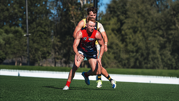
CASEY: Richmond
The winds finally returned to Casey Fields for the Demons’ third home game of the VFL season, and its impact was immediate. After two opening rounds played in uncharacteristically fine conditions, the Anzac Day clash brought back the familiar gusty conditions that have been a feature of the region at this time of the year.
Forced to kick into the breeze first, the slow-starting Demons faced a tricky opening against an enthusiastic young Tigers outfit. Casey responded by turning the contest into a scramble, pressuring Richmond into errors and missed targets. The tactic proved crucial, keeping the game tight for three and a half quarters before the Demons pulled away with the autumn wind at their backs.- 2 replies
-
REPORT: Richmond
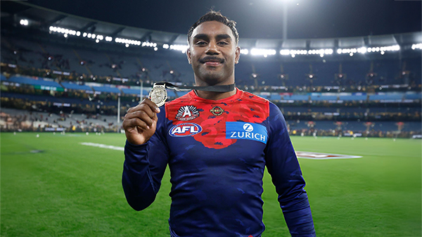
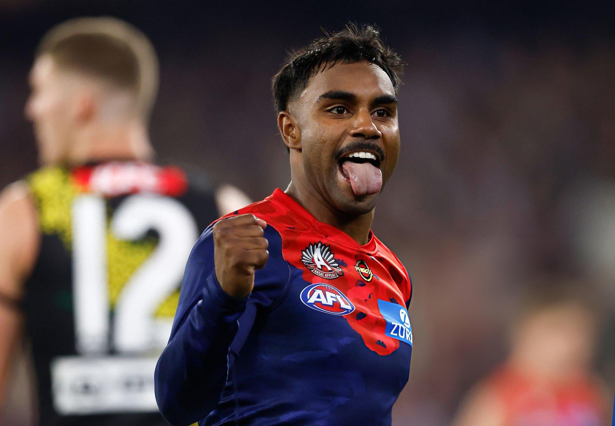
It seemed as if the whole purpose of the Anzac Eve clash at the MCG between the Demons and the Tigers was building toward that single, unforgettable moment when Kozzie Pickett soared above Campbell Gray and all but fittingly etched his name onto the face of the 2026 Frank ‘Checker’ Hughes Medal.- 1 reply
-
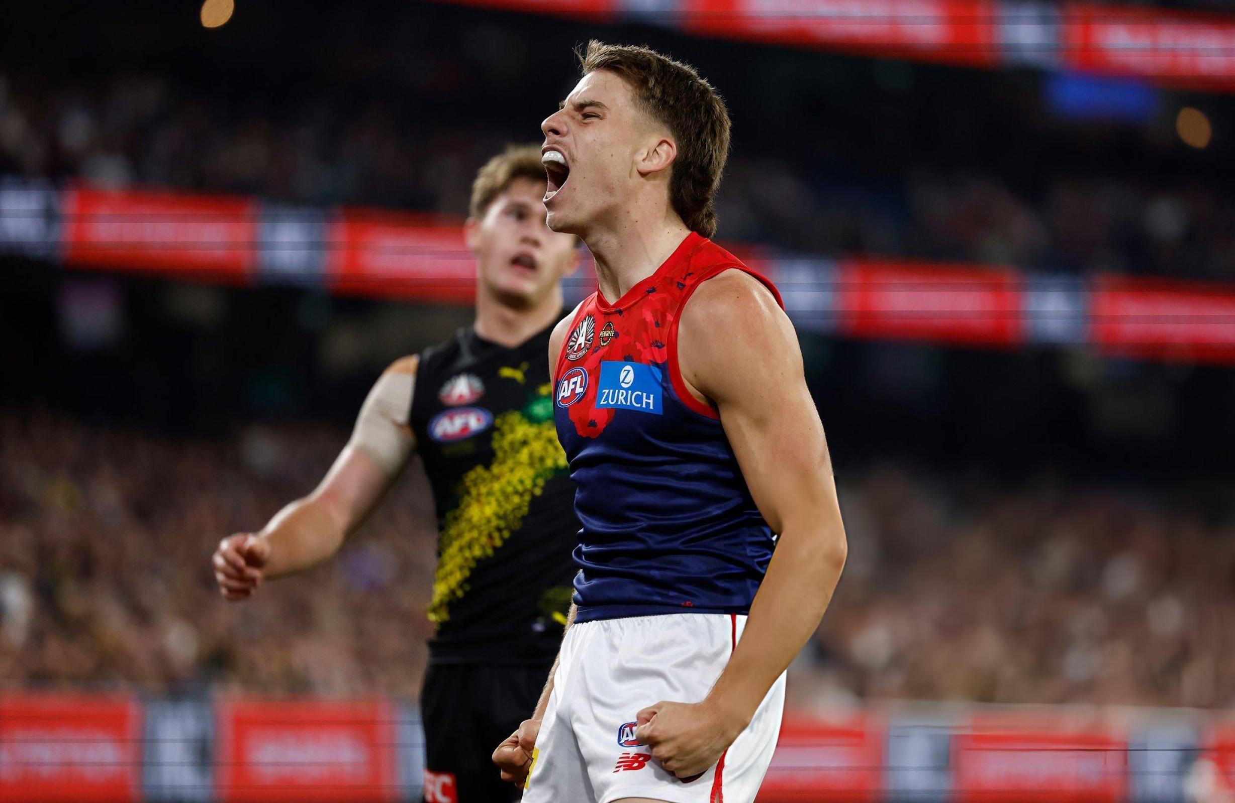
POSTGAME: Richmond
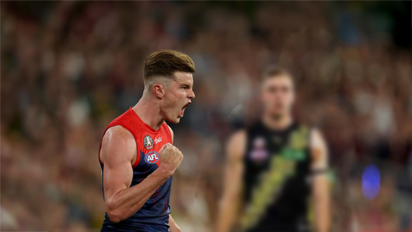
The Dees have gone 5-0 on their fortress at the MCG brushing aside Richmond by 54 points in a commanding performance on ANZAC Eve.-
-
- 269 replies
-
-
PODCAST: Richmond
Andy is back and the Demonland Podcast will air LIVE on Monday night at 8pm. Get your questions and comments in for the boys as they dissect a win on the big ANZAC Eve Stage over the Tigers at our Fortress at the G.- 19 replies
-
VOTES: Richmond
Captain and reigning back to back Champion Max Gawn has healthy lead over Kozzy Pickett in the Demonland Player of the Year Award. Jack Steele, Harvey Langford & Tom Sparrow round out the Top 5. Your votes please. 6, 5, 4, 3, 2 & 1.-
-
- 47 replies
-
-
GAMEDAY: Richmond
It's Game Day on Friday night. ANZAC Eve. The big stage at the ‘G. The Demons return to the spotlight for one of our most significant nights on the football calendar, taking on the Tigers in a clash that always carries extra weight given the gravity of occasion of the commemoration of the ANZAC Spirit. Under the lights, in front of a packed house, this is where moments are made. Can the Dees rise to the occasion and deliver on the big stage, or will Richmond spoil the night? All the build-up, discussion, and in-game reactions here. Go Dees.-
-
- 637 replies
-


|

|
|

|
 |
 |
 |
 |
 |
 |
 |
 |
Join the conversation
You can post now and register later. If you have an account, sign in now to post with your account.