


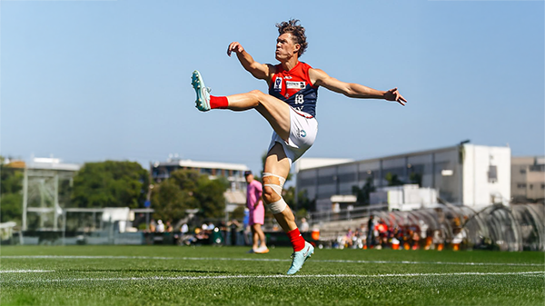
Retro gear

Featured Replies
Featured Content
-
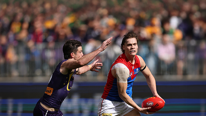
CASEY: Footscray
The Casey Demons faced a tough first up task taking on reigning VFL premiers Footscray at Mission Whitten Oval. The Bulldogs, who unfurled their premiership flag pre-game, had 15 AFL-listed players and their top VFL talent available, setting them up for their 15th consecutive win.- 0 replies
-
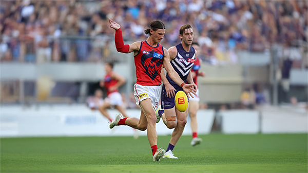
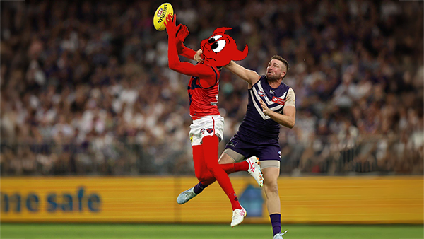
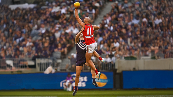
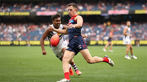
POSTGAME: Fremantle
The Demons were fumbly, inefficient, outrun and outgunned all over the field as they went down to the Dockers by 48 points at Optus Stadium in Perth.-
-
- 189 replies
-
-
PODCAST: Fremantle
The Demonland Podcast will air LIVE on Monday, 23rd March @ 8:00pm. Join Binman, George & I as we dissect the Dees dismal loss to the Dockers in Perth.
Your questions and comments are a huge part of our podcast so please post anything you want to ask or say below and we'll give you a shout out on the show.
PLEASE TRY TO KEEP THE QUESTIONS/COMMENTS TO ONE SPECIFIC TOPIC/PLAYER IN ORDER TO MAKE THE PREPARATION FOR THE PODCAST EASIER.-
- 9 replies
-
-
VOTES: Fremantle
Coming off Back to Back Demonland Player of the Year Award wins Captain Max Gawn is already in the lead followed by Jacob van Rooyen, Jai Culley, Kozzy Pickett & Jack Steele. Your votes please. 6, 5, 4, 3, 2 & 1.-
-
- 37 replies
-
-
GAMEDAY: Fremantle
It’s Game Day and the Demons have made the long trip west to take on Fremantle tonight at Optus Stadium. Can Melbourne make it two from two to start the season, and what are you hoping to see from the Dees under the lights in Perth?-
-
- 547 replies
-
-
PREVIEW: Fremantle
The dominant storyline coming out of Round One for Saturday Night’s clash at Optus Stadium centres on the influence of the big men. The spotlight naturally falls on two elite ruckmen who, five years ago, shared the stage in Melbourne’s memorable premiership triumph.-
- 3 replies
-


|

|
|

|
 |
 |
 |
 |
 |
 |
 |
 |
Join the conversation
You can post now and register later. If you have an account, sign in now to post with your account.