


Retro gear

Featured Replies
Featured Content
-
POSTGAME: Richmond
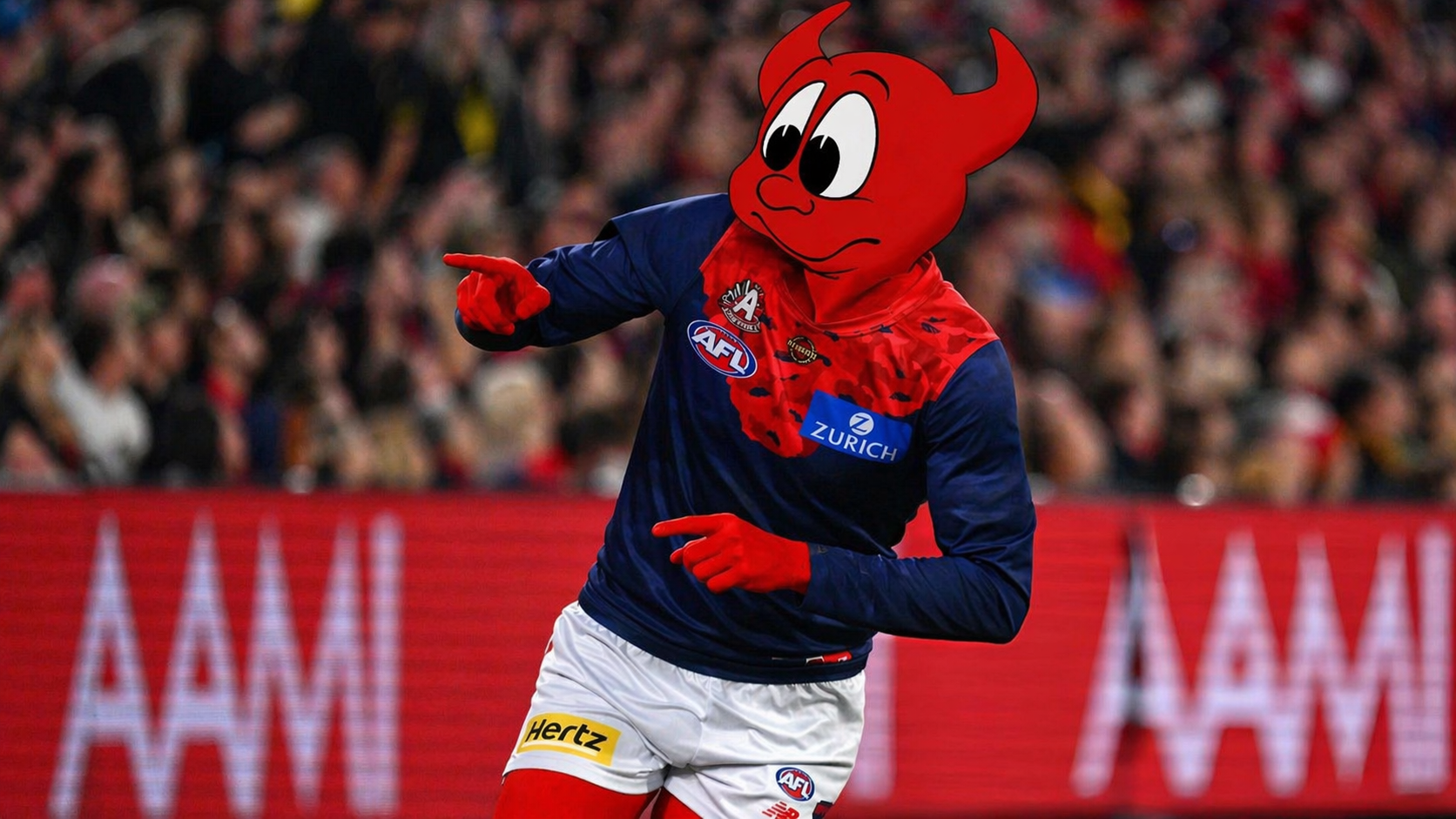
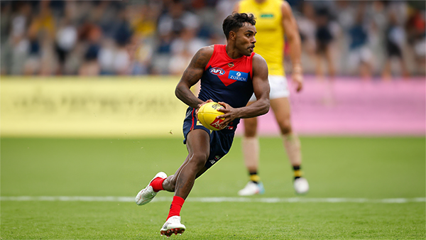
The Dees have gone 5-0 on their fortress at the MCG brushing aside Richmond by 54 points in a commanding performance on ANZAC Eve.-
-
- 103 replies
-
-
PODCAST: Richmond
Andy is back and the Demonland Podcast will air LIVE on Monday night at 8pm. Get your questions and comments in for the boys as they dissect a win on the big ANZAC Eve Stage over the Tigers at our Fortress at the G.-
- 5 replies
-
-
VOTES: Richmond
Captain and reigning back to back Champion Max Gawn has healthy lead over Kozzy Pickett in the Demonland Player of the Year Award. Jack Steele, Harvey Langford & Tom Sparrow round out the Top 5. Your votes please. 6, 5, 4, 3, 2 & 1.-
-
- 23 replies
-
-
GAMEDAY: Richmond
It's Game Day on Friday night. ANZAC Eve. The big stage at the ‘G. The Demons return to the spotlight for one of our most significant nights on the football calendar, taking on the Tigers in a clash that always carries extra weight given the gravity of occasion of the commemoration of the ANZAC Spirit. Under the lights, in front of a packed house, this is where moments are made. Can the Dees rise to the occasion and deliver on the big stage, or will Richmond spoil the night? All the build-up, discussion, and in-game reactions here. Go Dees.-
-
- 638 replies
-
-
NON-MFC: Round 7
Round 7 is here, with the ANZAC commemoration games taking centre stage. Who are you tipping this week, and which results would be most favourable for the Demons?-
-
- 47 replies
-
-
PREVIEW: Richmond
Who would have imagined, when the season kicked off early last month, that Melbourne would emerge from the opening six weeks with wins over both Queensland powerhouses? At the time, Gold Coast and Brisbane were the competition’s early pace-setters, the flavours of the month, and the prospect of the Demons toppling both within the course of a fortnight seemed remote. Yet here they are, banking those scalps alongside home victories over two traditional Victorian rivals and building a quietly impressive resume.- 1 reply


|

|

|

|
 |
 |
 |
 |
 |
 |
 |
 |
Join the conversation
You can post now and register later. If you have an account, sign in now to post with your account.