


A new Demonland banner

148 members have voted
-
1. Who do you want in the new Demonland banner (please select 5)?
-
Nathan Jones9
-
Mark Jamar33
-
James Frawley94
-
Jack Watts43
-
Jack Grimes65
-
Tom Scully87
-
Jack Trengove48
-
Brent Moloney36
-
Brad Green75
-
Liam Jurrah103
-
Jordie Gysberts2
-
Cale Morton2
-
Aaron Davey64
-
Dean Bailey10
-
Michael Newton6
-
NEW INCLUSION: Col Sylvia45
-
Please sign in or register to vote in this poll.
Featured Replies
Featured Content
-
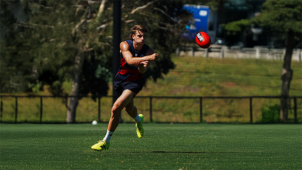
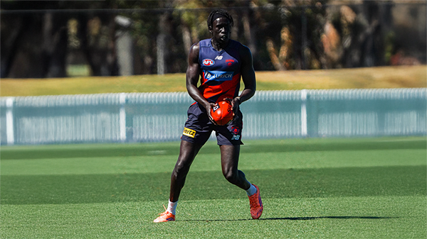
MATCH SIM: Friday 6th February 2026
A couple Demonland Trackwatchers as well as a Jounalist were in attendance out at Casey Fields this morning to bring you their observations from the Match Simulation including reports that Jai Culley left the field with a suspected broken arm.-
- 0 replies
-
-
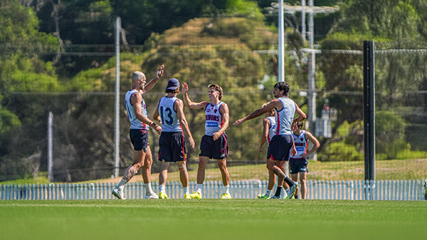
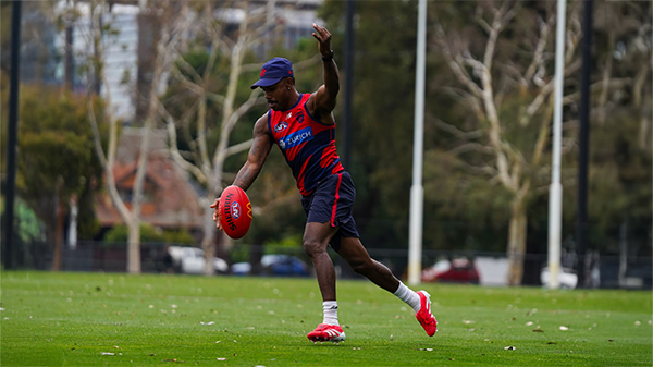
TRAINING: Wednesday 4th February 2026
It was sunny and hot morning as Demonland Trackwatchers took up positions along the boundary lines to bring you their observations from Wednesday morning's preseason training session at Gosch's Paddock.-
-
- 1 reply
-
-
TRAINING: Wednesday 28th January 2026
A plethora of Demonland Trackwatchers were once again out in force to bring you their preseason training observations from Wednesday morning's open session at Gosch's Paddock.-
-
- 3 replies
-
-
MATCH SIM: Friday 23rd January 2026
A couple of Demonland Trackwatchers managed to get ringside seats for Friday's Match SIM out at Casey Fields to bring you their observations of the intra-club contest.-
-
- 3 replies
-
-
TRAINING: Wednesday 21st January 2026
Demonland Trackwatchers were out in force at Wednesday morning's open training session at Gosch's Paddock to bring you their observations of preseason training.-
-
- 3 replies
-
-
TRAINING: Friday 16th January 2026
Demonland Trackwatcher Pickett Fence made the trek out to Casey Fields to watch the session from behind the locked fence to bring you his observations from preseason training.-
-
- 0 replies
-


|

|

|

|
 |
 |
 |
 |
 |
 |
 |
 |
Archived
This topic is now archived and is closed to further replies.