


The new MFC emblem

Featured Replies
Featured Content
-
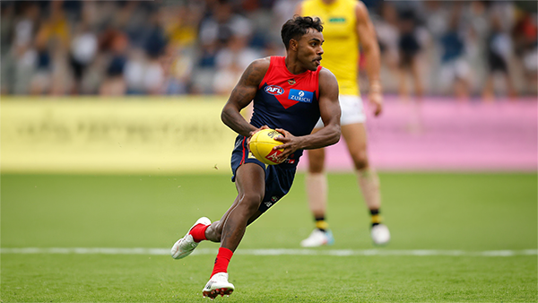
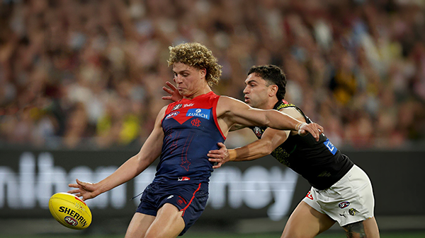
GAMEDAY: Richmond
It's Game Day on Friday night. ANZAC Eve. The big stage at the ‘G. The Demons return to the spotlight for one of our most significant nights on the football calendar, taking on the Tigers in a clash that always carries extra weight given the gravity of occasion of the commemoration of the ANZAC Spirit. Under the lights, in front of a packed house, this is where moments are made. Can the Dees rise to the occasion and deliver on the big stage, or will Richmond spoil the night? All the build-up, discussion, and in-game reactions here. Go Dees.-
-
- 112 replies
-
-
NON-MFC: Round 7
Round 7 is here, with the ANZAC commemoration games taking centre stage. Who are you tipping this week, and which results would be most favourable for the Demons?-
-
- 45 replies
-
-
PREVIEW: Richmond
Who would have imagined, when the season kicked off early last month, that Melbourne would emerge from the opening six weeks with wins over both Queensland powerhouses? At the time, Gold Coast and Brisbane were the competition’s early pace-setters, the flavours of the month, and the prospect of the Demons toppling both within the course of a fortnight seemed remote. Yet here they are, banking those scalps alongside home victories over two traditional Victorian rivals and building a quietly impressive resume.- 1 reply
-
PREGAME: Richmond
The Dees hit the big Friday night stage for the first and only time this season when they take on the Tigers under lights on ANZAC Eve at the G. Who comes in and who goes out?-
- 402 replies
-
-
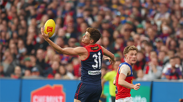
REPORT: Brisbane
Before Sunday, the last time the Brisbane Lions had walked onto the turf of the Melbourne Cricket Ground, they celebrated the pinnacle of the sport - an AFL premiership secured in emphatic fashion for the second consecutive year.- 1 reply
-
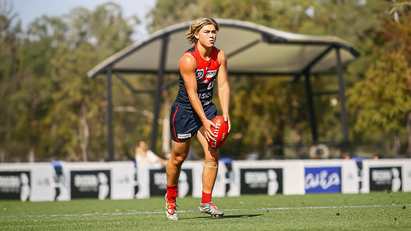
CASEY: Brisbane
From the outset, the Casey Demons lacked any spring in their steps. They were out-hustled and out-bustled and finally outplayed by the Brisbane Lions by 38 points on their home turf in perfect conditions at Casey Fields.- 0 replies


|

|

|

|
 |
 |
 |
 |
 |
 |
 |
 |
Archived
This topic is now archived and is closed to further replies.