


The new MFC emblem

Featured Replies
Featured Content
-
PREVIEW: Gold Coast
Melbourne’s slow starts have been a troubling theme for a while. Against the Suns, they started slowly in both of their games, they trailed by 5.7.37 to 0.1.1 at quarter time at Peoples First Stadium in Round 16. This season, the story has remained the same and if the Demons fail to shake off this issue against the unbeaten Gold Coast Suns, they will be in serious danger of capitulating once again in their Easter Sunday showdown.-
-
- 6 replies
-
-
NON-MFC: Round 04
Round 4 of the 2026 AFL Premiership Season is upon us and it is the last week of the early season byes. Who are you tipping this week and what are the best results for the Dees Finals chances? 😜-
-
- 72 replies
-
-
PREGAME: Gold Coast
The Demons are back at the MCG for the second week in a row. They face the Suns off a 15 day break without their prized recruit and former Demon champion Christian Petracca. This will be a massive test for the Demons who will be facing a genuine Premiership contender. Who comes in and who goes out?-
-
- 289 replies
-
-
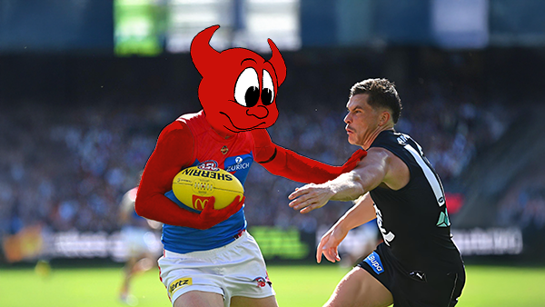
REPORT: Carlton
The text messages started flooding in shortly after quarter time. One read: “Is Melbourne even at the ground?” Moments later, as Carlton’s Elijah Hollands kicked the first goal of the second term, the Blues held a commanding 43-point lead. By then, the Demons’ only score was a behind kicked by Brody Mihocek nearly five minutes into the game. Ironically, Mihocek would also register the last minor score of the day after the game took a dramatic turnaround.-
-
- 4 replies
-
-
POSTGAME: Carlton
The Demons snatched Victory form the Jaws of Defeat as they clawed their way back from 43 points down to win by 23 points in Max Gawn and Tom McDonald's 250th matches at the MCG. Never in Doubt!!!-
-
- 556 replies
-
-
PODCAST: Carlton
The Demonland Podcast will air LIVE on TUESDAY, 31st March @ 8:00pm. Join Binman, George & I as we dissect the Dees miraculous 66 point turnaround win against the Blues at the G.-
-
- 49 replies
-


|

|

|

|
 |
 |
 |
 |
 |
 |
 |
 |
Archived
This topic is now archived and is closed to further replies.