


Advisory Panel 'Phase Two'
Featured Replies
Featured Content
-
TRAINING: Thursday 27th November 2025
Demonland Trackwatcher Where Demons Dare was our man on the spot at the Demon's Community Training Camp Open Training to bring you his observations from the Session.-
-
- 3 replies
-
-
2026 Player Numbers
The official Player Guernsey Numbers are in for the 2026 Season with a couple of players getting an upgrade and the new recruits getting their new numbers.-
-
- 56 replies
-
-
AFLW REPORT: North Melbourne
No team had come close to cracking North Melbourne all season, and Melbourne — up by six at the final change — nearly broke that trend in a pulsating preliminary final at IKON Park.-
-
- 3 replies
-
-
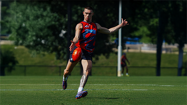
TRAINING: Friday 21st November 2025
It was a beautiful morning out at Gosch's Paddock for the final session of Preseason Training before the whole squad reunites for the annual training camp in Bright.-
-
- 0 replies
-
-
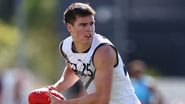
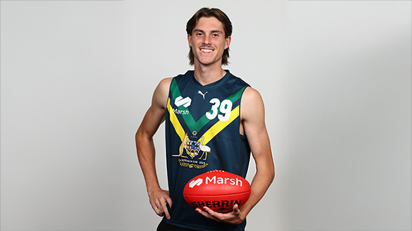
Welcome to Demonland: Riley Onley
The Demons have selected powerful and speedy midfielder Riley Onley with selection No. 3 in the 2025 AFL Rookie Draft.-
-
- 191 replies
-
-
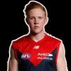
Welcome to Demonland: Kalani White
After being on the Demonland radar since 2016 the Demons have finally picked Kalani White, the sun of former Demon champion Jeff, as a Father/Son selection in the Draft.-
-
- 1,434 replies
-


|

|
|

|
 |
 |
 |
 |
 |
 |
 |
 |
Archived
This topic is now archived and is closed to further replies.