

DoubleRay
-
Posts
1 -
Joined
-
Last visited
Content Type
Profiles
Forums
Events
Store
Everything posted by DoubleRay
-
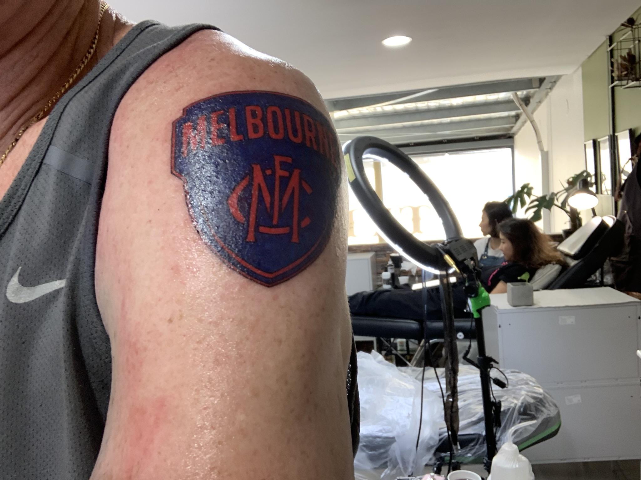
Just had this done. I looked at the official design but the cup and words wasted space. By just going with the emblem I could make it bigger to show the logo better. Top tip from my artist was to do all the lines in black for crisp definition then colour in.